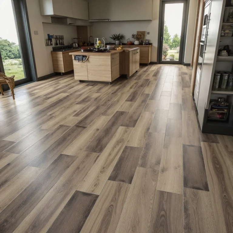
20+ Above Kitchen Cabinet Decor Ideas
That awkward gap between your kitchen cabinets and ceiling doesn’t have to collect dust and grease—it’s actually prime real estate for showcasing your personality and elevating your kitchen’s entire aesthetic.
Whether you’re working with a few inches or a foot of space, the right decor can make your kitchen feel more finished, cohesive, and intentionally designed while drawing the eye upward to make ceilings feel taller
This post features affiliate links. If you click and buy, I may earn a small commission at no extra charge to you.
Here 20+ Above Kitchen Cabinet Decor Ideas
1. Vintage Basket Collection
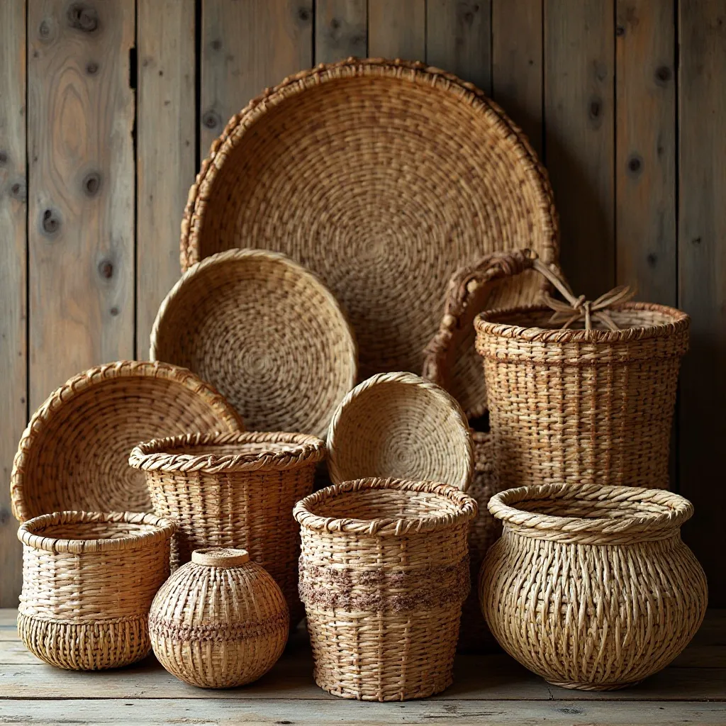
A carefully curated arrangement of woven baskets in varying sizes and textures creates an organic, layered look that adds warmth and visual interest. Mix round, rectangular, and oval shapes in natural materials like seagrass, rattan, and wicker for dimensional appeal. Shop on Amazon
Why It Works: Baskets bring rustic charm and softness to the hard surfaces of a kitchen while their neutral tones complement virtually any color scheme. They create visual weight without feeling heavy, and their texture catches light beautifully throughout the day. The collection tells a story and feels collected over time rather than bought all at once.
How to Style It:
- Group baskets in odd numbers (3, 5, or 7) and vary heights by 2-4 inches for the most pleasing composition
- Layer smaller baskets in front of larger ones, angling some at 30-45 degrees for depth
- Mix flat trays with dimensional baskets to create visual rhythm along the cabinet line
- Tuck in dried botanicals like pampas grass or eucalyptus between baskets for added texture
Where to Use It: Farmhouse kitchens, coastal spaces, transitional designs, breakfast nook areas
Pro Tip: Spray baskets with a clear matte sealant before placing them above the stove to protect against grease buildup and make cleaning effortless with a simple wipe-down.
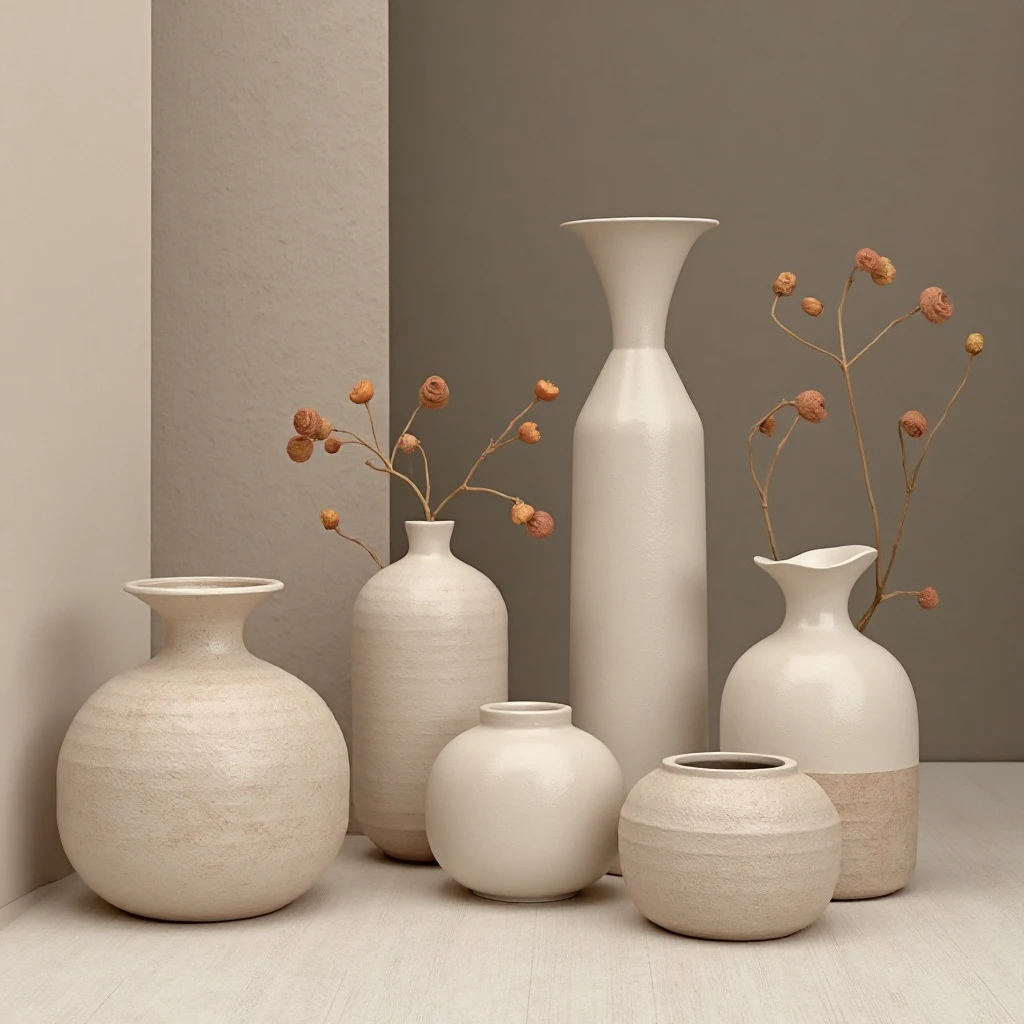
2. Symmetrical White Pitcher Display
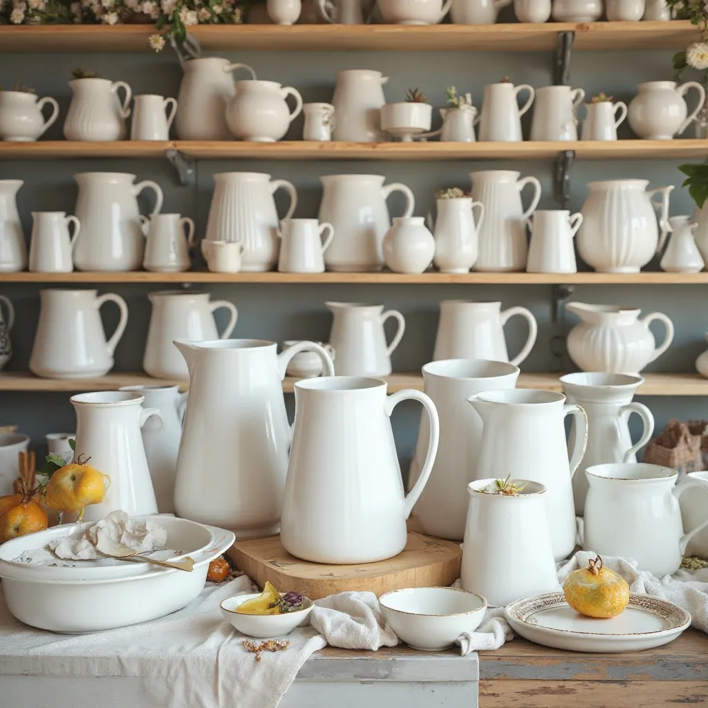
Matching white ceramic pitchers or crocks arranged with perfect symmetry create a clean, timeless look that feels both casual and refined. The repetition of form in white or cream creates visual breathing room in busy kitchens. Shop on Amazon
Why It Works: White ceramics reflect light and make the space feel brighter and more open, especially in kitchens with darker cabinets. The uniform color creates cohesion while the varied shapes keep things interesting. This approach works with any decor style because white is universally elegant and the symmetry feels intentional and polished.
How to Style It:
- Use 4-6 pitchers of similar height (8-12 inches) spaced evenly across the cabinet tops
- Vary the shapes slightly—mix rounded bodies with angular handles or fluted edges
- Add one contrasting element every 3-4 pitchers, like a white vase or ceramic bowl, to break monotony
- Fill a few pitchers with fresh greenery like olive branches or eucalyptus stems for life
Where to Use It: Modern farmhouse kitchens, French country spaces, traditional homes, minimalist designs
Pro Tip: Choose pitchers with a slight cream or ivory undertone rather than pure white—they’ll hide dust better and feel warmer against most cabinet colors.
3. Oversized Ironstone Collection
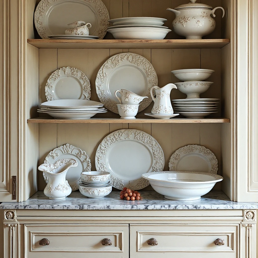
Large-scale vintage ironstone pieces—platters, tureens, and serving bowls—create dramatic impact and anchor the upper cabinet space with substantial presence. The creamy white patina and classic shapes bring Old World elegance. Shop on Amazon
Why It Works: Oversized pieces prevent the space from feeling cluttered or fussy while making a strong design statement. Ironstone’s weight and heft, even when displayed up high, gives the kitchen a sense of permanence and quality. The slight imperfections and age marks add authentic character that new pieces simply can’t replicate.
How to Style It:
- Choose pieces 14-18 inches in diameter for proper scale above standard cabinets
- Lean large platters vertically against the wall rather than laying them flat for maximum visual impact
- Group pieces in clusters of 2-3 with 6-8 inches between groupings
- Mix round platters with oval serving pieces and footed bowls for shape variety
Where to Use It: Traditional kitchens, English country designs, historic homes, butler’s pantries
Pro Tip: Position your largest, most impressive piece directly above the range or sink—these natural focal points deserve the showstopper treatment.
4. Greenery and Botanical Elements
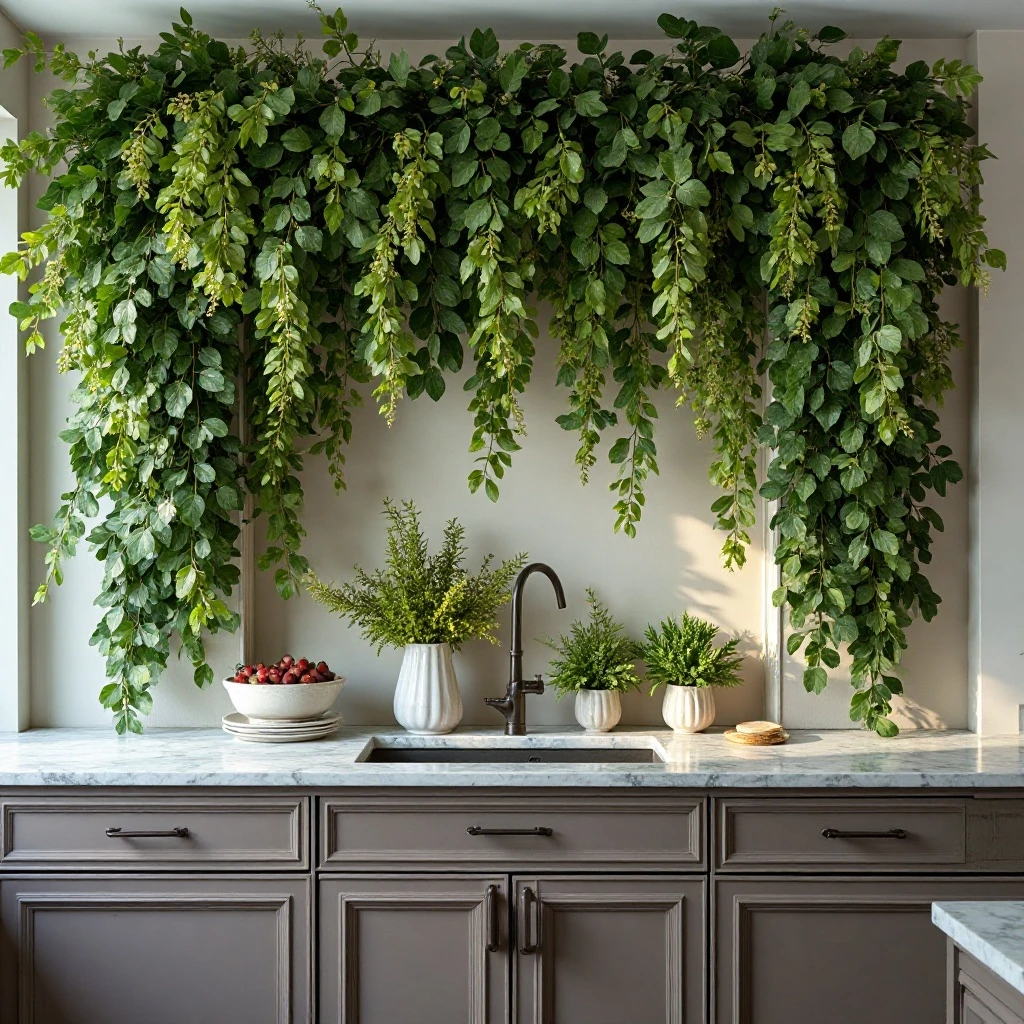
Faux or preserved garlands, stems, and trailing plants bring life and movement to the space without the maintenance demands of real plants in hard-to-reach areas. The organic shapes soften the linear architecture of cabinetry. Shop on Amazon
Why It Works: Greenery draws the eye upward and makes the kitchen feel fresh and connected to nature, which is especially welcome in spaces without windows or natural light. The movement and texture contrast beautifully with smooth cabinet surfaces. Unlike live plants in difficult-to-water locations, quality faux botanicals maintain their beauty year-round without effort.
How to Style It:
- Drape 6-8 foot garlands across cabinet tops, allowing them to dip slightly between cabinets
- Mix eucalyptus with olive branches and smilax for varied leaf shapes and natural movement
- Anchor corners with fuller arrangements and let strands trail toward the center
- Dust botanical elements monthly with a microfiber cloth or blow dryer on cool setting
Where to Use It: Kitchens lacking natural light, modern organic spaces, transitional designs, Italian villa-inspired kitchens
Pro Tip: Invest in preserved or high-quality silk botanicals rather than cheap plastic—the investment pays off in realism, and they’ll last 5-10 years looking fresh.
5. Grouped Cutting Boards and Trays
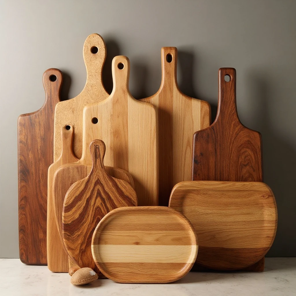
Wooden cutting boards and serving trays of varying sizes, shapes, and wood tones create a functional-yet-decorative display that celebrates craftsmanship and natural materials. The vertical arrangement showcases the beautiful grain patterns. Shop on Amazon
Why It Works: This approach feels authentic to kitchen spaces—displaying tools of the trade rather than purely decorative items. The warm wood tones add coziness and complement both light and dark cabinetry. The vertical lines created by standing boards draw the eye up and make ceilings appear higher.
How to Style It:
- Stand boards vertically at varying heights, leaning them at 70-80 degree angles
- Mix wood species—pair rich walnut with lighter maple or bamboo for tonal contrast
- Space boards 3-4 inches apart and overlap slightly for a layered, curated look
- Add one or two marble or slate boards for material diversity every 5-6 wooden pieces
Where to Use It: Farmhouse kitchens, rustic spaces, chef-inspired kitchens, open-concept designs
Pro Tip: Oil your displayed cutting boards every 3-4 months to maintain their beauty and prevent drying—just remove, treat, and return them for minimal maintenance.
6. Antique Book Stack Display

Vintage cookbooks and antique leather-bound books arranged in intentional stacks create an intellectual, lived-in quality that adds depth and story to the kitchen. The aged spines and varied heights create visual texture. Shop on Amazon
Why It Works: Books introduce unexpected sophistication to a kitchen and suggest this is a space for both cooking and gathering. The neutral tones of aged book spines complement any color palette while their rectangular shapes echo the cabinet architecture. This approach works particularly well for avid cooks who appreciate culinary history.
How to Style It:
- Stack books in groups of 2-5, varying stack heights between 8-14 inches
- Alternate horizontal and vertical orientations every other grouping for rhythm
- Place a small object (vintage scale, copper pot, or ceramic bowl) atop some stacks
- Include books with interesting spines—embossed titles, colorful cloth covers, or gold lettering
Where to Use It: Library kitchens, traditional spaces, English cottage designs, apartment kitchens
Pro Tip: Use vintage cookbooks specifically—they’re inexpensive at estate sales ($1-3 each) and their stained, worn condition actually adds authenticity rather than looking damaged.
7. Large-Scale Architectural Salvage
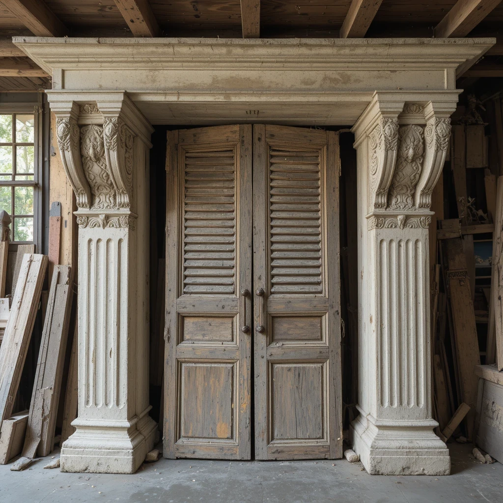
Oversized corbels, pediments, shutters, or sections of vintage molding bring architectural gravitas and serve as sculptural art pieces. These substantial elements command attention and add Old World character. Shop on Amazon
Why It Works: Architectural pieces create instant age and patina in new construction or builder-grade kitchens. Their scale makes a bold statement without cluttering the space, and the aged finish adds layers of visual interest. These pieces feel one-of-a-kind and give the kitchen a collected, curated quality that can’t be replicated with mass-produced decor.
How to Style It:
- Center one large corbel (18-24 inches) above the range hood or sink as a focal point
- Flank architectural pieces with simpler elements like greenery or small crocks to balance the visual weight
- Leave 12-18 inches of empty space around large salvage pieces to let them breathe
- Position pieces at slight angles or lean them casually rather than mounting them flat
Where to Use It: French country kitchens, historic renovations, farmhouse spaces, European-inspired designs
Pro Tip: Paint architectural salvage in the same color as your cabinets for a cohesive, built-in look, or choose a complementary accent color to make them pop.
8. White Ceramic and Pottery Collection
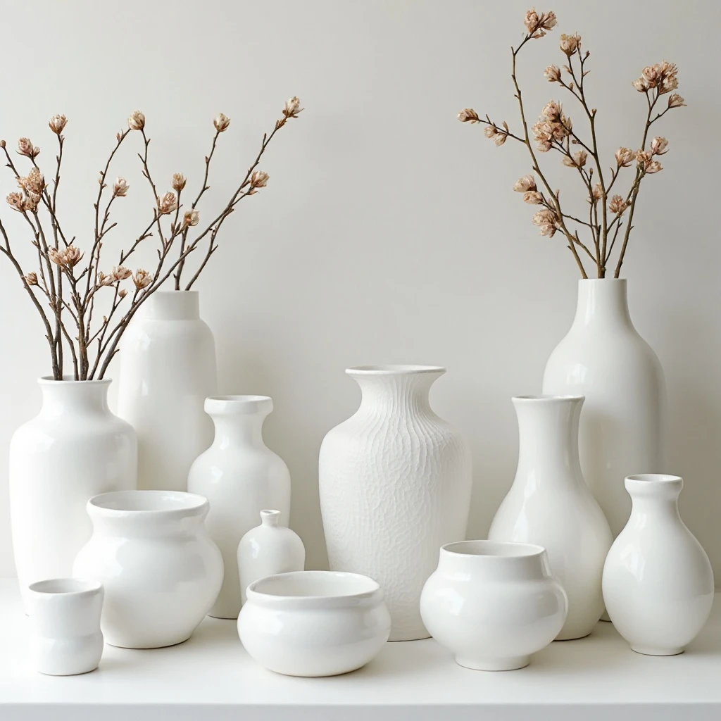
A monochromatic display of white ceramics—mixing vases, bowls, pitchers, and decorative pieces—creates a gallery-like effect that feels sophisticated and intentional. The varied shapes and surface treatments keep the all-white palette interesting. Shop on Amazon
Why It Works: The color restriction creates cohesion and calm while allowing you to mix different styles, periods, and provenances freely. White reflects light and makes the kitchen feel more spacious and airy. This approach lets the forms and textures shine without competing colors, and it’s incredibly forgiving—nearly any white piece will work within the collection.
How to Style It:
- Mix matte, glossy, and textured finishes to create depth within the white palette
- Vary heights dramatically—from 4-inch bowls to 14-inch vases—for dynamic composition
- Group similar forms together (all bowls, all vases) then separate groupings with negative space
- Include pieces with interesting details like rope handles, ribbed surfaces, or scalloped edges
Where to Use It: Modern kitchens, Scandinavian designs, coastal spaces, minimalist homes
Pro Tip: Embrace mismatched shades of white—pure white, cream, ivory, and even pale gray all work together and create more interest than perfectly matched pieces.
9. Vintage Glassware and Bottles
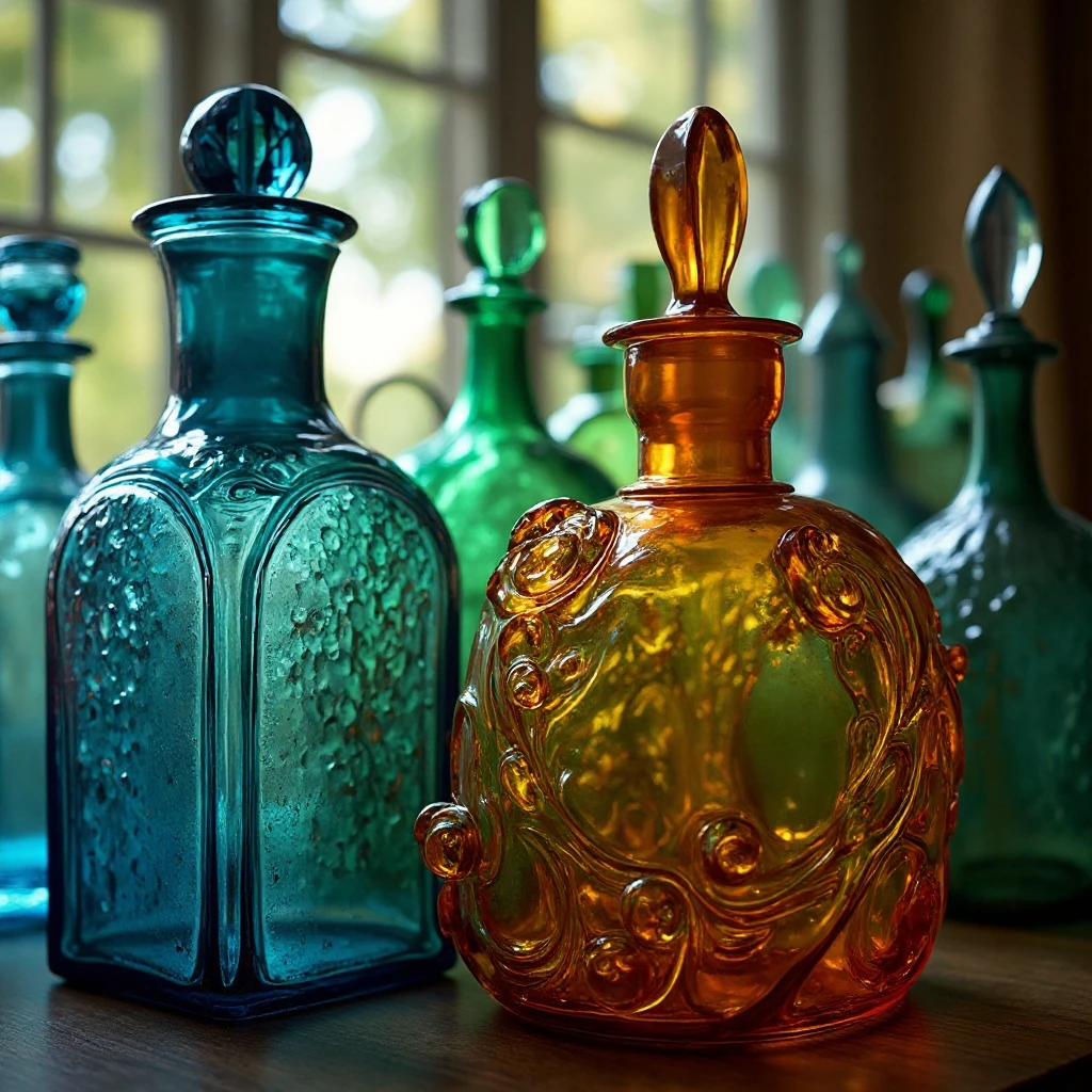
Colored glass bottles, vintage apothecary jars, and antique glassware in blues, greens, and ambers catch and filter light beautifully, creating a jewel-like effect. The transparency keeps the display from feeling heavy. Shop on Amazon
Why It Works: Colored glass adds personality and warmth without solid visual weight, and the way light plays through the pieces changes throughout the day, creating living art. The vintage quality brings character and history, while the transparency ensures the space doesn’t feel cluttered. This is particularly magical in kitchens with windows where natural light can illuminate the collection.
How to Style It:
- Group bottles by color family rather than mixing randomly—create “zones” of blues, greens, or ambers
- Vary bottle heights from 6-16 inches and mix slim cylinder shapes with curvy vessels
- Position taller pieces toward the back and shorter ones in front for depth and visibility
- Leave some bottles empty and fill others with single stems or small dried arrangements
Where to Use It: Cottage kitchens, vintage-inspired spaces, apothecary-style designs, eclectic homes
Pro Tip: Hit estate sales and antique shops rather than buying reproduction pieces—authentic vintage glass has better color saturation and interesting imperfections that catch light more beautifully, usually for $5-15 per piece.
10. Industrial Metal Containers and Tins
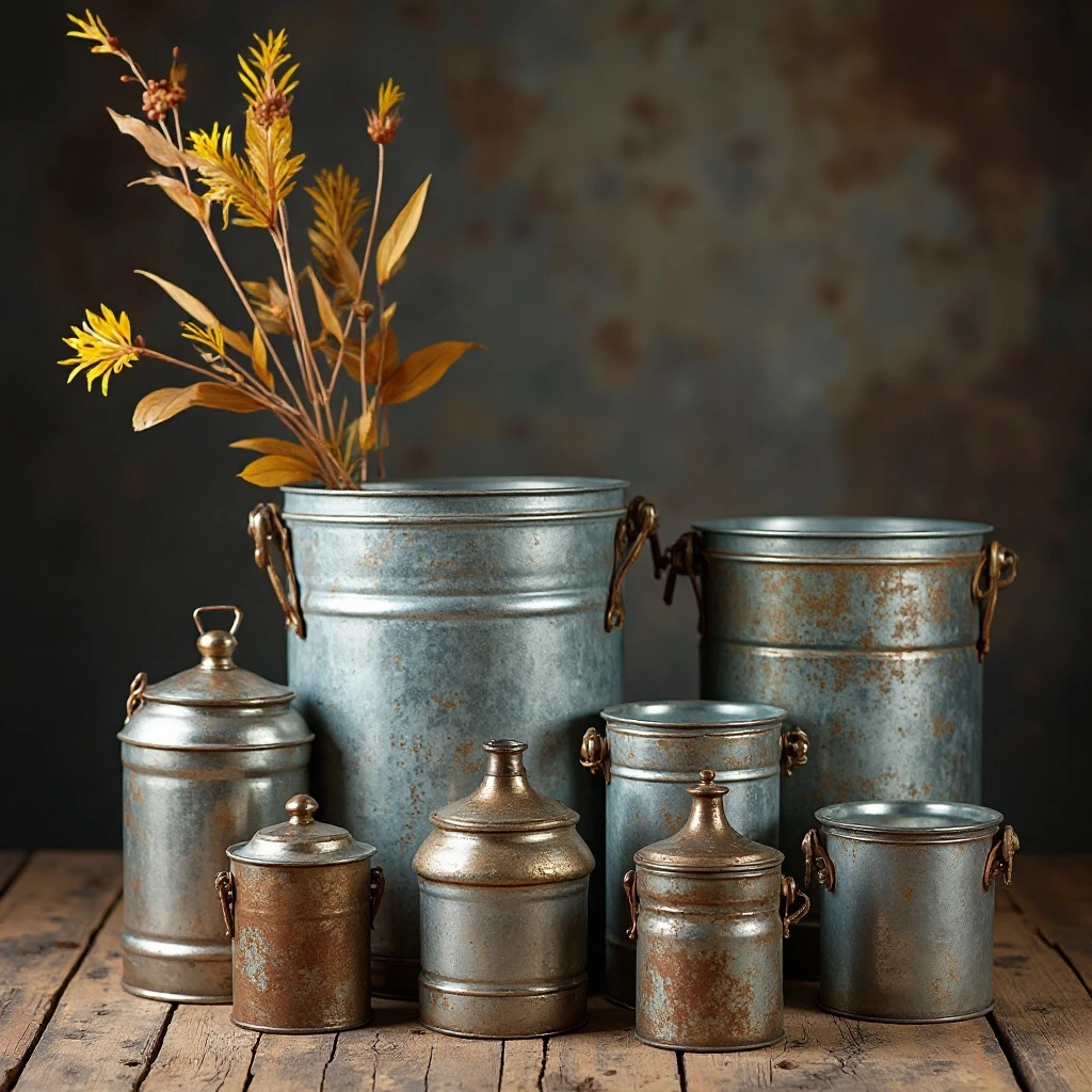
Galvanized metal buckets, vintage advertising tins, enamelware, and metal canisters bring industrial edge and authentic vintage appeal. The metallic finishes add shine and reflect light while grounding the space. Shop on Amazon
Why It Works: Metal elements introduce cool tones that balance warm wood and ceramic pieces, and their durability is perfect for kitchen environments. The patina and aging on vintage pieces adds character without requiring maintenance. These pieces feel genuinely functional rather than purely decorative, which is ideal for kitchen spaces.
How to Style It:
- Mix finishes—combine galvanized zinc, weathered tin, and glossy enamelware for variety
- Vary shapes between cylindrical, rectangular, and tapered forms
- Fill some containers with dried wheat, lavender bundles, or wooden spoons for height
- Space metal pieces 8-12 inches apart to prevent the display from feeling too industrial
Where to Use It: Industrial kitchens, modern farmhouse designs, loft spaces, rustic contemporary homes
Pro Tip: Look for vintage pieces with original graphics and advertising—they’re conversation starters and add authentic personality for the same price as plain containers.
11. Seasonal Styling Rotation
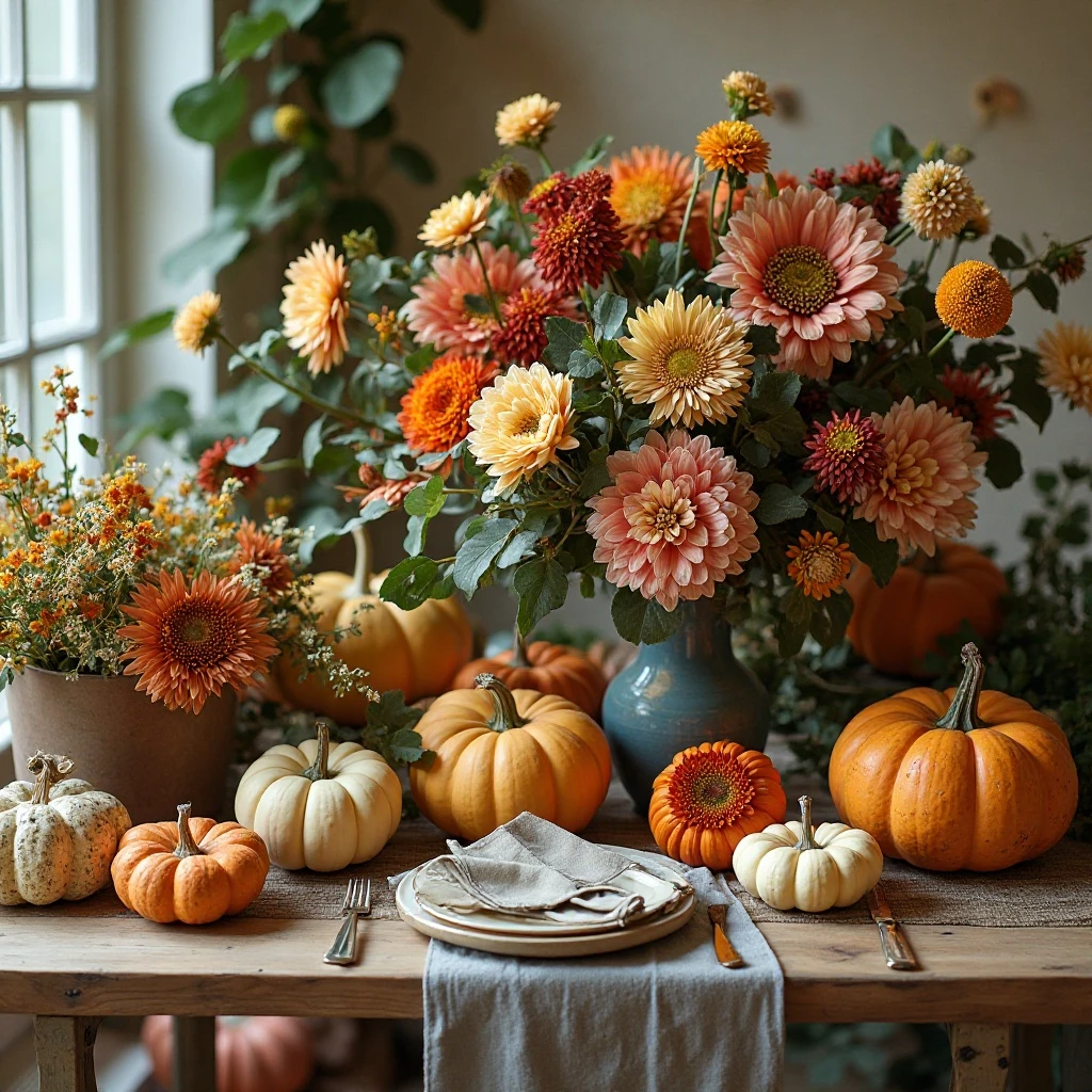
A curated selection of seasonal elements that change quarterly keeps the space feeling fresh and connected to the rhythms of the year. This might include fall pumpkins, winter evergreen, spring florals, and summer coastal elements. Shop on Amazon
Why It Works: Rotating decor prevents visual fatigue and gives you permission to change things up without committing to a permanent look. It’s an opportunity to express creativity and celebrate the seasons, making your kitchen feel current and thoughtfully maintained. This approach works with any base style—simply swap accent pieces while keeping foundational elements constant.
How to Style It:
- Maintain 60-70% permanent “anchor” pieces (baskets, pottery, etc.) and swap only 30-40% seasonally
- Store seasonal items in labeled bins for easy rotation four times per year
- Choose subtle seasonal nods rather than overly themed decorations for sophistication
- Transition gradually—swap one section at a time over 2-3 weeks rather than all at once
Where to Use It: All kitchen styles, family homes, spaces where entertaining happens regularly
Pro Tip: Shop post-season clearances and thrift stores to build a seasonal collection affordably—aim to spend under $30 per season for accent pieces you’ll use year after year.
12. Copper and Brass Accents
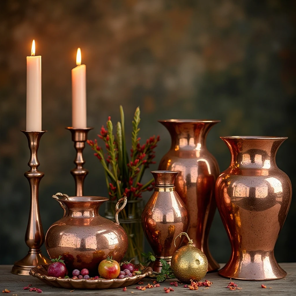
Polished or patinated copper pots, brass candlesticks, bronze vessels, and metallic containers create warmth and luxury while catching and reflecting light. The warm metal tones add richness and elegance. Shop on Amazon
Why It Works: Copper and brass bring immediate warmth and sophistication that elevates any kitchen style from traditional to contemporary. These metals develop beautiful patina over time, actually improving with age rather than looking worn. The reflective surfaces bounce light around the space, making it feel brighter and more dynamic.
How to Style It:
- Mix finishes—combine polished pieces with naturally aged patina for depth and interest
- Vary scales from small 4-inch measures to substantial 12-inch pots
- Group metal pieces in odd numbers and separate groupings with non-metallic elements
- Angle some pieces at 45 degrees and stand others straight for dimensional interest
Where to Use It: Traditional kitchens, French country spaces, transitional designs, luxury homes
Pro Tip: Embrace the patina—don’t polish pieces above cabinets. The aged finish requires zero maintenance and looks more authentic and collected than bright, shiny copper that needs constant polishing.
13. Farmhouse Signs and Typography
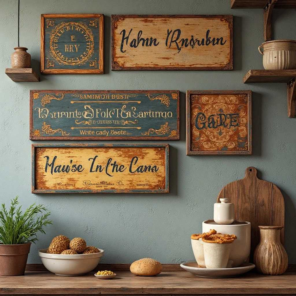
Vintage-inspired wooden signs with meaningful words, antique advertising plaques, or typography art bring personality and can reinforce your kitchen’s theme. The words add an intimate, personal touch. Shop on Amazon
Why It Works: Typography adds a personal message to the space and can set the tone—whether welcoming, humorous, or inspirational. Signs break up three-dimensional objects with flat surfaces, creating visual variety. They’re also an easy way to incorporate your favorite quotes or family mottos in a space where you spend significant time.
How to Style It:
- Limit to 1-2 signs maximum to avoid a cluttered, over-themed look
- Choose signs 24-36 inches wide to have proper presence above cabinets
- Lean signs casually at angles rather than hanging them flat for a more relaxed feel
- Surround signs with simpler, neutral elements like crocks or greenery to let the words stand out
Where to Use It: Farmhouse kitchens, family homes, casual dining spaces, country cottages
Pro Tip: Create custom signs using reclaimed wood and letter stencils for a fraction of the cost of store-bought options—the DIY imperfection actually looks more authentic than perfectly printed alternatives.
14. Woven Tray and Platter Display
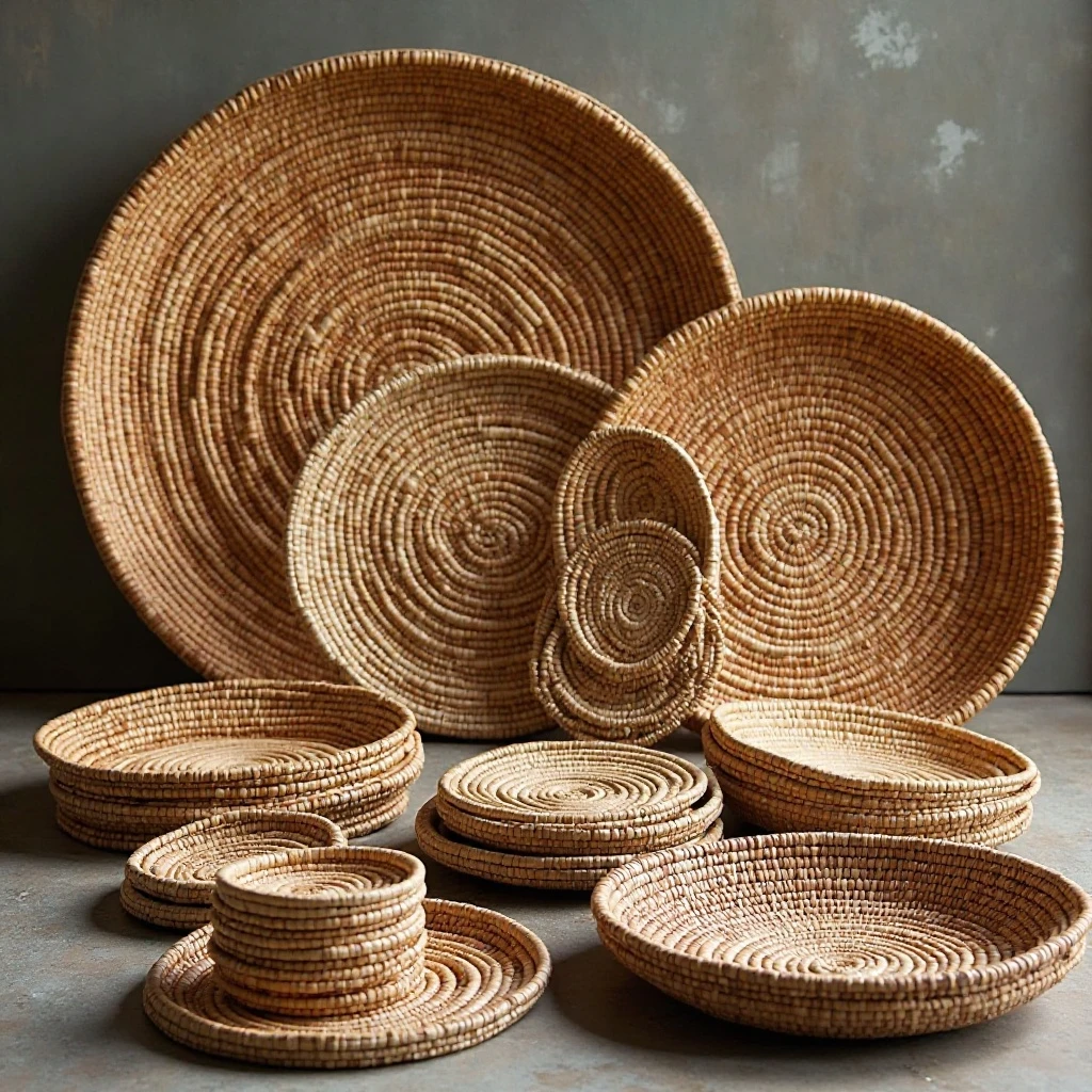
Large round, rectangular, and oval woven trays in various weaves and natural materials create texture and dimension. Stood on edge or layered, they make a graphic statement. Shop on Amazon
Why It Works: Woven trays add substantial visual impact without actual weight, and their neutral tones work with any color scheme. The variety of weave patterns—from tight to loose, herringbone to circular—creates incredible texture that’s visible from below. They’re also affordable and easy to find, making this an accessible decorating approach.
How to Style It:
- Stand large 18-24 inch trays vertically, leaning at 75-80 degree angles
- Alternate weave directions—horizontal, vertical, and diagonal—for pattern interest
- Layer smaller 12-inch trays in front of larger ones for depth
- Group 3-5 trays together, then leave 12 inches of space before the next grouping
Where to Use It: Coastal kitchens, bohemian spaces, organic modern designs, casual dining areas
Pro Tip: Rub woven trays with paste wax twice a year to seal them against kitchen grease and humidity while maintaining their natural appearance—this 5-minute task extends their life indefinitely.
15. Vintage Crate and Box Collection
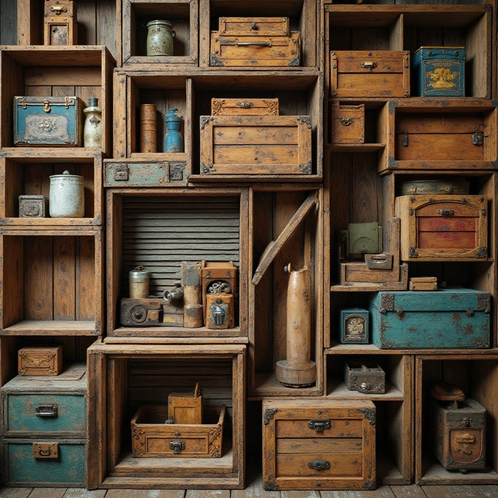
Wooden crates, vintage soda boxes, antique toolboxes, and rustic containers add authentic aged character and create interesting rectangular forms among curves. The weathered wood brings warmth and history. Shop on Amazon
Why It Works: Wooden crates and boxes feel genuinely vintage and functional, not decorator-y. Their rectangular shapes provide structure and architectural interest that contrasts nicely with round bowls and curved vessels. The labels, stamps, and wear marks tell stories and give each piece unique character.
How to Style It:
- Mix crate orientations—some on their sides showing interiors, others standing upright
- Fill some crates with vintage mason jars, rolling pins, or vintage kitchen tools for layered interest
- Vary wood tones from light pine to dark walnut to create depth
- Position crates at slight angles rather than perfectly square for a casual, collected look
Where to Use It: Industrial farmhouse kitchens, rustic spaces, vintage-inspired designs, cottage kitchens
Pro Tip: Look for crates with original graphics and company names—Coca-Cola, local dairies, or regional brands add authentic regional character and are conversation starters, usually selling for $15-40 at flea markets.
16. Minimalist Sculptural Objects
A few carefully chosen modern sculptures, abstract vessels, or art objects in neutral tones create a gallery-like feel. The clean lines and simple forms make a sophisticated statement. Shop on Amazon
Why It Works: Minimalist objects prove that above-cabinet decor doesn’t have to be rustic or traditional—it can be sleek and contemporary. The sculptural quality adds artistry while the restraint keeps the focus on form rather than clutter. This approach works especially well in modern kitchens where rustic elements would feel out of place.
How to Style It:
- Limit to 3-5 statement pieces total across all upper cabinets for maximum impact
- Choose pieces 10-16 inches tall in organic shapes—spheres, cylinders, abstract forms
- Leave 24-36 inches of empty space between objects to let each piece breathe
- Stick to a tight color palette—all white, black and white, or natural wood tones
Where to Use It: Modern kitchens, contemporary spaces, minimalist homes, urban lofts
Pro Tip: Visit HomeGoods, TJ Maxx, or West Elm outlet for sculptural vessels at 50-70% off retail—you can build a stunning minimalist collection for under $100.
17. Vintage Kitchen Tool Display
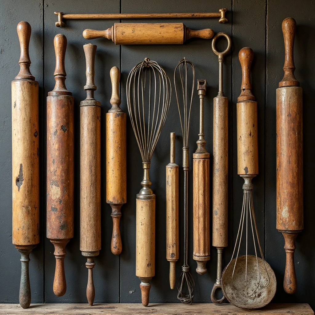
Antique rolling pins, mashers, whisks, and other kitchen implements arranged as art celebrate culinary history and add authentic functionality-meets-decoration. The worn wood and aged metal have beautiful patina. Shop on Amazon
Why It Works: Displaying vintage tools reinforces that this is a working kitchen with appreciation for culinary craft. The tools tell stories of home cooking across generations, and their worn handles and aged materials can’t be replicated with new items. This approach feels especially authentic because these items genuinely belong in a kitchen rather than being generic decor.
How to Style It:
- Stand rolling pins vertically in groupings of 3-5, varying handle styles and lengths
- Hang some tools from small hooks attached to cabinet edges for dimensional variety
- Mix wood tones from light maple to dark walnut for visual richness
- Pair tools with functional containers like crocks filled with wooden spoons
Where to Use It: Vintage kitchens, farmhouse designs, country cottages, baker’s kitchens
Pro Tip: Estate sales are goldmines for vintage kitchen tools—arrive early and expect to pay $3-8 per piece for authentic, usable antiques with beautiful patina.
18. Natural Elements and Organic Materials
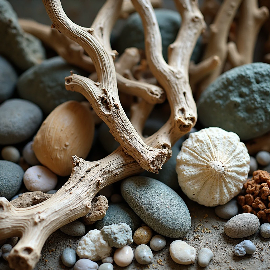
Driftwood, branches, stones, shells, and other natural found objects bring the outdoors in and create organic, sculptural interest. The irregular shapes and earth tones are grounding. Shop on Amazon
Why It Works: Natural elements add unexpected texture and remind us of the connection between food and nature. Their irregular, imperfect forms provide relief from the straight lines and manufactured materials dominating most kitchens. They’re also free or nearly free, making this approach incredibly budget-friendly while looking thoughtfully curated.
How to Style It:
- Choose substantial pieces—driftwood 18-24 inches long, coral 8-12 inches tall
- Balance organic shapes with structured containers like ceramic bowls or glass vessels
- Group similar elements together—all driftwood in one area, shells in another
- Replace or rotate pieces seasonally based on beach walks, hikes, or nature finds
Where to Use It: Coastal kitchens, nature-inspired spaces, organic modern designs, lake houses
Pro Tip: Bake natural materials at 200°F for 30 minutes before displaying to eliminate any insects or organisms—this simple step ensures your collected treasures stay pristine indefinitely.
19. Textile and Fabric Elements
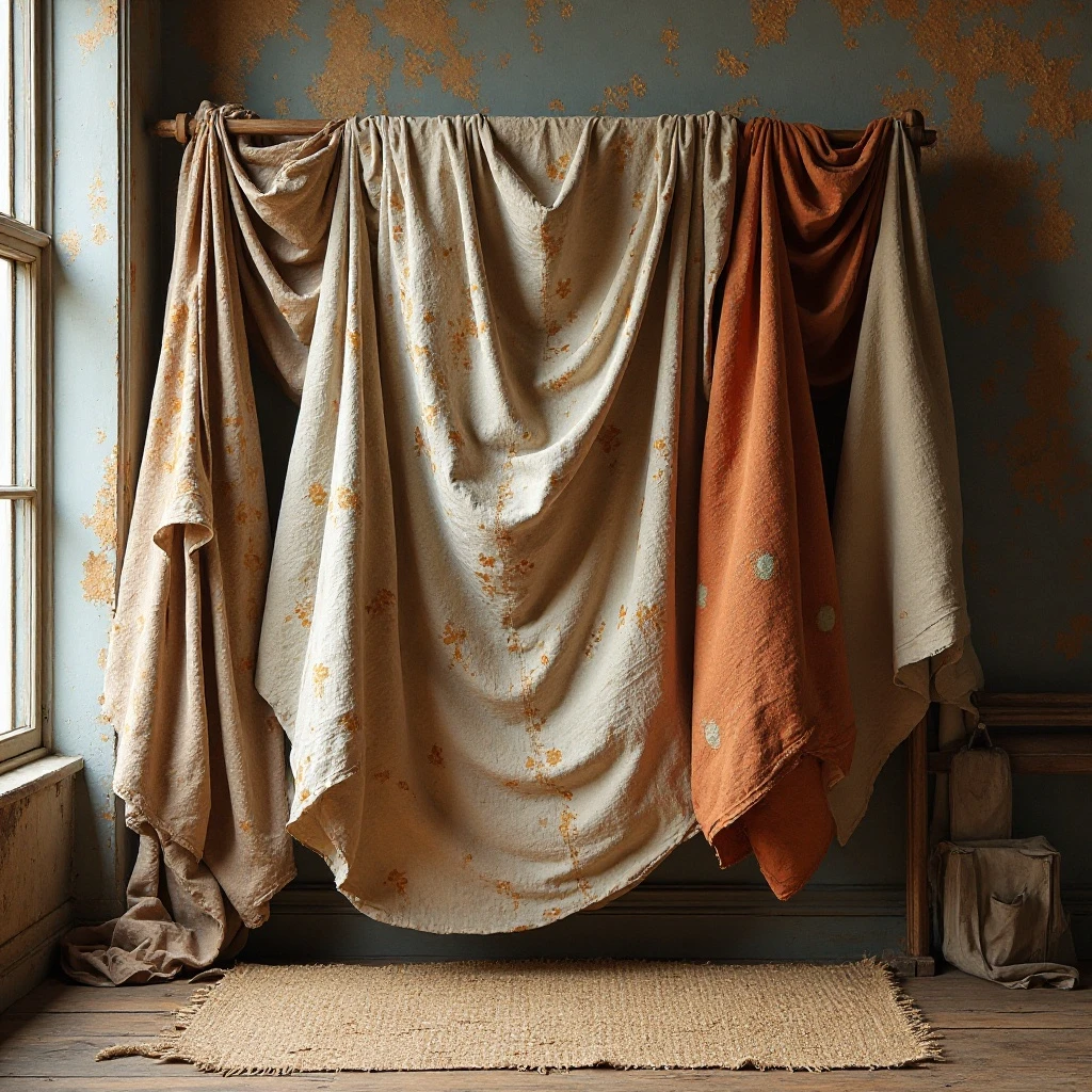
Vintage grain sacks, antique quilts draped over dowels, or textiles in muted tones add unexpected softness and texture. The fabric elements create warmth and visual contrast against hard surfaces. Shop on Amazon
Why It Works: Textiles introduce softness and movement that’s rare in kitchens dominated by hard materials like wood, stone, and metal. The draping quality adds romance and a collected, casual quality that feels welcoming. Vintage textiles especially bring history and one-of-a-kind character through their faded patterns and natural wear.
How to Style It:
- Drape textiles casually over the cabinet edge, allowing 8-12 inches to hang down
- Layer 2-3 textiles with complementary patterns or tones rather than displaying just one
- Anchor textile groupings with heavier objects like crocks or vases at the ends
- Choose faded, neutral tones—grays, creams, soft blues—that won’t compete with other elements
Where to Use It: French country kitchens, cottage designs, shabby chic spaces, romantic interiors
Pro Tip: Spray fabric with Scotchgard or fabric protector before displaying in the kitchen—this creates a barrier against grease and moisture while maintaining the textile’s natural drape and appearance.
20. Empty Space as Design Element
Intentionally leaving sections of cabinet tops empty creates breathing room and makes adjacent decorated areas feel more curated and intentional. The negative space is just as important as filled areas. Shop on Amazon
Why It Works: Empty space prevents visual overwhelm and gives the eye places to rest. It makes what you do display feel more important and thoughtfully chosen rather than cluttered. This approach is particularly effective in smaller kitchens where too much decor can make the space feel cramped and busy.
How to Style It:
- Follow the 60/40 rule—fill 60% of available space and leave 40% empty
- Group decorated sections in 3-4 foot clusters with 2-3 feet of empty space between
- Leave cabinets above the refrigerator or in corner areas completely bare
- Use empty space strategically to highlight your favorite or most impactful pieces
Where to Use It: Small kitchens, modern designs, minimalist spaces, contemporary homes
Pro Tip: If you’re worried empty space looks unfinished, paint the wall behind cabinets an accent color—this makes the bare sections feel intentional and designed rather than forgotten.
21. Color-Coordinated Collections
Grouping decor by color—all blue and white, all earth tones, or all metallics—creates visual cohesion and impact. The color restriction unifies disparate objects and styles. Shop on Amazon
Why It Works: Color coordination makes even random thrift store finds look curated and intentional. It creates a bold visual statement that’s visible from across the room while allowing you to mix styles, materials, and forms freely within the chosen palette. This approach is particularly effective for making affordable, mismatched pieces look expensive and collected.
How to Style It:
- Choose 2-3 colors maximum and stick to those shades exclusively
- Vary the intensity—mix deep navy with pale blue, rich terracotta with cream
- Include different materials in your color palette—wood, ceramic, metal, glass—for texture
- Create “zones” of color across cabinets rather than mixing colors evenly throughout
Where to Use It: Eclectic kitchens, colorful spaces, bohemian designs, artistic homes
Pro Tip: Keep a paint chip of your chosen colors in your wallet when thrifting—this ensures every piece you bring home works with your collection, preventing expensive mistakes.
22. Antique Scale and Kitchenware Display
Vintage kitchen scales, meat grinders, coffee mills, and other antique appliances serve as sculptural focal points while celebrating culinary history. The mechanical details are fascinating up close. Shop on Amazon
Why It Works: Antique kitchenware combines form and function in beautiful ways, with attention to detail and craftsmanship that modern appliances lack. These pieces are genuinely interesting to look at with their mechanical components, brass fittings, and aged finishes. They anchor a space with weight and substance while telling the story of home cooking across generations.
How to Style It:
- Position your largest or most impressive piece (like a scale) as a centerpiece with simpler items flanking it
- Group smaller tools around anchor pieces—measuring cups near scales, graters near mills
- Mix enamelware, cast iron, and brass pieces for material variety
- Angle pieces slightly to showcase their most interesting sides and mechanical details
Where to Use It: Vintage kitchens, industrial spaces, chef-inspired designs, historic homes
Pro Tip: Test mechanical elements before buying—scales that balance and mills that turn are worth more and make better display pieces than broken equivalents, even though you won’t be using them functionally.
Common Mistakes to Avoid
1. Using Items That Are Too Small
The biggest mistake people make is using decor that’s too petite for the scale of the space. Items that look substantial on a shelf appear insignificant from 8-10 feet below when placed above cabinets. Opt for pieces at least 8 inches tall, with focal pieces 12-16 inches. When in doubt, go bigger—you can always balance large items with smaller accent pieces, but tiny objects alone create visual clutter without impact.
2. Creating Visual Clutter
Overcrowding the space with too many small items makes the kitchen feel chaotic and busy rather than curated and intentional. Follow the 60/40 rule: fill only 60% of available space and leave 40% empty for breathing room. Group items in clusters with deliberate empty space between groupings, and remove pieces until it feels slightly sparse rather than packed—you’ll know you’ve achieved balance when you can identify individual items from below.
3. Ignoring Grease and Dust Buildup
Kitchen environments are harsh on decor, and ignoring maintenance leads to grimy, dusty displays that detract from your design. Clean above-cabinet items every 2-3 months with a microfiber cloth or dust with a long-handled duster monthly. For items above the range, use a degreasing spray quarterly. Choose materials wisely: sealed wood, glazed ceramics, and treated baskets resist grime better than porous, unsealed materials.
4. Mixing Too Many Styles
While eclectic can work, combining farmhouse baskets with modern sculptures, industrial metal, and beach cottage elements creates visual confusion rather than collected charm. Choose 2-3 complementary styles maximum and stick with them throughout the space. Your decor above cabinets should enhance and reflect your kitchen’s overall aesthetic, not fight against it or introduce competing themes.
5. Placing Heavy Items Unsafely
Positioning heavy ceramic or metal pieces too close to cabinet edges creates safety hazards and anxiety every time you walk beneath them. Keep items at least 4-6 inches back from the front edge of cabinets, and use museum putty or non-slip shelf liner underneath heavy pieces for added security. Never place anything remotely fragile or valuable above high-traffic areas where bumping the cabinets could cause items to fall.
6. Forgetting About Lighting
Not considering how (or if) light reaches above your cabinets means displays can disappear into shadows, especially with dark-colored items. If your kitchen has recessed lighting or pendant lights, position reflective items (glass, metal, white ceramics) where light will hit them. In darker kitchens, focus on light-colored pieces that show up against shadows, or consider adding LED strip lights above cabinets to illuminate your display and make it a nighttime focal point.
Frequently Asked Questions
How much space should I leave between items above kitchen cabinets?
Leave 6-12 inches of space between individual items or groupings to prevent a cluttered appearance and allow each piece to be appreciated individually. For larger statement pieces like oversized platters or architectural salvage, increase spacing to 12-18 inches. The key is achieving balance: items should feel connected and intentional but not crowded. Use the “squint test”—step back and squint at your display; if everything blurs together into visual chaos, you need more breathing room between pieces.
What’s the best way to clean decor above kitchen cabinets?
Remove all items every 2-3 months and wipe both them and the cabinet tops with a degreasing cleaner mixed with warm water, then dry thoroughly before returning items. For monthly maintenance without removing everything, use a long-handled microfiber duster or a vacuum with a soft brush attachment to remove surface dust.
Items above or near the range require more frequent attention—spray them quarterly with degreasing solution and wipe with a damp cloth. Treat porous materials like baskets or untreated wood with a clear sealant to make them easier to clean and more resistant to grease buildup.
Should above-cabinet decor match my kitchen’s color scheme exactly?
Your decor should complement rather than exactly match your kitchen colors. Neutral elements (white, cream, natural wood, metallics) work with any palette and provide flexibility as your style evolves. Introduce color through 1-2 accent pieces that pull tones from your backsplash, counters, or walls rather than trying to match paint colors precisely. This approach feels collected and curated rather than overly coordinated. If your kitchen has bold colors, neutral decor provides visual relief; if your kitchen is neutral, this is your opportunity to introduce personality through color above.
How do I decorate above cabinets in a small kitchen without making it feel cramped?
In small kitchens, less is definitely more. Limit your display to 3-5 substantial pieces in light colors—white ceramics, light wood, or glass—that won’t visually weigh down the space. Leave entire sections of cabinets bare to create breathing room and make the ceiling feel higher. Avoid dark colors, busy patterns, or crowded groupings that can make the space feel closed in. Consider using only vertical elements like tall vases or standing trays rather than spreading items horizontally across all available space, which can emphasize the kitchen’s small size.
What’s the ideal height for items above kitchen cabinets?
Items should be 8-16 inches tall for standard 8-foot ceilings, with your tallest pieces (14-16 inches) used sparingly as focal points and most items in the 10-12 inch range. For 9-foot ceilings, you can use items up to 18-20 inches tall. The goal is for items to have presence without appearing crammed against the ceiling, which looks uncomfortable.
As a rule, leave at least 6-8 inches of empty space between the top of your tallest items and the ceiling—this breathing room is essential for the display to feel intentional rather than desperate to fill space.
Can I use real plants above kitchen cabinets?
While tempting, real plants above cabinets are challenging to maintain properly due to difficult access for watering, poor light conditions (unless you have skylights), and drainage issues. Instead, opt for high-quality faux plants or preserved botanicals that look realistic but require only occasional dusting.
If you’re determined to use live plants, choose extremely drought-tolerant varieties like pothos or snake plants, use self-watering planters, and keep a step stool handy for weekly checks. Alternatively, use fresh-cut branches or stems that you can replace monthly rather than committing to keeping plants alive in a less-than-ideal location.
Final Thoughts: Making Your Kitchen Uniquely Yours
The space above your kitchen cabinet is an opportunity to express your personal style without committing to permanent changes like paint or tile. Start with what you already own—that collection of vintage finds, beautiful serving pieces, or natural elements you’ve gathered—and build from there. Your display should evolve over time as you discover new pieces and your style develops, so don’t feel pressured to achieve perfection immediately.
Beyond aesthetics, above-cabinet decor impacts how you feel in your kitchen every day. A thoughtfully styled space creates visual interest that makes cooking and gathering more enjoyable, while transforming what could be dead space into an element of your kitchen that brings you genuine pleasure. Whether you choose rustic baskets, elegant white ceramics, or vintage treasures, your selections tell your story and make your kitchen feel more like home.
Trust your instincts and don’t be afraid to experiment with different arrangements, heights, and groupings until something feels right. Step back frequently to view your work from kitchen height rather than ladder height—this perspective is what you and your guests will experience daily. Remember that editing is just as important as adding, and sometimes removing one piece makes the entire display more beautiful.
Your Next Step: Right now, stand in your kitchen and take three photos of your cabinet tops from different angles. Use these to sketch out a rough plan of what might go where, measuring your available space so you know what sizes to look for as you shop or shop your home.
Remember: The most beautiful kitchens are those that feel collected over time rather than decorated all at once. Give yourself permission to build your display gradually, swapping pieces in and out as you discover what truly speaks to you. Your above-cabinet space should spark joy every time you look up—if it doesn’t, keep refining until it does.