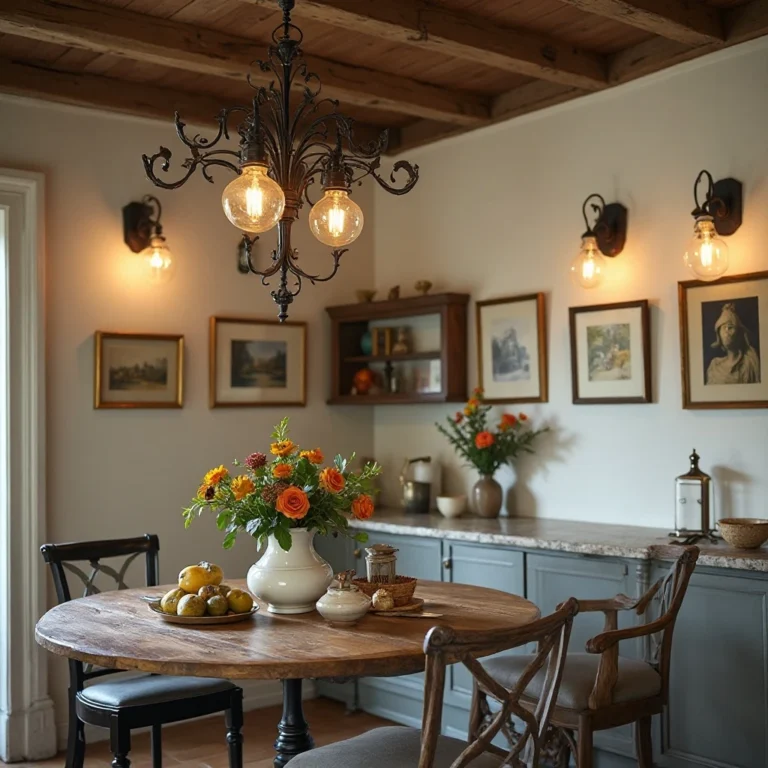
15+ Kitchen Tile Ideas You’ll Want to Copy
Your kitchen tiles do more than protect your walls and floors—they set the entire mood of your space. Whether you’re dreaming of a cozy farmhouse vibe, a sleek modern aesthetic, or a bold statement that makes guests say “wow,” the right tile choice can completely transform your kitchen from ordinary to extraordinary.
This guide will walk you through inspiring ideas that work for every budget, style preference, and skill level.
I may earn a small commission from affiliate links in this post if you make a purchase, at no extra cost to you.
1. Classic White Subway Tile with Dark Grout
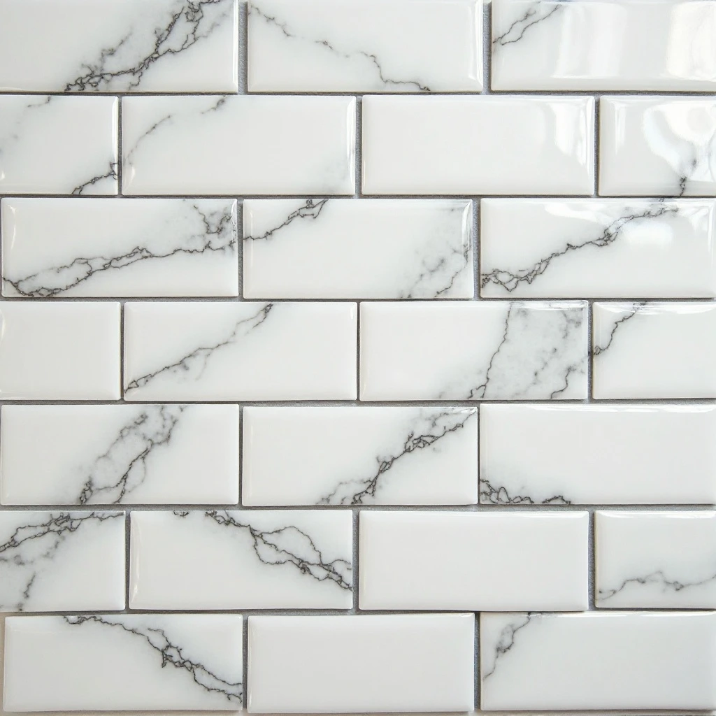
A timeless grid of rectangular white subway tiles arranged in a traditional brick pattern, punctuated by charcoal or black grout lines that create dramatic definition and visual interest against the crisp white surface. Shop on Amazon
Why It Works: This combination offers the best of both worlds—the clean, bright foundation of white tile that makes spaces feel larger and more open, paired with dark grout that adds character and hides everyday stains. It’s a design choice that feels both classic and contemporary, working seamlessly across decades of changing trends while providing a sophisticated backdrop that lets your cabinetry and decor shine.
How to Style It:
- Install tiles in a 3×6-inch size with 1/8-inch grout lines for the most authentic subway tile proportions
- Use charcoal, navy, or true black grout to create maximum contrast—avoid gray tones that can look dingy over time
- Extend the tile pattern 18-24 inches above countertops for a standard backsplash, or go full-height to the ceiling for a dramatic European-inspired look
- Seal grout lines every 12-18 months with a quality penetrating sealer to maintain the crisp contrast
Where to Use It: Kitchen backsplashes, full wall installations behind ranges, bathroom walls, mudroom wainscoting
Pro Tip: Apply your dark grout slightly recessed from the tile surface using a grout float at a 45-degree angle, then clean immediately with a damp sponge—this technique ensures the white tile stays pristine while the grout lines remain deeply pigmented and dramatic.
2. Moroccan Zellige Tiles in Jewel Tones
Hand-cut, glossy ceramic tiles in rich emerald greens, sapphire blues, or terracotta oranges, featuring the characteristic irregular edges and luminous glazed finish that catches and reflects light with an almost liquid quality. Shop on Amazon
Why It Works: Zellige tiles bring an artisanal, handcrafted element to your kitchen that machine-made tiles simply cannot replicate. The slight variations in size, the undulating surface, and the depth of color created by traditional glazing techniques add soul and warmth to modern kitchens. These tiles transform a functional backsplash into a work of art that becomes the focal point of your entire space.
How to Style It:
- Choose 2×6-inch or 3×3-inch formats for easier installation and authentic Moroccan proportions
- Pair jewel-toned tiles with brass or aged gold hardware and fixtures to enhance the luxurious, global aesthetic
- Use ivory or cream grout to soften the look and highlight each tile’s individual character rather than creating harsh grid lines
- Install under-cabinet lighting to maximize the reflective quality and bring out the depth in the glazed finish
Where to Use It: Kitchen backsplashes, accent walls, bathroom feature walls, fireplace surrounds
Pro Tip: Embrace the imperfections—the irregular edges and slight color variations are the signature of authentic zellige craftsmanship. Ask your installer to leave slightly varied grout lines (between 1/16 and 1/8 inch) rather than perfectly uniform spacing to honor the handmade nature of these tiles.
3. Large Format Marble-Look Porcelain Slabs
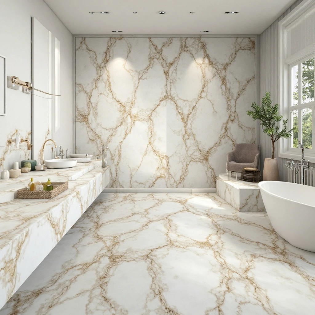
Expansive porcelain tiles measuring 24×48 inches or larger, featuring realistic marble veining in classic Carrara white, dramatic Calacatta gold, or sophisticated gray tones, with minimal grout lines creating a nearly seamless appearance. Shop on Amazon
Why It Works: This approach delivers the luxury aesthetic of natural marble without the maintenance headaches, cost, or susceptibility to staining and etching. Large format tiles create fewer grout lines, which means easier cleaning and a more streamlined, high-end appearance. The continuous veining pattern creates visual flow that makes kitchens feel more spacious and sophisticated.
How to Style It:
- Install slabs vertically on backsplashes with book-matched patterns for a show-stopping mirror effect that highlights the natural veining
- Use rectified (perfectly straight) edges with 1/16-inch grout lines in a matching color to create an almost groutless appearance
- Extend the same tile from backsplash to countertop for a waterfall effect, or use complementary veining patterns for coordinated but not matchy-matchy design
- Choose matte or honed finishes for floors to prevent slipping, and polished finishes for walls to maximize light reflection
Where to Use It: Kitchen backsplashes and floors, bathroom walls and floors, accent walls in living spaces, fireplace surrounds
Pro Tip: When selecting marble-look porcelain, photograph the tiles in your actual kitchen lighting before installation—veining that looks subtle in the showroom can read as busy under bright task lighting, while dramatic veining might disappear in low-light spaces. Test before you commit to ensure the pattern intensity matches your vision.
4. Hexagon Tiles in Matte Black
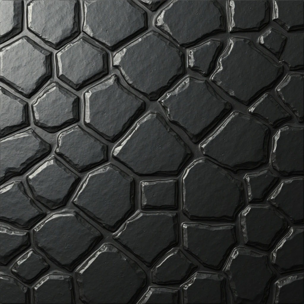
Six-sided geometric tiles in a sophisticated matte black finish, arranged in a honeycomb pattern that creates dimension through shadow play and angular lines, offering a bold alternative to traditional rectangular tiles. Shop on Amazon
Why It Works: Hexagon tiles add architectural interest and a modern edge while the matte black finish provides dramatic contrast without the high-gloss maintenance. The geometric pattern draws the eye and creates visual intrigue, transforming a simple backsplash into a statement feature. Black tiles are incredibly forgiving with splatters and daily wear, making them as practical as they are stylish.
How to Style It:
- Use 2-inch hexagons for a delicate, detailed look or 4-6 inch hexagons for bolder, more contemporary impact
- Pair with light gray or white grout (never black grout) to define each tile’s shape and prevent the wall from looking like a flat black void
- Balance the drama with warm wood tones, brass fixtures, and open shelving to prevent the space from feeling too heavy or stark
- Install from countertop to ceiling on one accent wall rather than covering all walls to maintain visual breathing room
Where to Use It: Kitchen backsplashes, powder room floors, shower floors with slip-resistant finish, laundry room accent walls
Pro Tip: Matte black tiles show water spots and mineral deposits more readily than you’d expect. Install a water softener if you have hard water, and keep a microfiber cloth handy to buff tiles dry after cooking or washing dishes—this 30-second habit keeps your black tiles looking flawless without harsh chemical cleaners.
5. Terrazzo Tiles with Colorful Aggregate
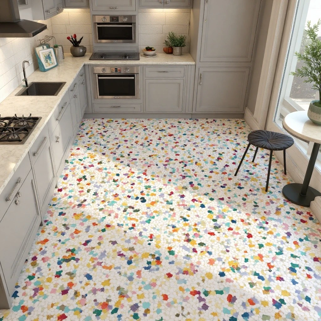
Composite tiles featuring a neutral base embedded with chips of marble, glass, or quartz in varying sizes, creating a speckled pattern in either subtle monochromatic tones or vibrant multi-color combinations that add playful energy. Shop on Amazon
Why It Works: Terrazzo is experiencing a major renaissance because it perfectly balances retro charm with contemporary sensibility. The busy, varied pattern brilliantly camouflages crumbs, splatters, and everyday wear—making it ideal for high-traffic kitchens. The mix of aggregate colors means you can pull accent colors from the tile for accessories, textiles, and decor, creating a cohesive design scheme effortlessly.
How to Style It:
- Choose large format terrazzo (12×24 inches or larger) for a modern interpretation, or classic smaller squares (8×8 or 12×12 inches) for vintage appeal
- Match grout color to the base color of the tile rather than the aggregate to create seamless flow
- Use terrazzo on floors with coordinating solid-color backsplash tiles to avoid pattern overload, or vice versa
- Select low-contrast versions (white base with cream and gray aggregate) for subtle texture, or high-contrast combinations (navy with pink and gold chips) for bold personality
Where to Use It: Kitchen floors, entryways, bathroom floors, backsplashes in powder rooms, outdoor patios
Pro Tip: Terrazzo’s durability varies significantly by manufacturing method—porcelain terrazzo-look tiles are virtually indestructible and perfect for floors, while true cement-based terrazzo offers authentic texture but requires sealing every 1-2 years. For kitchen backsplashes where stain resistance matters more than foot traffic durability, porcelain gives you the look with zero maintenance.
6. Vertical Stacked Tile Pattern
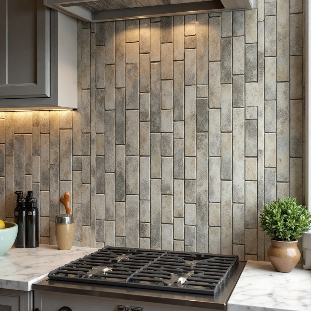
Standard rectangular tiles—whether subway, plank-style, or thin linear formats—installed vertically in straight, stacked columns rather than the traditional horizontal brick pattern, creating strong vertical lines that draw the eye upward. Shop on Amazon
Why It Works: This simple orientation change makes standard tiles feel completely fresh and contemporary. Vertical installation elongates your space, making ceilings appear higher and rooms feel more expansive. It’s a budget-friendly way to achieve a custom, designer look using readily available materials—the same affordable subway tile looks completely different when rotated 90 degrees.
How to Style It:
- Use 3×12-inch or 4×12-inch tiles for the most dramatic vertical effect—longer tiles create stronger lines
- Install with perfectly aligned vertical grout lines using a laser level to ensure precision—even slight misalignment is highly visible in this pattern
- Pair with horizontal elements like floating shelves or a horizontal wood range hood to create balanced visual interest
- Choose contrasting grout colors to emphasize the vertical lines, or tonal grout for a subtle, sophisticated effect
Where to Use It: Kitchen backsplashes, bathroom shower surrounds, accent walls behind beds, wainscoting in dining rooms
Pro Tip: Vertical stacking requires more precision during installation than traditional brick patterns because any inconsistencies in tile size or spacing become immediately obvious in those long, straight grout lines. Order 15% extra tile and hand-select the most uniform pieces for visible sections, saving slightly imperfect tiles for inside corners or areas behind appliances.
7. Glossy Colored Glass Tiles
Translucent or solid glass tiles in saturated colors—aqua blue, sage green, coral, or sunshine yellow—that create a luminous, light-catching surface with depth that ceramic tiles cannot match. Shop on Amazon
Why It Works: Glass tiles have an inherent glow and dimensional quality because light penetrates the surface rather than simply reflecting off it. This creates a backsplash that seems to radiate color and light, brightening your kitchen in ways that feel almost magical. The ultra-smooth, non-porous surface is naturally resistant to stains, bacteria, and moisture, making glass tiles incredibly hygienic and easy to maintain.
How to Style It:
- Use 3×6-inch or 4×4-inch glass tiles to balance cost (glass is pricier than ceramic) with visual impact
- Install a white modified thinset mortar specifically formulated for glass to prevent shadowing or discoloration showing through the translucent tiles
- Limit glass tile to the backsplash area rather than floors where scratching is a concern—glass is durable but can show surface scratches over time
- Pair with simple white or light gray cabinets to let the colored glass be the star, avoiding competing patterns or bold cabinet colors
Where to Use It: Kitchen backsplashes, bathroom accent walls, pool surrounds, bar backsplashes, outdoor kitchen walls
Pro Tip: Glass tile’s reflective quality means you’ll see every imperfection in the wall surface behind it. Before installation, apply an additional skim coat of thinset or a bonding primer to create a perfectly smooth substrate—any bumps, ridges, or inconsistencies will telegraph through the glass and create shadows that ruin the polished look.
8. Wood-Look Porcelain Planks
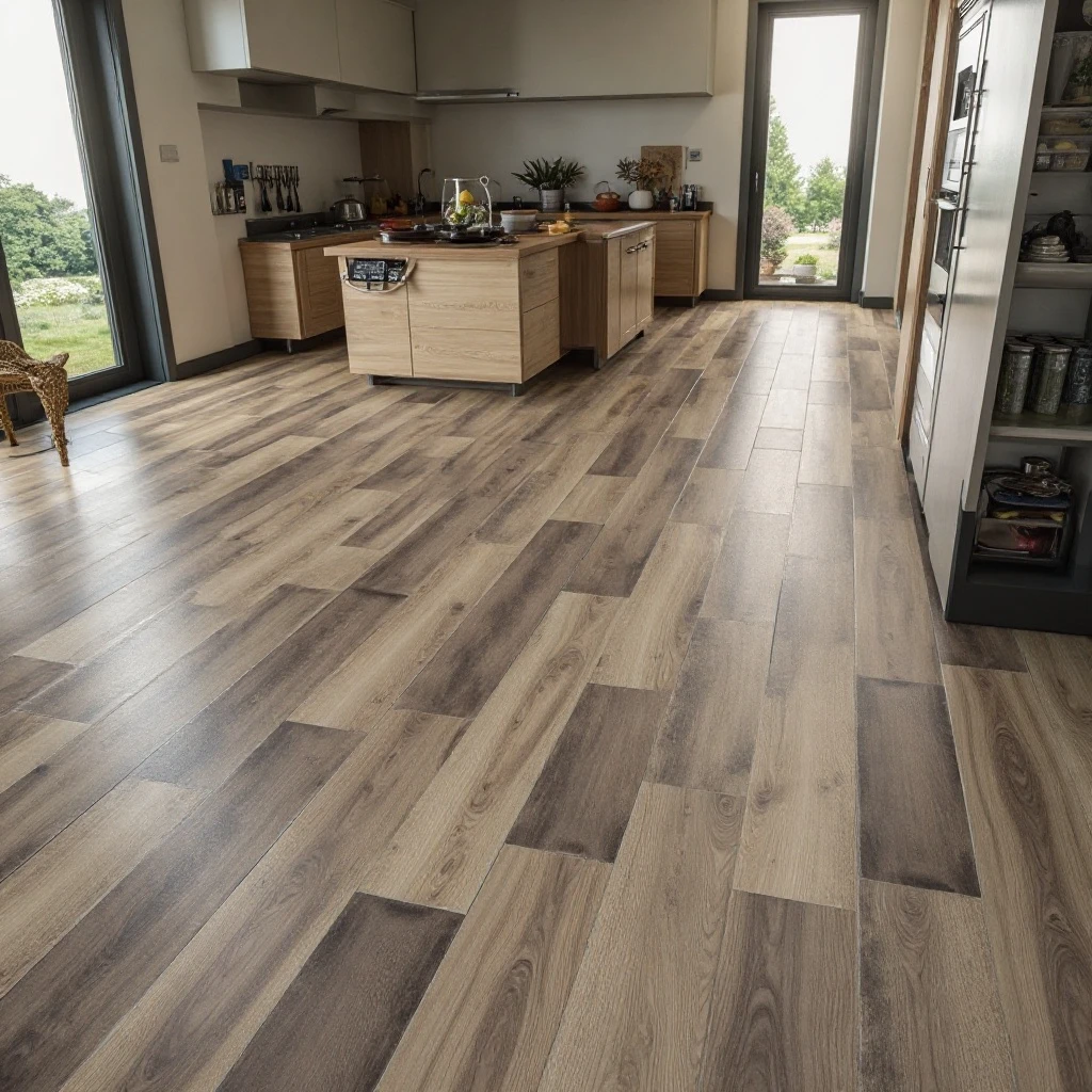
Long, rectangular porcelain tiles that convincingly mimic the grain patterns, knots, and color variations of natural hardwood in shades ranging from light oak and gray-washed driftwood to rich walnut and ebony. Shop on Amazon
Why It Works: You get the warmth, beauty, and organic feel of wood floors with the waterproof, stain-proof, scratch-resistant durability of porcelain—perfect for kitchens where spills, moisture, and dropped utensils are daily realities. Unlike real wood that requires refinishing, careful cleaning, and climate control, wood-look tile maintains its beauty for decades with minimal maintenance while standing up to everything a busy kitchen dishes out.
How to Style It:
- Choose plank sizes of 6×36 inches or 8×48 inches to mimic realistic hardwood proportions—avoid small squares that read as obviously fake
- Install in a random offset pattern (33% or random stagger) rather than aligned rows to replicate how real wood floors are laid
- Use grout that matches the tile’s primary tone to minimize grout lines visually, creating a seamless wood floor illusion
- Mix multiple boxes during installation to distribute color variations evenly throughout the room rather than clustering similar shades together
Where to Use It: Kitchen floors, bathroom floors, mudrooms, basements, covered porches, dining room floors
Pro Tip: The key to fooling the eye with wood-look tile is grout line width—real hardwood planks sit tightly together with barely visible seams, so use the smallest grout lines possible (1/16 inch for rectified edges) and choose a grout color from the same family as your tile. Wide grout lines or contrasting colors immediately reveal the tile as an imitation.
9. Mixed Material Mosaic Strips
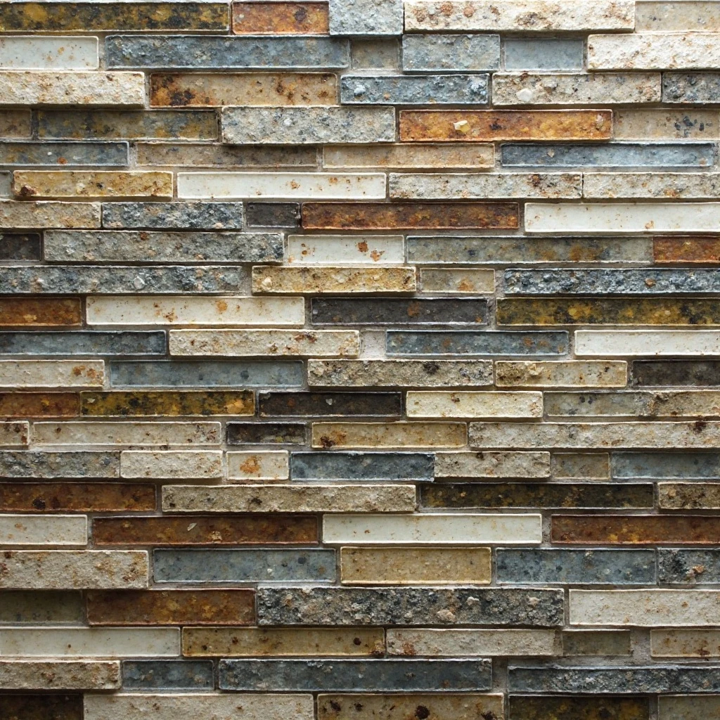
Linear strips combining different materials—glass, stone, metal, and ceramic—in coordinated colors, typically arranged in horizontal bands that create textural interest and visual complexity within a single tile sheet. Shop on Amazon
Why It Works: Mixed mosaics deliver a custom, high-end designer look while being surprisingly DIY-friendly because they come pre-mounted on mesh sheets. The combination of materials adds depth and catches light in varied ways throughout the day as natural and artificial lighting changes. This approach allows you to incorporate premium materials like glass and metal in small doses, achieving a luxe look without the full-wall premium price tag.
How to Style It:
- Install mixed mosaic as a 4-6 inch accent band at mid-backsplash height, bordered above and below by solid tiles to create a jewelry-like detail
- Choose mosaics where all materials share a cohesive color palette—metallic accents should complement your fixtures and hardware finishes
- Use modified thin-set suitable for the most delicate material in your mosaic (typically glass) to ensure proper adhesion for all components
- Keep surrounding tiles simple and neutral to let the mosaic strip be the focal point without creating visual chaos
Where to Use It: Kitchen backsplash accent bands, bathroom shower niches, border details around mirrors, fireplace trim
Pro Tip: When cutting mixed material mosaics, make your cuts between the individual tiles within the sheet rather than through them—cutting through glass, stone, and metal requires different blade types and techniques. Plan your layout so cuts happen at sheet edges where you can simply remove tiles from the mesh backing, avoiding the need to cut through the materials themselves.
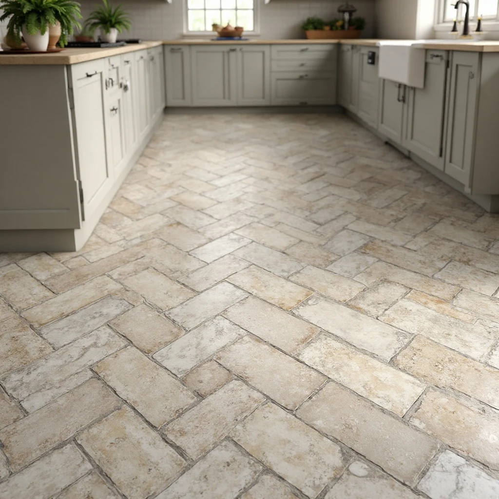
10. Patterned Cement Tiles
Handmade hydraulic pressed tiles featuring intricate geometric or floral patterns in multiple colors, with pigments that go through the full thickness of the tile rather than sitting on the surface as a glaze. Shop on Amazon
Why It Works: Cement tiles are the ultimate statement flooring, capable of transforming a plain kitchen into a showstopping space that looks like it belongs in a European villa or trendy café. The patterns range from subtle tone-on-tone geometrics to bold, colorful designs that command attention. Because the pattern is integral to the tile rather than surface-applied, these floors age beautifully—wear and patina only add to their charm and character over time.
How to Style It:
- Use patterned cement tiles on floors with simple, solid-colored backsplashes and cabinets to avoid overwhelming the space with competing patterns
- Seal cement tiles with a penetrating sealer before and after grouting, then reseal annually to protect against stains and maintain color vibrancy
- Start the pattern at the room’s visual center (typically the kitchen island or main walkway) and work outward to ensure the pattern reads correctly
- Create borders with solid cement tiles in coordinating colors to frame the patterned field and give the eye a place to rest
Where to Use It: Kitchen floors, entryway floors, bathroom floors, covered patio floors, accent walls (with proper sealing)
Pro Tip: Cement tiles are porous and will stain if not properly sealed, especially in the first few months of use when the cement is still curing. Wipe up spills immediately during the break-in period, avoid acidic cleaners that can etch the surface, and plan your installation timing so the tiles can cure undisturbed for at least 24 hours before sealing and 72 hours before heavy use.
11. Herringbone Pattern in Natural Stone
Rectangular stone tiles—travertine, slate, marble, or limestone—arranged in a distinctive V-shaped weaving pattern that creates sophisticated diagonal lines and timeless architectural detail. Shop on Amazon
Why It Works: Herringbone is a pattern that has graced prestigious buildings and homes for centuries, lending instant credibility and elegance to any space. The diagonal lines create movement and energy while the natural stone provides organic color variation and texture that mass-produced materials cannot replicate. This combination delivers a kitchen floor or backsplash that feels both historically rooted and completely current.
How to Style It:
- Use stone tiles cut to 2×8-inch or 3×12-inch proportions for classic herringbone angles—squares or very wide rectangles don’t create the proper geometric effect
- Install with the pattern running parallel to your kitchen’s main sightline (usually from the entrance) to draw the eye through the space
- Choose honed or leathered stone finishes for floors to provide traction and hide scratches; save polished finishes for walls where the reflective quality enhances light
- Use grout that matches the stone’s lightest tones to unify the pattern, or go bold with contrasting dark grout to emphasize every angle
Where to Use It: Kitchen floors, backsplashes, entryway floors, bathroom floors, mudroom floors
Pro Tip: Herringbone installation requires significantly more labor and tile waste (typically 15-20% extra) than straight patterns because every edge requires a precise 45-degree cut. To control costs, use herringbone in a focal area like the kitchen floor while surrounding spaces get the same stone in a simpler straight lay pattern—you’ll still get the wow factor where it counts most while staying on budget.
12. Metallic or Mirrored Tile Accents
Reflective tiles with brushed metal finishes in copper, brass, or stainless steel, or actual mirror tiles, used as accent strips or focal points that bounce light and add glamorous sparkle to kitchen designs. Shop on Amazon
Why It Works: Metallic tiles function like jewelry for your kitchen, adding luxury and light-reflective qualities that make spaces feel brighter and more expansive. They’re particularly transformative in kitchens with limited natural light, where the reflective surfaces amplify every available light source. The shimmer and shine create a sense of movement and energy that brings vitality to the space.
How to Style It:
- Use metallic tiles sparingly as 4-6 inch accent strips, border details, or in small focal areas like behind open shelving rather than covering entire walls
- Match metal finishes to your kitchen hardware, faucets, and light fixtures for cohesive design—mixing metals can work but requires intentional planning
- Combine metallic accents with matte or honed tiles to create contrast—too much shine can feel overwhelming and visually chaotic
- Position metallic tiles where they’ll catch natural light from windows or be illuminated by under-cabinet lighting for maximum impact
Where to Use It: Backsplash accent bands, borders around kitchen windows, trim details in shower niches, behind stove areas as focal points
Pro Tip: Real metal tiles require special care—copper develops a patina over time, stainless steel shows fingerprints, and aluminum can oxidize with prolonged water exposure. For low-maintenance metallic looks, choose porcelain or glass tiles with metallic glazes or finishes that capture the aesthetic without the upkeep demands of actual metal.
13. Oversized Subway Tiles (4×16 or 6×20)
Dramatically elongated versions of classic subway tiles, scaled up to create bold horizontal lines with fewer grout lines, fewer visual interruptions, and a distinctly contemporary interpretation of a traditional format. Shop on Amazon
Why It Works: Oversized subway tiles feel fresh and modern while maintaining connection to the beloved classic subway aesthetic. The larger format means fewer grout lines to clean and maintain, faster installation, and a more streamlined contemporary look. The extended horizontal lines make walls appear wider and spaces feel more expansive—particularly valuable in galley kitchens or spaces with lower ceilings.
How to Style It:
- Install in traditional horizontal brick pattern for a nod to classic design, or stack vertically for unexpected contemporary drama
- Use contrasting grout in charcoal or black to create graphic impact, or match grout to tile color for subtle sophistication
- Extend tiles to ceiling height rather than stopping at standard backsplash height to maximize the size impact and create architectural presence
- Pair with minimalist hardware and streamlined cabinets to let the tile proportions be the statement rather than competing with ornate details
Where to Use It: Kitchen backsplashes, full bathroom walls, shower surrounds, mudroom wainscoting, laundry room walls
Pro Tip: The larger the tile, the more critical perfect wall preparation becomes—any dips, bumps, or inconsistencies will create lippage (uneven edges between tiles) that looks sloppy and unprofessional. Invest time in leveling compound and smoothing your substrate before installation, or the impressive scale of oversized tiles will be undermined by poor execution.
14. Arabesque or Lantern-Shaped Tiles
Distinctive tiles with curved, teardrop, or lantern-like silhouettes reminiscent of Moorish architecture, available in glossy ceramics, matte finishes, or natural stone that create organic, flowing patterns across walls. Shop on Amazon
Why It Works: Arabesque tiles deliver instant personality and distinctive style that immediately elevates a kitchen from generic to gallery-worthy. The curved, organic shapes provide welcome contrast in rooms dominated by the straight lines of cabinets, countertops, and appliances. These tiles work across design styles—they can read as romantic and traditional in soft colors, or sleek and contemporary in bold monochromatic schemes.
How to Style It:
- Choose 4-6 inch sizes for kitchen backsplashes to create pattern density without overwhelming smaller wall areas
- Install in monochromatic colors (all white, all navy, all sage) for sophisticated subtlety, or mix coordinating colors for playful energy
- Use bright white or light gray grout to define each tile’s graceful shape—dark grout can make the pattern look muddy and unclear
- Balance the organic curves with rectilinear elements like subway tile borders, straight-edged countertops, and simple cabinet styles
Where to Use It: Kitchen backsplashes, bathroom walls, powder room accent walls, behind freestanding tubs, foyer walls
Pro Tip: Arabesque tiles create significant pattern waste because the curved shapes don’t nest efficiently during cutting. Order 20-25% extra to account for waste and to ensure you have enough tiles from the same dye lot. Save leftover tiles for future repairs, as arabesque shapes and colors can be discontinued quickly or vary between production runs.
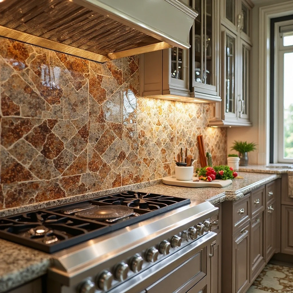
15. Textured 3D Tiles with Raised Patterns
Dimensional tiles featuring raised geometric patterns, waves, or linear ridges that create actual depth and shadow play, transforming flat walls into tactile, sculptural surfaces that change appearance throughout the day as lighting shifts. Shop on Amazon
Why It Works: Three-dimensional tiles are the ultimate way to add drama and architectural interest without color or pattern—the sculptural quality creates visual intrigue through form alone. The changing shadows throughout the day mean your backsplash literally transforms from morning to evening as natural light moves through the space. This dynamic quality brings life and energy to kitchens in ways flat tiles simply cannot achieve.
How to Style It:
- Use white or neutral 3D tiles to let the shadow play be the star, avoiding busy colors or patterns that compete with the dimensional texture
- Install under-cabinet lighting aimed at the tile to create dramatic shadows and emphasize the three-dimensional effect, especially at night
- Keep 3D tiles to one accent wall or backsplash area rather than covering all walls—too much texture can feel overwhelming and busy
- Pair with matte or satin finishes rather than high gloss to create soft, sculptural shadows rather than harsh, glaring highlights
Where to Use It: Kitchen backsplashes (especially behind ranges as focal walls), feature walls in living spaces, behind bathroom vanities, fireplace surrounds
Pro Tip: 3D tiles have significantly more surface area than flat tiles, which means more surface to collect grease, dust, and cooking splatter in the kitchen. Install them behind areas with lighter cooking (like sinks or prep zones) rather than directly behind cooktops where grease exposure is heaviest, or commit to weekly cleaning with a soft brush to reach into all the dimensional crevices.
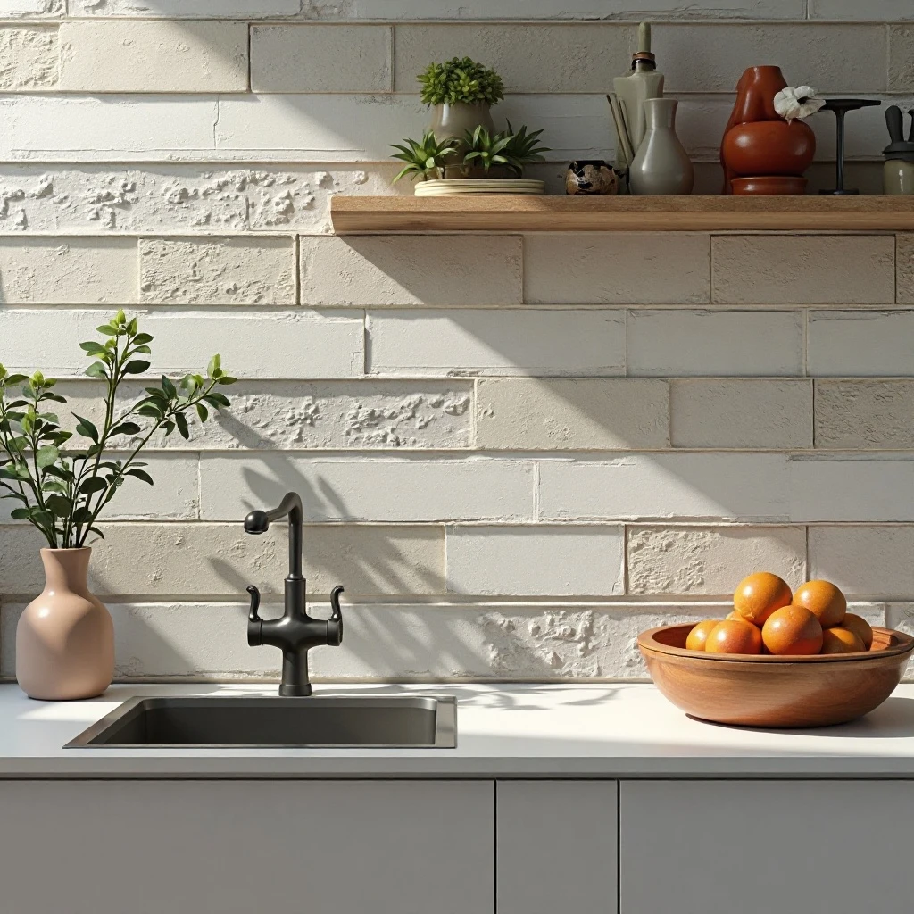
16. Brick-Style Thin Tiles in Natural or Painted Finishes
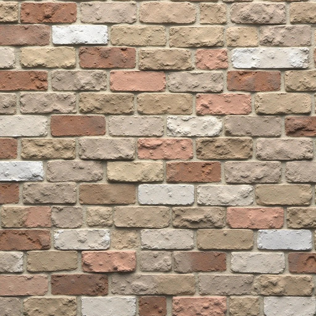
Thin brick veneer tiles that capture the texture and appearance of reclaimed or whitewashed brick, typically around 1/2 inch thick, offering the character of exposed brick walls without the structural requirements, weight, or expense. Shop on Amazon
Why It Works: Brick brings instant warmth, texture, and architectural character that makes kitchens feel collected over time rather than builder-standard generic. Thin brick tiles are dramatically lighter and easier to install than full bricks, making them suitable for locations where structural brick isn’t feasible. The rough, varied surface hides imperfections beautifully and adds organic texture that contrasts beautifully with smooth cabinets and countertops.
How to Style It:
- Choose natural red brick for traditional or industrial styles, whitewashed brick for farmhouse or coastal looks, or painted brick for modern eclectic spaces
- Install with irregular grout joints (varying from 1/4 to 1/2 inch) to mimic authentic brick wall construction rather than perfectly uniform tile spacing
- Seal brick tiles with a breathable masonry sealer to protect against staining while maintaining the natural matte texture
- Limit brick to one accent wall or backsplash area, combining with smoother materials to prevent the space from feeling too rough or heavy
Where to Use It: Kitchen backsplashes, accent walls, basement walls, fireplace surrounds, commercial-style restaurant kitchens
Pro Tip: The grout joints between brick tiles are notorious for collecting grease and grime in kitchen environments. Use a grout sealer specifically formulated for kitchen applications, and clean grout lines monthly with a soft-bristled brush and degreasing solution. Alternatively, consider dark charcoal grout that hides discoloration better than traditional light gray or white mortar.
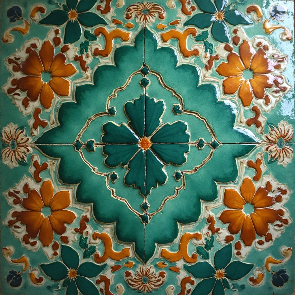
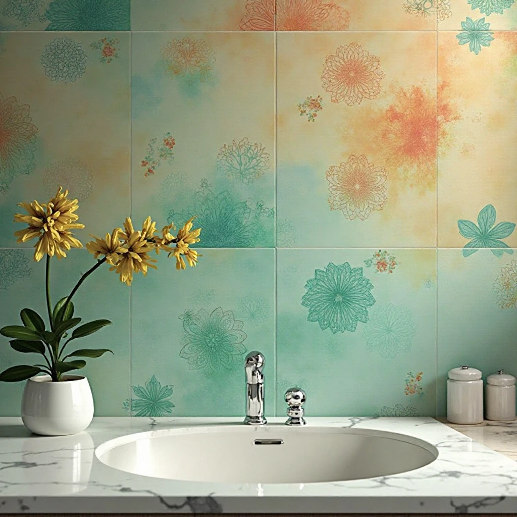
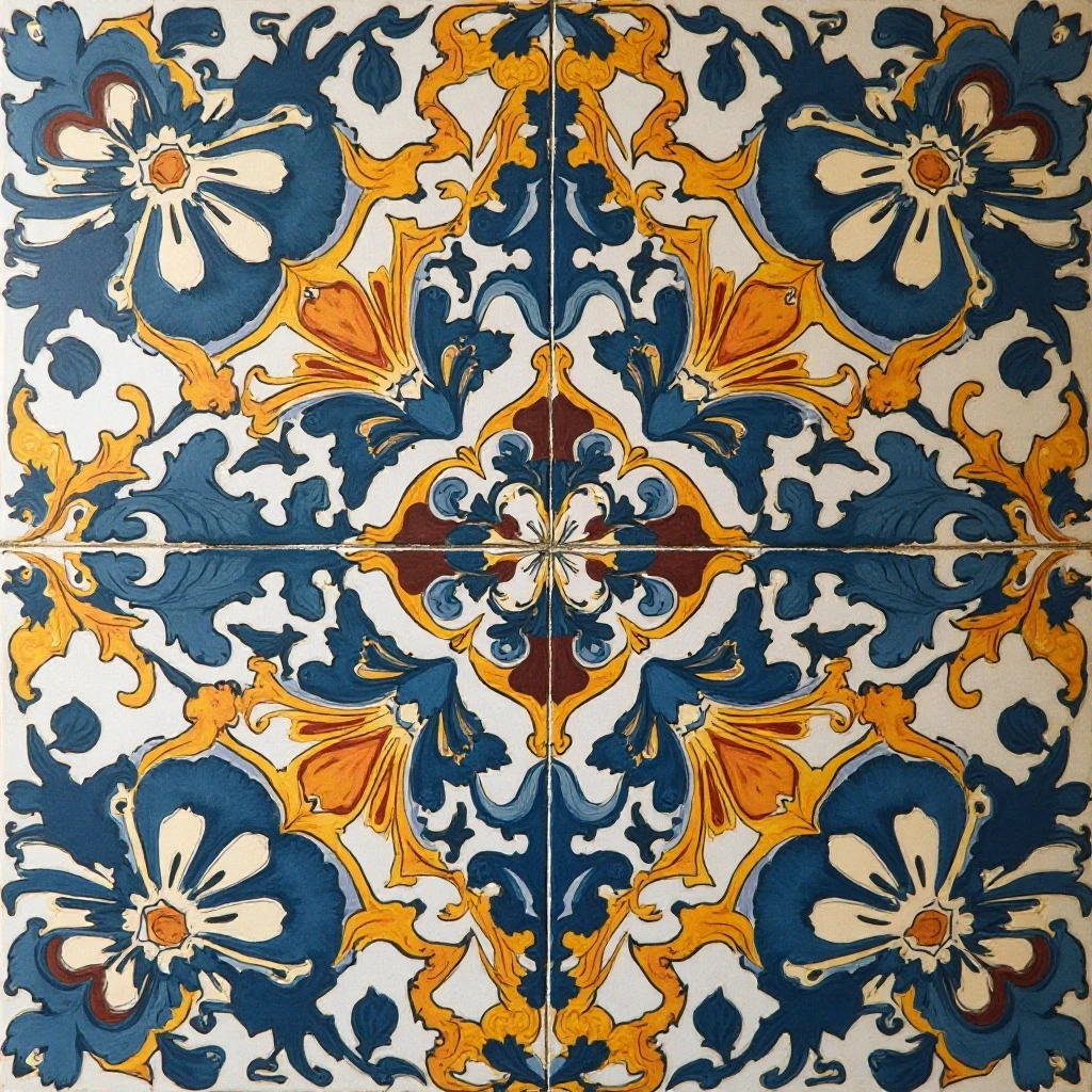
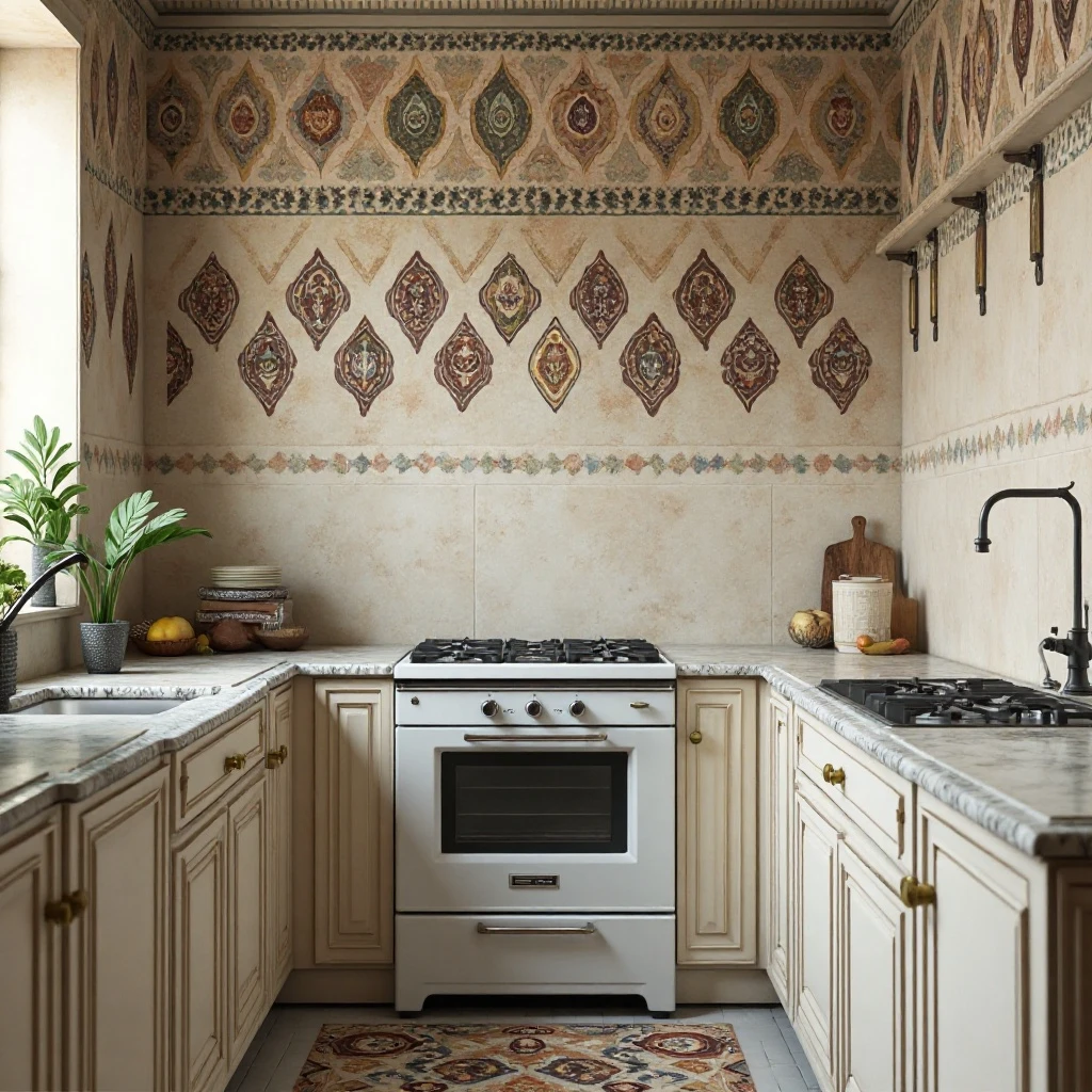
17. Geometric Encaustic-Style Tiles
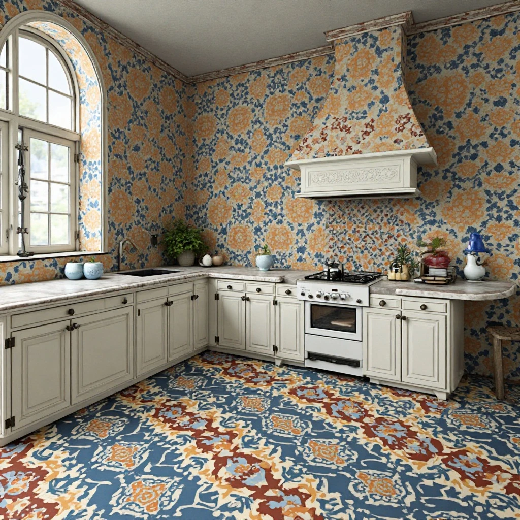
Flat cement or porcelain tiles printed with intricate geometric patterns inspired by traditional encaustic tiles, featuring bold colors and complex designs like Moroccan stars, Spanish tile patterns, or Art Deco geometrics. Shop on Amazon
Why It Works: These tiles deliver maximum visual impact and artistic expression, functioning as the room’s artwork rather than merely its surface covering. The bold patterns create instant personality and serve as the foundation for your entire kitchen color scheme—you can pull accent colors from the tile for textiles, accessories, and even paint colors. Unlike subtle materials that fade into the background, geometric encaustic tiles make a confident statement that defines the space.
How to Style It:
- Use as a rug-like pattern area in the center of the kitchen floor, bordered by solid coordinating tiles to create visual definition
- Keep all other surfaces simple—solid color cabinets, simple countertops, and minimal backsplashes let the floor pattern be the star
- Choose patterns with 3-4 coordinating colors maximum to avoid visual chaos and maintain some design cohesion
- Seal porous cement versions thoroughly before grouting and reapply sealer annually to prevent staining and maintain color vibrancy
Where to Use It: Kitchen floors (especially in front of islands or sinks), entryway floors, bathroom floors, backsplashes in powder rooms, outdoor covered patios
Pro Tip: Living with bold patterned floors requires commitment—they’re harder to update or conceal if your style evolves. Test your pattern choice by ordering samples and living with them in your space for at least two weeks before committing. Place them on the floor, view them in different lighting conditions, and imagine seeing them thousands of times over the coming years. If you’re still excited after the novelty wears off, they’re the right choice.
Common Mistakes to Avoid
1. Choosing Tile Before Considering Grout Color
Most people select their tile and treat grout as an afterthought, but grout color dramatically affects the final appearance. Light grout on dark tiles creates grid lines that can look institutional, while contrasting grout on detailed patterns can create visual chaos.
Always request to see tile samples with different grout colors during selection, or use digital visualization tools that show the combined effect. For timeless appeal, choose grout that matches the tile’s primary tone; for bold contemporary statements, intentionally contrast colors but only with simple tile patterns.
2. Not Ordering 15-20% Extra Tile
Nothing derails a tile project faster than running short of materials mid-installation, especially since dye lots vary between production runs and discontinued styles can be impossible to match. Always order 15-20% extra for standard patterns, 20-25% for diagonal layouts or specialty shapes, and keep leftover tiles stored safely for future repairs. That $200 in extra materials now could save you from a $5,000 partial re-tile later when you can’t match your original selection.
3. Ignoring Tile Thickness Transitions
Mixing different tile types—like thick natural stone floors meeting thinner ceramic backsplashes, or transitioning from tile to hardwood—requires careful planning for threshold strips, edge treatments, and height adjustments. Failing to account for these transitions leads to awkward lips that collect dirt, create tripping hazards, or look unfinished.
Work with your installer early to plan proper transitions using schluter strips, reducer moldings, or graduated threshold pieces that create smooth, professional-looking connections.
4. Selecting High-Gloss Tiles for Floors
Glossy, polished tiles look stunning in showrooms but become dangerously slippery when wet—a serious hazard in kitchens where water, oil, and spills are inevitable. Always choose matte, honed, textured, or slip-resistant finishes for floor applications, reserving high-gloss tiles for walls and backsplashes where their light-reflective qualities enhance the space without creating safety issues. Check the tile’s slip resistance rating (COF rating of 0.6 or higher for wet areas) before committing to floor installations.
5. Using Incorrect Mortar or Grout Products
Not all thinset mortars and grouts work with all tile types—glass requires modified thinset to prevent shadowing, large format tiles need large-and-heavy-tile mortar to prevent sagging, and natural stone needs non-staining grout to avoid discoloration.
Using standard products with specialty tiles leads to failed installations, cracked tiles, or permanent staining. Always consult the tile manufacturer’s installation guidelines and invest in the recommended adhesives and grouts—the $50 difference in product cost is negligible compared to the thousands it costs to redo failed installations.
6. Covering Every Surface in the Same Tile
While using one tile type throughout might seem cohesive, it often results in monotonous, visually flat spaces that lack dimension and interest. Successful kitchen tile design typically combines 2-3 complementary materials—perhaps wood-look porcelain floors with subway tile backsplashes, or patterned cement tile floors with solid stone countertops and simple glass backsplashes.
The variation creates visual hierarchy, gives the eye places to rest, and allows you to allocate your budget strategically by using premium materials in small doses and economical choices for large expanses.
Frequently Asked Questions
What tile pattern makes a small kitchen look bigger?
Large format tiles (12×24 inches or larger) with minimal grout lines create the illusion of more expansive space by reducing visual interruptions and creating fewer breaks across surfaces. Light colors—white, cream, soft gray, or pale blue—reflect light and make rooms feel airier than dark tiles that absorb light.
Installing rectangular tiles horizontally elongates walls, while vertical installation makes ceilings appear higher. Glossy or polished finishes reflect more light than matte tiles, further enhancing the spacious feeling.
The most dramatic impact comes from extending the same tile continuously from floor to wall or from backsplash to ceiling, eliminating transitions that chop up space and make rooms feel smaller and more compartmentalized.
Should kitchen floor tiles be matte or glossy?
Kitchen floors should always use matte, honed, textured, or slip-resistant finishes rather than glossy or polished tiles for critical safety reasons. Wet glossy tiles become dangerously slippery, creating fall hazards in an environment where water and food spills are everyday occurrences.
Matte finishes also hide scratches, scuffs, and wear patterns better than polished tiles that show every mark. Reserve glossy finishes for kitchen walls and backsplashes where their light-reflective qualities brighten spaces without compromising safety. For best results, verify your floor tile has a COF (Coefficient of Friction) rating of 0.6 or higher for wet conditions—this technical measurement ensures adequate slip resistance even when the floor is wet.
How high should a kitchen backsplash go?
Standard kitchen backsplashes extend 18 inches above countertops to the bottom of upper cabinets, providing adequate protection in the most splash-prone zones. However, full-height backsplashes that extend to the ceiling create more dramatic, contemporary looks and are easier to clean since there’s no ledge or edge where the tile stops to collect dust and grease.
Behind ranges, consider extending tile coverage higher (24-30 inches or to hood height) since this area experiences the most splatter and heat. If you have windows interrupting the backsplash area, continue tile to the window frame for a finished appearance rather than stopping short, and consider wrapping the window frame with tile or coordinating trim. Full-height installations cost more in materials but reduce long-term maintenance and deliver more architectural presence.
Can you mix different tile materials in one kitchen?
Absolutely—mixing materials creates visual interest, texture contrast, and design sophistication when done thoughtfully. Successful combinations include wood-look porcelain floors with marble-look backsplashes, subway tile walls with patterned cement tile floors, or natural stone accents paired with ceramic field tiles.
The key is maintaining a cohesive color palette (2-4 coordinating colors maximum) whilevarying textures and finishes. Use the most durable, practical materials in high-traffic or high-exposure areas (slip-resistant floors, stain-resistant backsplashes behind stoves) and reserve more delicate or expensive materials for lower-impact zones.
Avoid mixing more than three different tile types in one kitchen—beyond that, the space feels chaotic and lacks the cohesive design narrative that makes mixed materials feel intentional rather than random.
What’s the most durable kitchen tile material?
Porcelain tile ranks as the most durable option for kitchens due to its density, low water absorption (less than 0.5%), stain resistance, and extreme hardness that resists scratching and chipping. Unlike natural stone that requires regular sealing, porcelain is naturally impervious to stains and needs no ongoing maintenance beyond regular cleaning.
Porcelain also offers remarkable versatility with convincing wood, marble, and concrete looks that deliver natural aesthetics without natural material vulnerabilities. For highest durability, choose porcelain with a PEI rating (Porcelain Enamel Institute hardness scale) of 4-5 for floors and 3-5 for walls—these ratings indicate resistance to wear from foot traffic.
Through-body porcelain, where color runs through the entire tile thickness rather than just the surface glaze, shows wear even less because chips or scratches don’t reveal a different colored core.
How do I choose between ceramic and porcelain tile?
While both are clay-based tiles, porcelain is fired at higher temperatures (making it denser and harder), absorbs less water (making it more frost and stain-resistant), and costs 20-40% more than ceramic. Choose porcelain for kitchen floors, high-moisture areas, and anywhere durability is paramount—it’s harder, more water-resistant, and holds up better to heavy use over decades.
Ceramic works beautifully for backsplashes and walls where foot traffic isn’t a concern and water exposure is moderate. Ceramic also offers more diverse decorative patterns and hand-painted designs since the softer material is easier to customize. If you’re in a cold climate or using tile in outdoor kitchens, porcelain’s low water absorption makes it frost-resistant, while ceramic can crack with freeze-thaw cycles.
For most kitchen applications where performance matters and you want a lifetime installation, porcelain delivers better long-term value despite the higher upfront cost.
Final Thoughts: Designing Your Dream Kitchen, One Tile at a Time
The tiles you choose will outlast appliances, paint colors, and probably even your kitchen cabinets, so this decision deserves thoughtful consideration rather than rushed selection. Start by identifying which aspects of your current kitchen frustrate you—difficult cleaning, dated appearance, lack of personality—and let those pain points guide you toward solutions. Remember that the “perfect” tile choice balances your aesthetic vision with practical realities like maintenance requirements, durability, and budget constraints.
Your kitchen tile don’t just protect surfaces—they set the mood every time you walk into the space. Whether you’re drawn to timeless classics that work across decades, bold statements that showcase your personality, or practical solutions that make daily life easier, trust that your instincts combined with the technical information in this guide will lead you to the right choice. Great design isn’t about following rules slavishly; it’s about understanding principles well enough to break them intentionally.
Give yourself permission to experiment with samples, live with different options for days rather than minutes, and test materials in your actual lighting conditions before committing. The best kitchen tile designs emerge from this thoughtful process rather than hasty showroom decisions. Your unique space, lifestyle, and aesthetic preferences deserve a customized solution, not a generic template.
Your Next Step: Order samples of your top three tile choices (including the grout colors you’re considering) and place them in your actual kitchen for at least one week, observing how they look at different times of day, how they feel underfoot, and whether they still excite you after the initial novelty fades.
Remember: The tiles that work hardest often show off least—sometimes the most successful choice is the one that creates the perfect backdrop for your life rather than demanding constant attention. Trust your process, and enjoy watching your kitchen transform into the space you’ve been imagining.