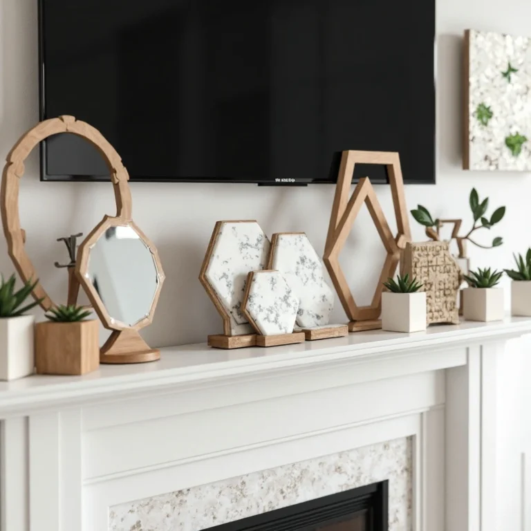
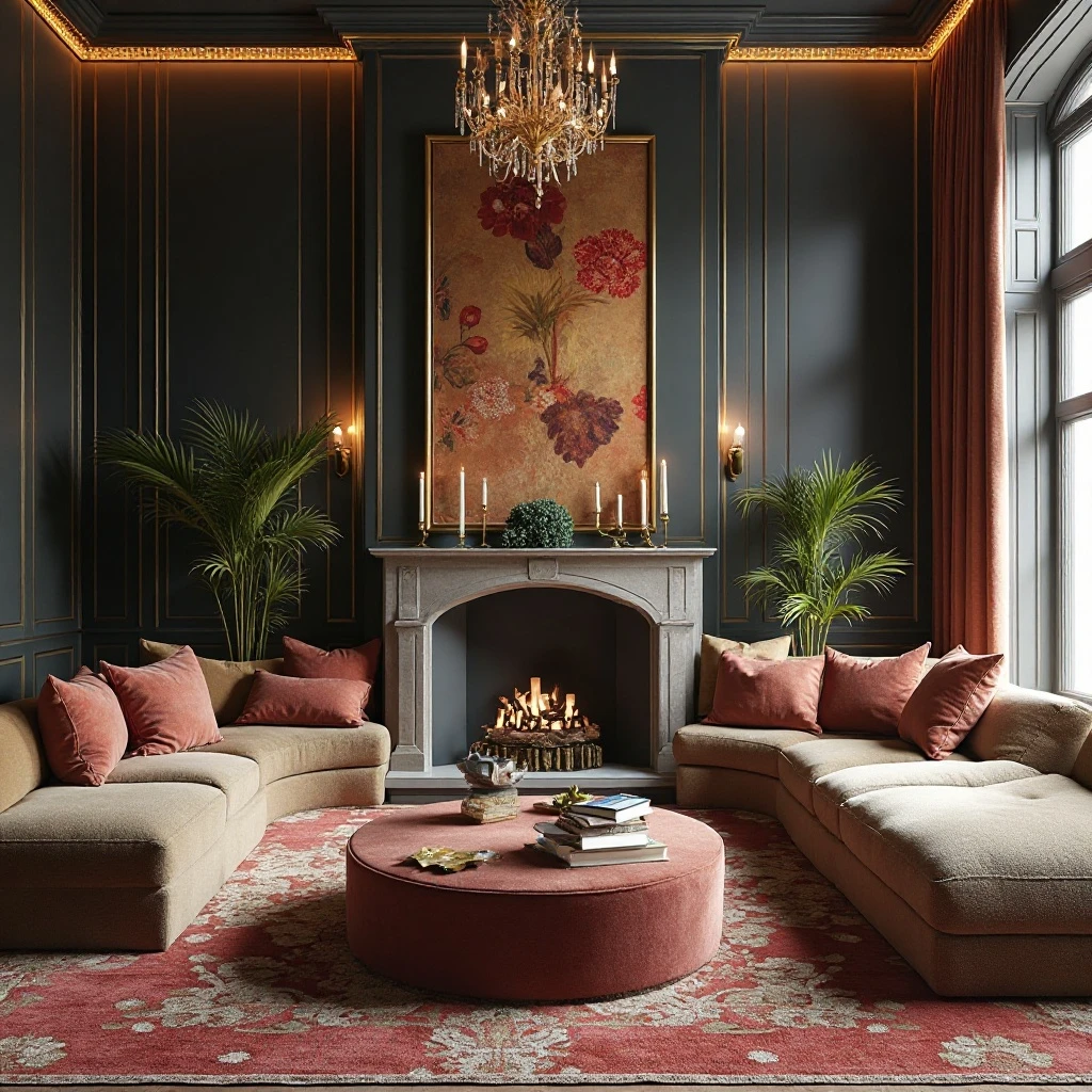
20+ Living Room Shelf Decor Ideas That Look Designer-Styled
Your living room shelves are prime real estate for expressing your personality and elevating your space from ordinary to extraordinary. Whether you’re staring at bare built-ins or struggling to style that floating shelf, the right approach transforms functional storage into a curated display that tells your story.
This guide Of Living Room Shelf Decor Ideas delivers expert-approved ideas that balance beauty with practicality, helping you create shelves that look professionally designed while remaining authentically you.
I use affiliate links in this post. If you purchase through them, I may receive a small commission without affecting your price.
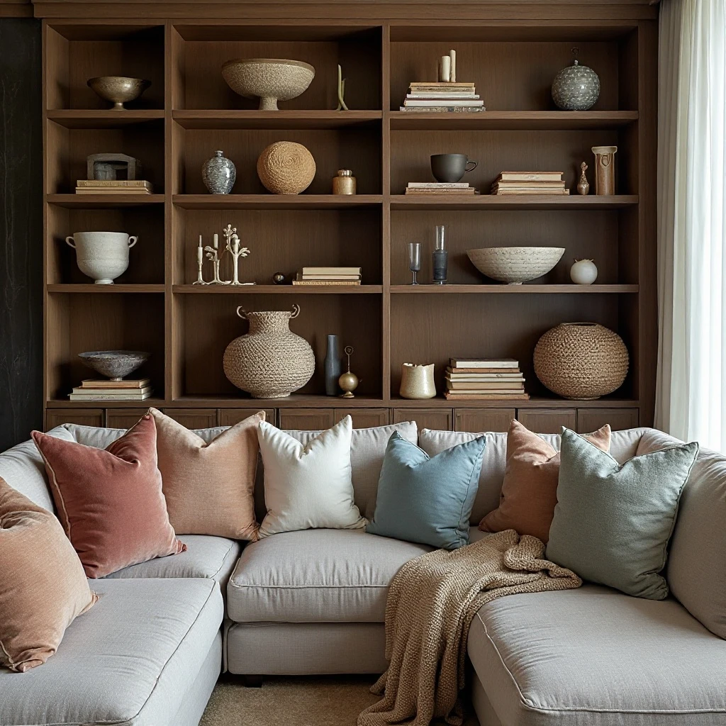
1. Layered Book Stacks with Sculptural Objects
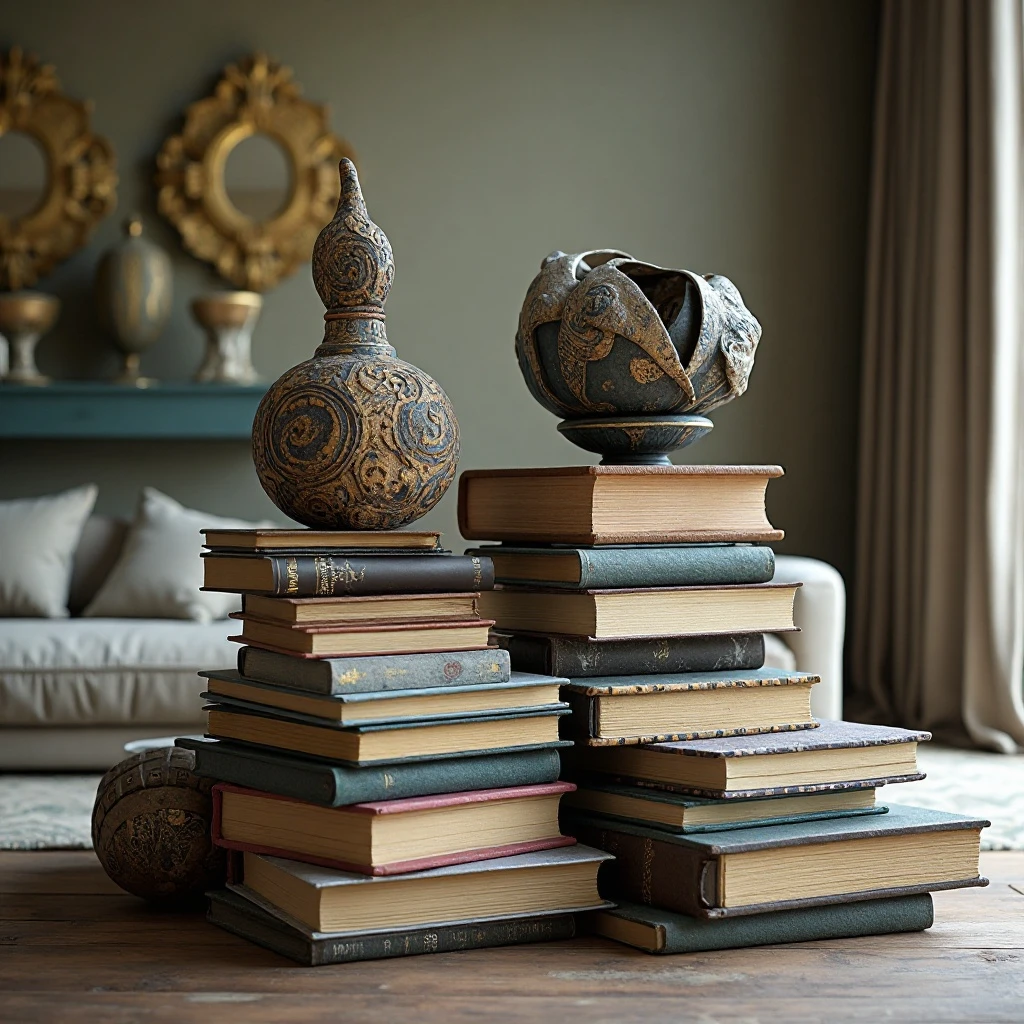
Create visual interest by stacking books horizontally in groups of 2-4, then placing a distinctive sculptural piece on top. Mix in vertical book arrangements between stacks, alternating the orientation to create rhythm. The contrast between the linear books and organic sculpture shapes adds sophisticated dimension. Shop on Amazon
Why It Works: This technique solves the common problem of books looking monotonous while adding vertical variety that draws the eye upward. It creates natural pedestals for displaying treasured objects without needing additional furniture, and the layering adds professional depth that makes shelves feel intentionally curated rather than simply stored.
How to Style It:
- Stack books in odd numbers (groups of 3 or 5) with largest volumes on bottom, decreasing in size as you go up
- Place sculptures, small plants, or decorative boxes on top of horizontal stacks, ensuring the object is smaller than the book base
- Leave 2-3 inches of breathing room between each arrangement to prevent visual clutter
- Mix hardcovers and paperbacks, turning some spines inward to show page edges for textural contrast
Where to Use It: Built-in bookcases flanking a fireplace, floor-to-ceiling shelving units in home offices, console table shelving in entryways, or ladder shelf displays
Pro Tip: Use books with complementary spine colors as your base layer to create a cohesive color story, then let your sculptural pieces be the accent colors that pop.
2. Botanical Shelf Garden with Varied Heights
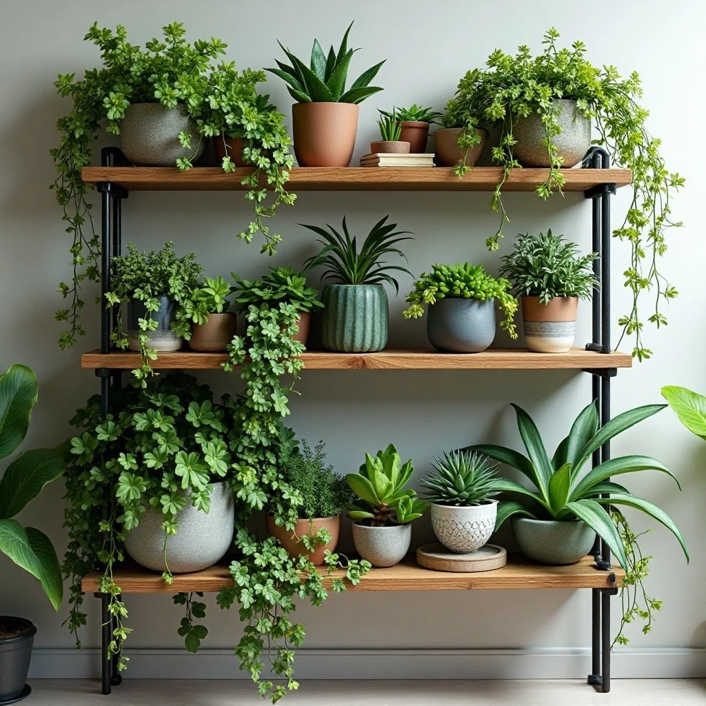
Transform shelves into a living gallery by incorporating plants at different heights using a mix of trailing, upright, and cascading varieties. Combine potted plants with hanging planters that drape from upper shelves, and tuck smaller succulents into gaps between decorative objects. Shop on Amazon
Why It Works: Plants bring life, color, and air-purifying benefits while softening the hard edges of shelving and other décor items. The varied heights create natural focal points and movement, making static shelves feel dynamic and alive. This approach works particularly well for bringing nature indoors in urban spaces where outdoor access is limited.
How to Style It:
- Position trailing pothos or string-of-pearls on upper shelves where they can cascade down 12-18 inches
- Place medium-height plants (8-12 inches) at eye level where their foliage can be appreciated up close
- Use ceramic, terracotta, or woven basket planters in complementary colors to tie the look together
- Group plants in odd numbers (1, 3, or 5) on each shelf level, balancing with books or objects on the opposite side
Where to Use It: Bright living rooms with natural light, shelves adjacent to windows, open-concept spaces needing natural dividers, or minimalist rooms needing organic warmth
Pro Tip: Install small LED grow lights underneath upper shelves if your space lacks natural light—they’re nearly invisible but keep plants thriving and add ambient lighting.
3. Monochromatic Color-Blocked Shelving
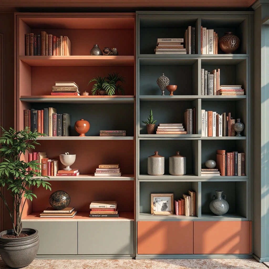
Create striking visual impact by dedicating each shelf or section to a single color family, arranging books, objects, and decorative pieces in graduated shades from light to dark. This creates an ombré effect or distinct color zones that make a bold design statement. Shop on Amazon
Why It Works: Color blocking transforms chaotic shelves into an intentional art installation that anchors your room’s color scheme. It makes even mismatched objects look cohesive and creates a sense of calm through visual organization. This technique is particularly effective for showcasing book collections while making them feel like part of the décor rather than afterthoughts.
How to Style It:
- Choose 2-3 dominant colors from your room’s palette and assign each to specific shelf sections
- Arrange items within each color zone from lightest to darkest for an ombré gradient effect
- Include varied textures (matte, glossy, woven) within each color family to add dimension without breaking the color story
- Leave strategic white space or neutral breaks between color zones to prevent overwhelming the eye
Where to Use It: Contemporary living rooms, creative studio spaces, rooms with neutral walls needing color injection, or maximalist interiors embracing bold design
Pro Tip: Photograph your shelves in black and white to check if your color blocking has enough tonal variation—if everything looks the same shade of gray, add lighter or darker pieces to create depth.
4. Gallery Wall Shelf Integration
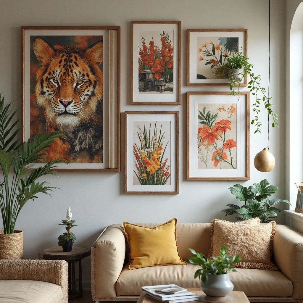
Blend shelving with wall art by interspersing floating shelves among framed prints, creating a three-dimensional gallery that extends beyond flat walls. Place small shelves at varying heights between artwork to display sculptural objects, plants, or special trinkets. Shop on Amazon
Why It Works: This breaks up the predictability of traditional gallery walls while adding functional display space for objects that can’t be hung. The depth variation creates visual intrigue and allows you to rotate smaller pieces seasonally without rearranging entire walls. It’s perfect for renters who want impact without extensive wall damage.
How to Style It:
- Install 6-12 inch floating shelves between framed pieces at staggered heights, maintaining 8-10 inches between elements
- Keep shelf displays minimal (1-3 objects per shelf) so they complement rather than compete with artwork
- Echo shapes from your artwork in shelf objects—angular sculptures with geometric prints, organic pieces with abstract art
- Use shelves to bridge different frame sizes, creating visual stepping stones that unify disparate pieces
Where to Use It: Living room feature walls, hallways with high ceilings, spaces above sofas or consoles, or stairwell walls
Pro Tip: Paint floating shelves the same color as your wall to make displayed objects appear to float, creating a more integrated, less cluttered look.
5. Symmetrical Balance with Bookend Anchors
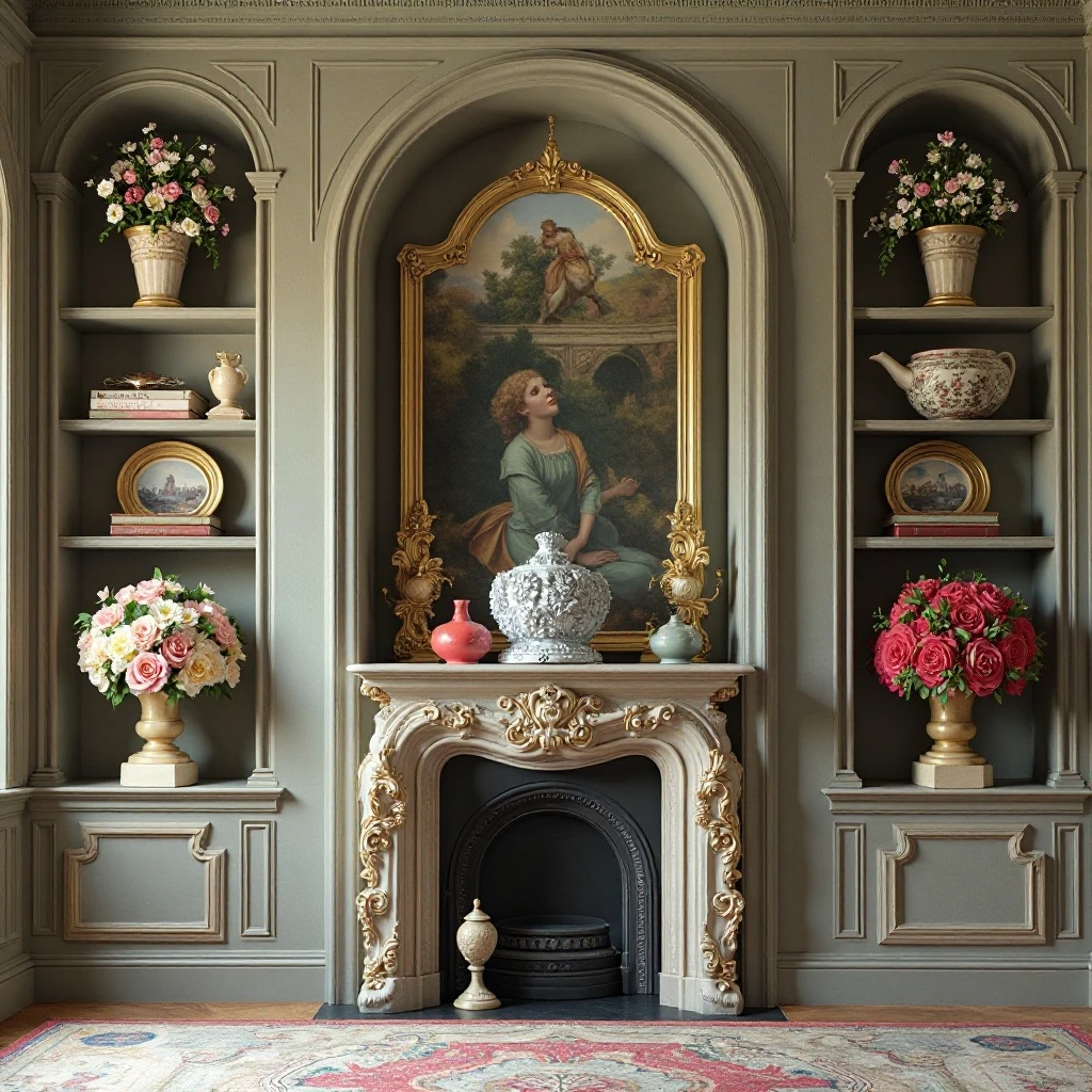
Create formal elegance by mirroring arrangements on either side of a central focal point, using substantial bookends or objects as anchors. This classical approach brings order and sophistication, making shelves feel like architectural features rather than storage. Shop on Amazon
Why It Works: Symmetry naturally pleases the eye and creates a sense of calm and intentionality. It’s especially effective in traditional or transitional spaces where balance and proportion are key design principles. This approach makes styling decisions easier since you simply replicate what works on one side.
How to Style It:
- Place identical or similar weighted objects (large vases, sculptures, or stacks of books) at each outer edge of the shelf
- Mirror the placement and height of items moving from outside edges toward the center, maintaining consistent spacing
- Keep the center point either empty for breathing room or anchor it with a single standout piece like a clock or mirror
- Ensure objects on opposite sides are similar in visual weight even if not identical—two different vases of similar size and color work perfectly
Where to Use It: Formal living rooms, spaces flanking fireplaces or windows, traditional home offices, or entryway console shelving
Pro Tip: Use the rule of thirds within each half of your symmetrical arrangement—divide each side into three zones and place your most important piece at the one-third or two-thirds mark rather than dead center.
6. Curated Collections Display
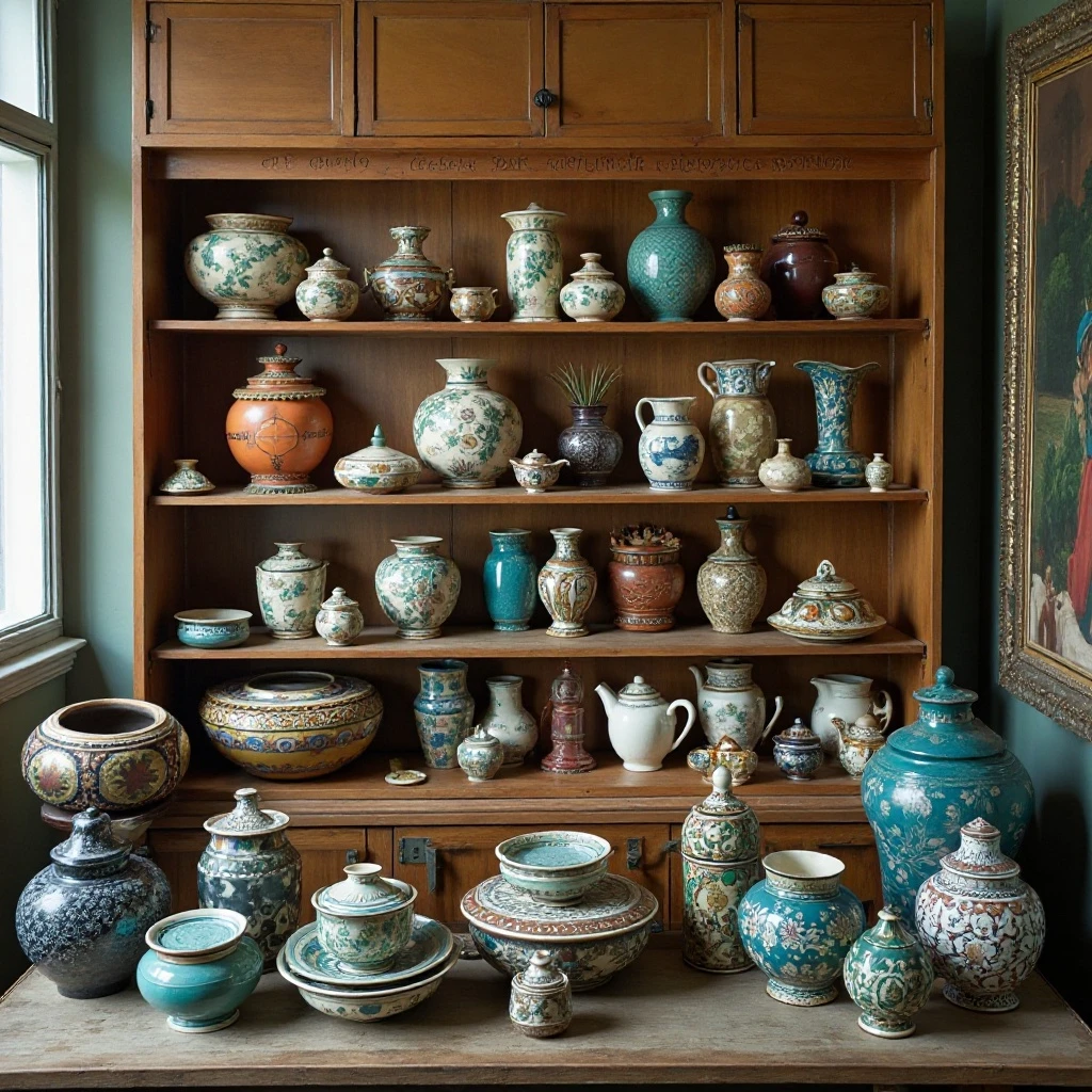
Transform personal collections—whether vintage cameras, pottery, travel souvenirs, or vinyl records—into focal points by grouping similar items together with intentional spacing and supporting décor that tells their story. Shop on Amazon
Why It Works: Collections displayed with purpose become conversation starters and personal signatures rather than clutter. Grouping creates impact that individual scattered pieces can’t achieve, and the repetition of similar forms creates visual cohesion. This approach celebrates what makes your home uniquely yours while maintaining a curated aesthetic.
How to Style It:
- Dedicate one full shelf or a clearly defined section to your collection, keeping 6-12 pieces visible (rotate others seasonally)
- Arrange items by size, color, or chronology depending on what tells the best story—largest to smallest, light to dark, or oldest to newest
- Add context with a small descriptive card, vintage book about the subject, or complementary objects that enhance the narrative
- Use risers, small platforms, or stacked books to create height variation within the collection, ensuring each piece is visible
Where to Use It: Built-in shelving units, glass-front cabinets, console tables, or dedicated display walls in living rooms or libraries
Pro Tip: Apply museum-style spacing—leave at least 3-4 inches between collection pieces so each can be appreciated individually, preventing the “crowded curio shop” effect.
7. Textural Contrast Layers
Build depth by combining smooth, rough, soft, and metallic textures within each shelf section. Pair woven baskets with glass vases, velvet-bound books with ceramic sculptures, or brass candlesticks with raw wood bowls for a rich, collected-over-time aesthetic. Shop on Amazon
Why It Works: Texture creates visual interest without requiring color variation, making it perfect for neutral or minimalist spaces. The contrast between materials adds sophistication and prevents monochromatic schemes from feeling flat or boring. Tactile variety also invites interaction, making spaces feel warm and lived-in rather than sterile.
How to Style It:
- Include at least three different textures per shelf level: one smooth (glass, polished ceramic), one rough (natural fiber, unglazed pottery), and one with sheen (metal, lacquered wood)
- Balance heavy visual textures (chunky knits, rough stone) with smooth surfaces to prevent overwhelming the eye
- Group similar textures in odd numbers—three woven baskets, five brass objects—then space them across the shelving unit
- Add fabric elements like small textiles, folded vintage linens, or a casually draped throw on lower shelves for softness
Where to Use It: Neutral-toned living rooms, Scandinavian-style spaces, coastal interiors, or anywhere needing warmth without bold color
Pro Tip: Touch-test your arrangements—if you can’t resist running your fingers across the textures, you’ve achieved the right tactile appeal.
8. Negative Space Minimalism
Embrace the “less is more” philosophy by intentionally leaving substantial empty space on shelves, allowing each carefully chosen object to breathe and command attention. This sophisticated approach prevents visual clutter and makes every piece feel important. Shop on Amazon
Why It Works: Strategic emptiness creates a gallery-like quality that elevates ordinary objects into art. It reduces visual stress, makes cleaning easier, and allows the architecture of the shelving itself to shine. This approach is particularly effective in small spaces where overcrowding can make rooms feel cramped.
How to Style It:
- Follow the “one-third rule”—keep two-thirds of each shelf empty, clustering objects in just one-third of the space
- Place single statement pieces on shelves with nothing else, allowing 6-8 inches of empty space on all sides
- Use larger-scale objects rather than many small items, ensuring each piece has sculptural presence on its own
- Alternate filled and empty sections across your shelving unit to create breathing room and visual rhythm
Where to Use It: Modern or contemporary living rooms, small apartments, meditation or reading spaces, or any room embracing minimalist design
Pro Tip: If shelves feel too empty, you need better (not more) objects—invest in one stunning piece rather than filling space with mediocre items.
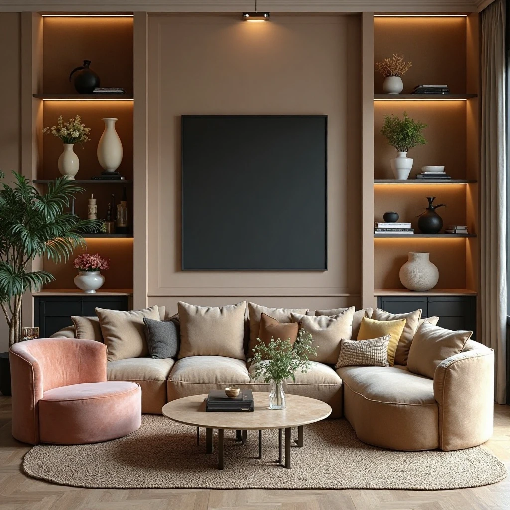
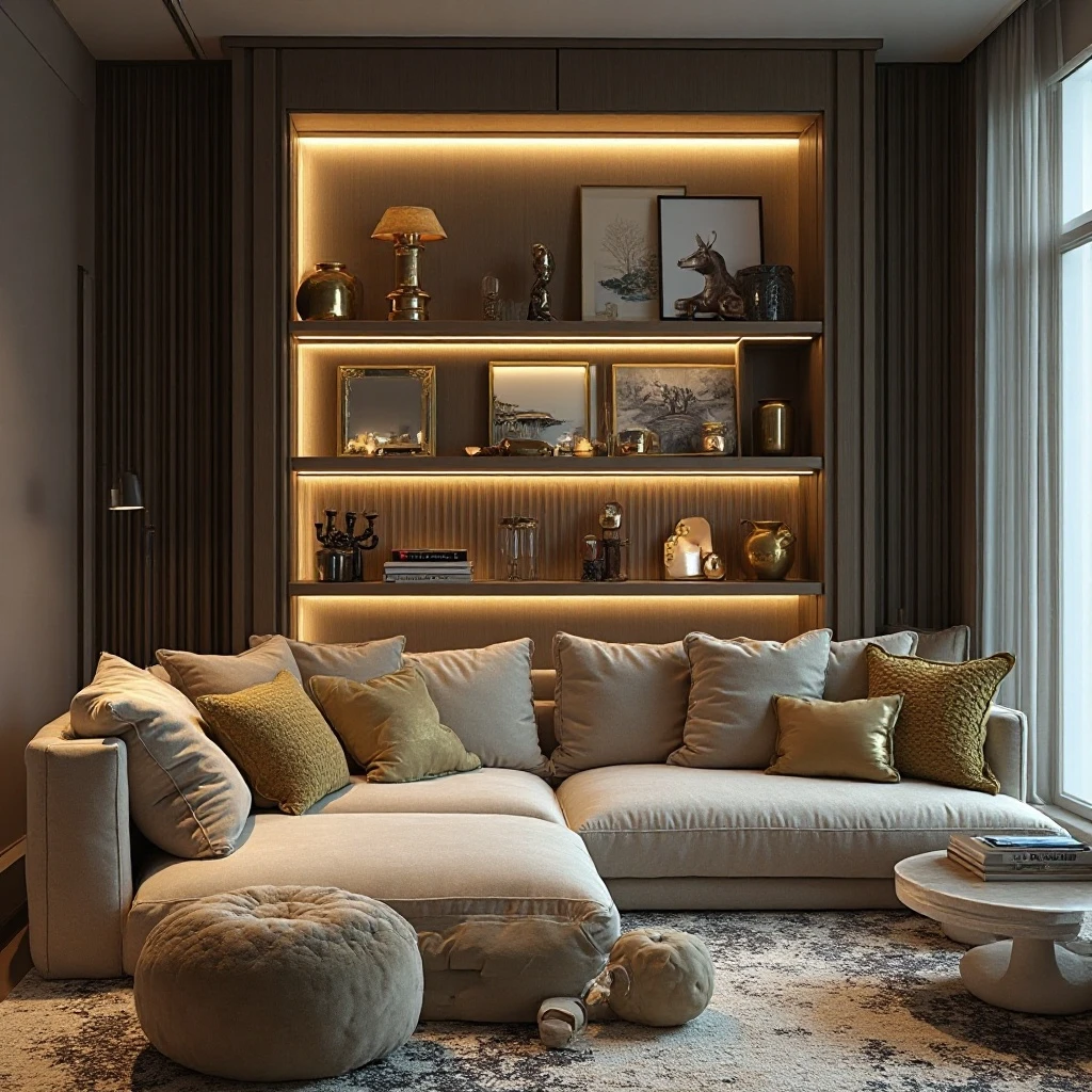
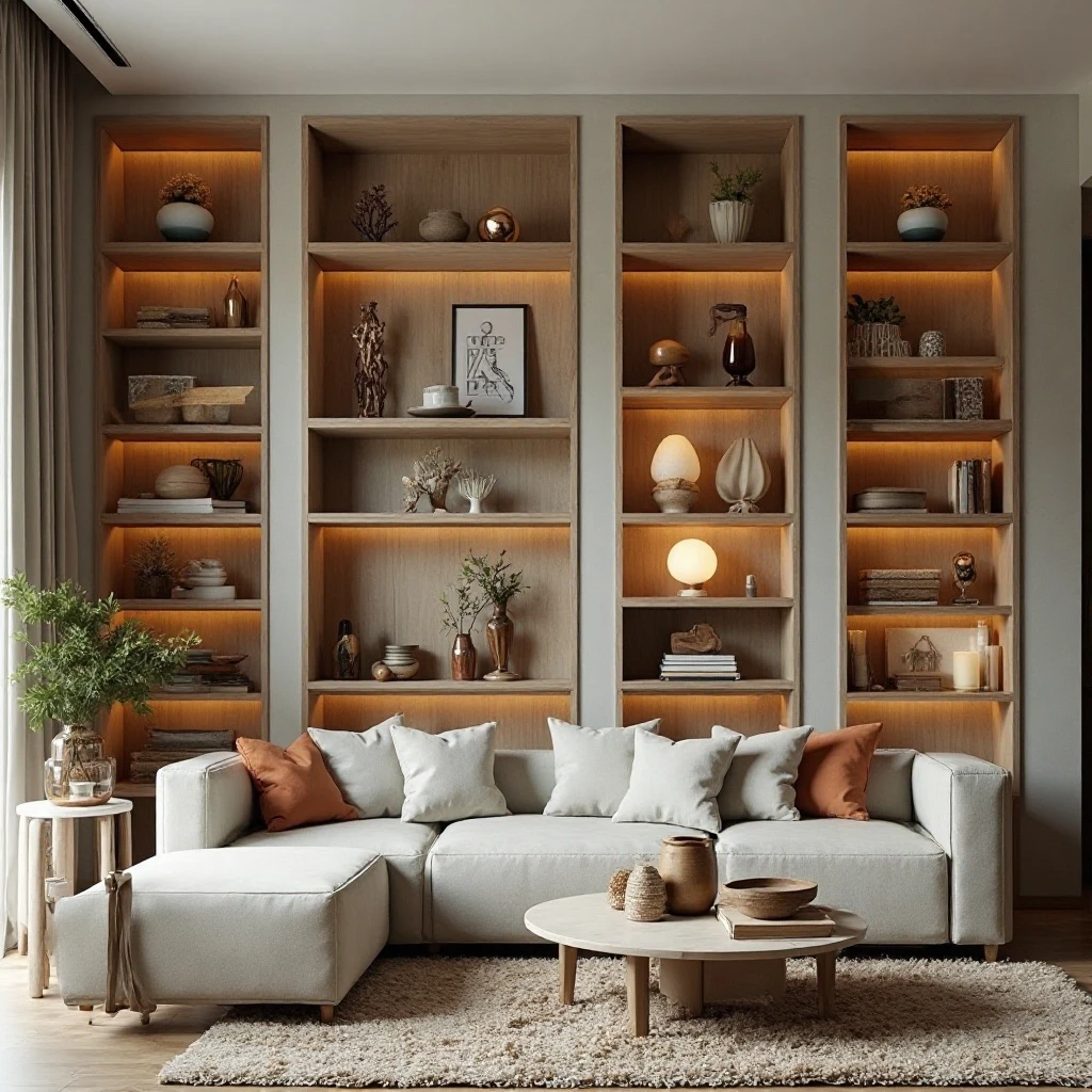
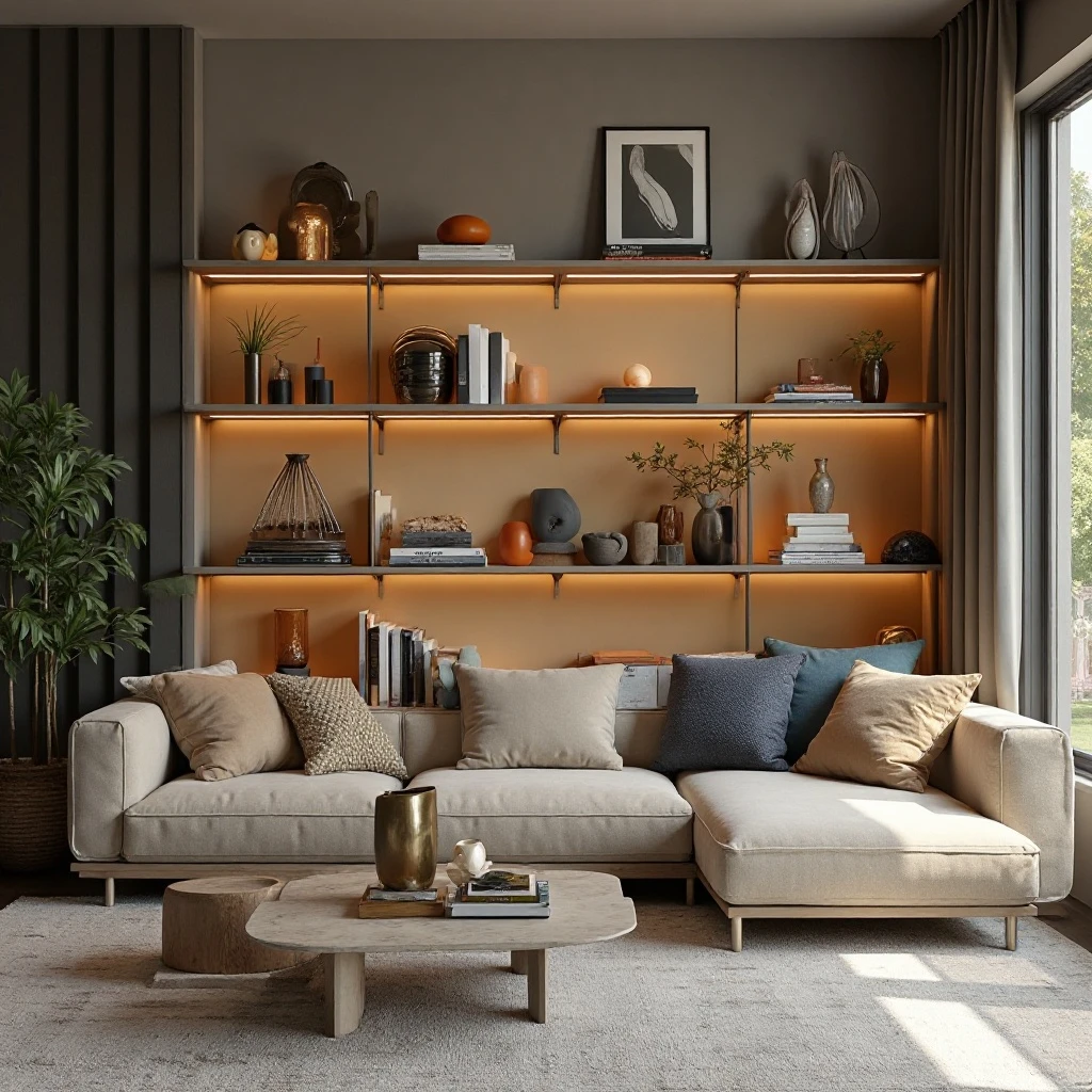
9. Lighting-Integrated Display
Transform shelves into illuminated showcases by incorporating LED strip lights, battery-operated puck lights, or small picture lights that highlight key objects and add ambiance during evening hours. Shop on Amazon
Why It Works: Proper lighting transforms shelves from daytime-only features into 24-hour focal points that create atmosphere and drama. Illumination adds depth, casts intriguing shadows, and draws attention to your best pieces. It’s particularly valuable in rooms lacking architectural lighting or with dim corners.
How to Style It:
- Install LED strip lights along the underside of each shelf, positioned 2-3 inches from the front edge to minimize glare
- Use warm white (2700-3000K) for cozy living spaces rather than cool blue-toned lights
- Place small battery-operated spotlights behind or beneath key objects to create dramatic uplighting or backlighting effects
- Connect lights to a dimmer switch for adjustable ambiance from bright task lighting to subtle mood lighting
Where to Use It: Built-in bookcases, entertainment centers, bar shelving, or any display shelving in spaces used during evening hours
Pro Tip: Hide light sources behind books or larger objects so you see the glow effect rather than the light fixtures themselves, creating a magical floating effect.
10. Styled Storage Baskets and Boxes
Combine form and function by incorporating beautiful storage containers—woven baskets, vintage boxes, or fabric bins—that hide clutter while contributing to the overall aesthetic with texture and pattern. Shop on Amazon
Why It Works: This solves the universal struggle of wanting attractive shelves that also store everyday items like remotes, chargers, toys, or paperwork. Pretty containers maintain the styled look while keeping life’s necessities accessible and organized. It’s the secret weapon of professionally designed spaces that somehow never look messy.
How to Style It:
- Choose containers in consistent materials (all natural fiber, all metal, all fabric) or a cohesive color palette to maintain visual unity
- Vary sizes across the shelving unit—larger baskets on lower shelves for heavier items, smaller decorative boxes on upper shelves
- Mix open and closed storage, leaving some items visible while tucking others away in containers
- Label containers with subtle tags or leave them unlabeled for a cleaner look, organizing contents so items are easy to locate
Where to Use It: Family living rooms, media centers, playroom-adjacent spaces, or multi-functional rooms needing flexible storage
Pro Tip: Spray the inside of decorative baskets with your favorite subtle scent—each time you retrieve something, you’ll get a pleasant sensory bonus.
11. Vertical Line Emphasis with Tall Objects
Create drama and draw the eye upward by incorporating tall, slender objects like candlesticks, narrow vases, or sculptural pieces that emphasize vertical lines and make ceilings feel higher. Shop on Amazon
Why It Works: Vertical emphasis counteracts the horizontal nature of shelves, preventing arrangements from feeling squat or heavy. Height variation creates visual interest and makes standard ceiling heights feel more impressive. This technique is especially valuable in rooms with low ceilings or spaces that feel horizontally stretched.
How to Style It:
- Place at least one tall object (12-18 inches or more) on each shelf level, positioning it off-center rather than in the middle
- Pair tall elements with low, wide objects (bowls, stacked books, small plants) to create pleasing contrast
- Use the rule of threes for height—combine tall, medium, and short objects in triangular arrangements
- Ensure tall objects don’t exceed 80% of the vertical space between shelves to avoid a cramped appearance
Where to Use It: Rooms with standard 8-foot ceilings, horizontal shelving units that feel too wide, or spaces needing to feel more expansive
Pro Tip: Place your tallest objects on lower shelves and gradually decrease height as you move up—this creates a pyramid effect that feels stable and grounded.
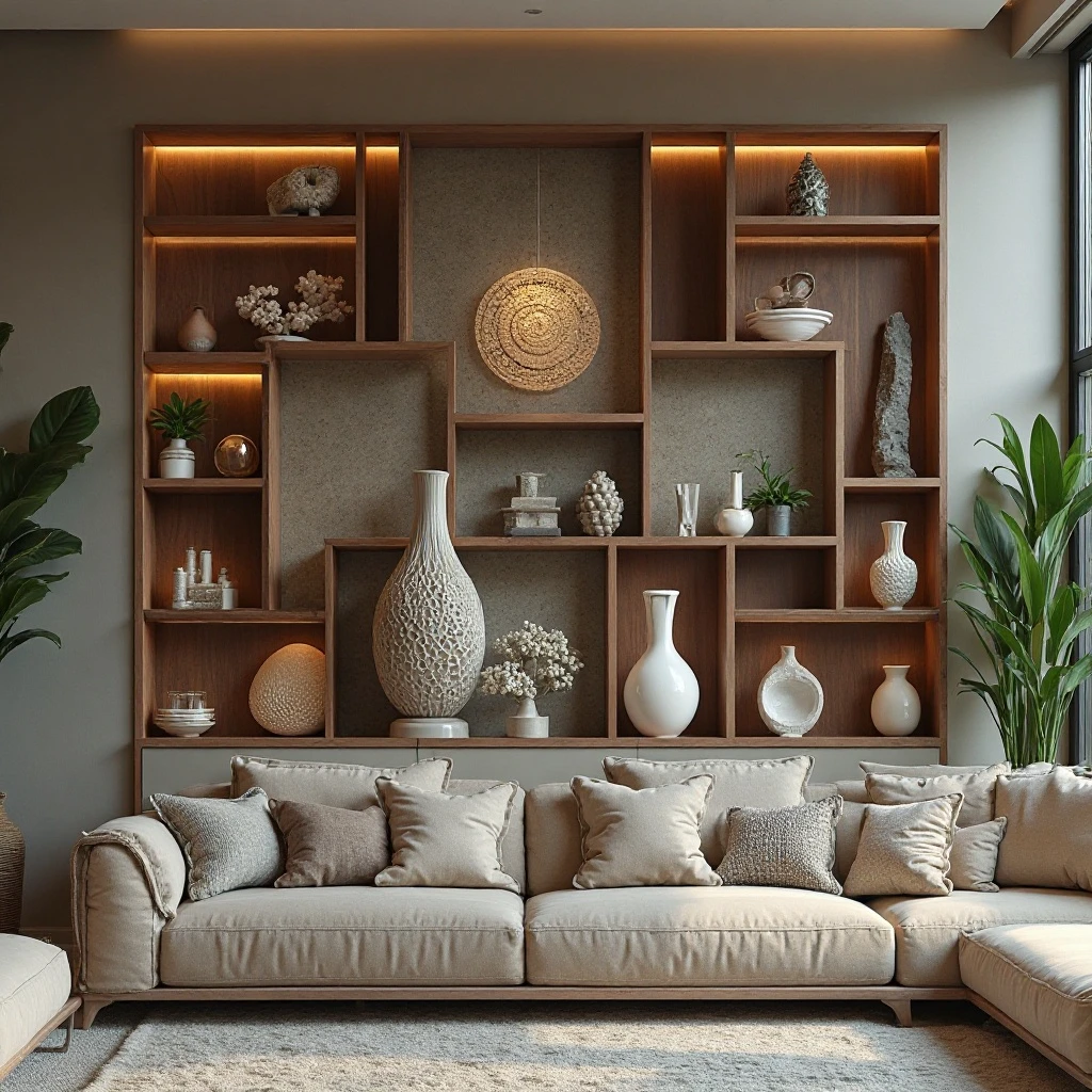
12. Organic Natural Elements
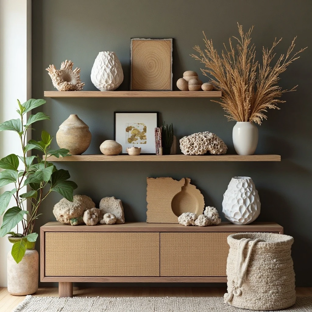
Bring the outdoors in with natural materials like driftwood, stones, dried botanicals, coral, shells, or wood slices that add organic shapes and earthy tones to counterbalance manufactured items. Shop on Amazon
Why It Works: Natural elements provide textural contrast to books and manufactured objects while creating a calming, biophilic connection to nature. They’re free or inexpensive to source, easily replaced seasonally, and work across design styles from coastal to rustic to modern organic. The irregular shapes of natural objects prevent shelves from feeling too rigid or formal.
How to Style It:
- Arrange 3-5 pieces of driftwood or branches in a tall vase as a vertical element, choosing pieces with interesting curves
- Group beach stones, geodes, or crystals in shallow bowls or directly on shelves, clustering odd numbers together
- Display preserved botanicals like pampas grass, dried flowers, or eucalyptus branches in vases for texture without maintenance
- Mix natural elements with more polished pieces to prevent a “beach shack” look—pair driftwood with a sleek modern vase, for example
Where to Use It: Coastal-style living rooms, organic modern spaces, rustic or farmhouse interiors, or any room needing natural warmth
Pro Tip: Treat large interesting pieces of driftwood or branches like sculpture—give them solo placement with plenty of breathing room to showcase their unique forms.
13. Metallic Accent Integration
Add glamour and light reflection with metallic elements in brass, copper, gold, or silver through candlesticks, picture frames, decorative objects, or small mirrors that catch and bounce light. Shop on Amazon
Why It Works: Metallics add sophistication and visual interest without color, making them perfect for neutral schemes. They reflect light to brighten dim corners and add a touch of luxury that elevates the entire space. Mixed metals create an eclectic, collected-over-time look that feels less rigid than matching sets.
How to Style It:
- Distribute metallic pieces throughout the shelving unit rather than clustering them, placing one on every other shelf for consistent sparkle
- Mix metal finishes (brass with silver, copper with gold) but keep one as the dominant metal (60-70% of metallic items)
- Pair metallic objects with matte textures like wood or stone to prevent an overly shiny appearance
- Include various metallic forms—frames, bowls, candlesticks, small sculptures—to add dimensional interest
Where to Use It: Traditional living rooms, glam or Hollywood Regency spaces, contemporary interiors, or dim rooms needing light reflection
Pro Tip: Polish brass and copper monthly to maintain their glow, or embrace the natural patina for a more vintage, lived-in aesthetic.
14. Personal Photograph Gallery
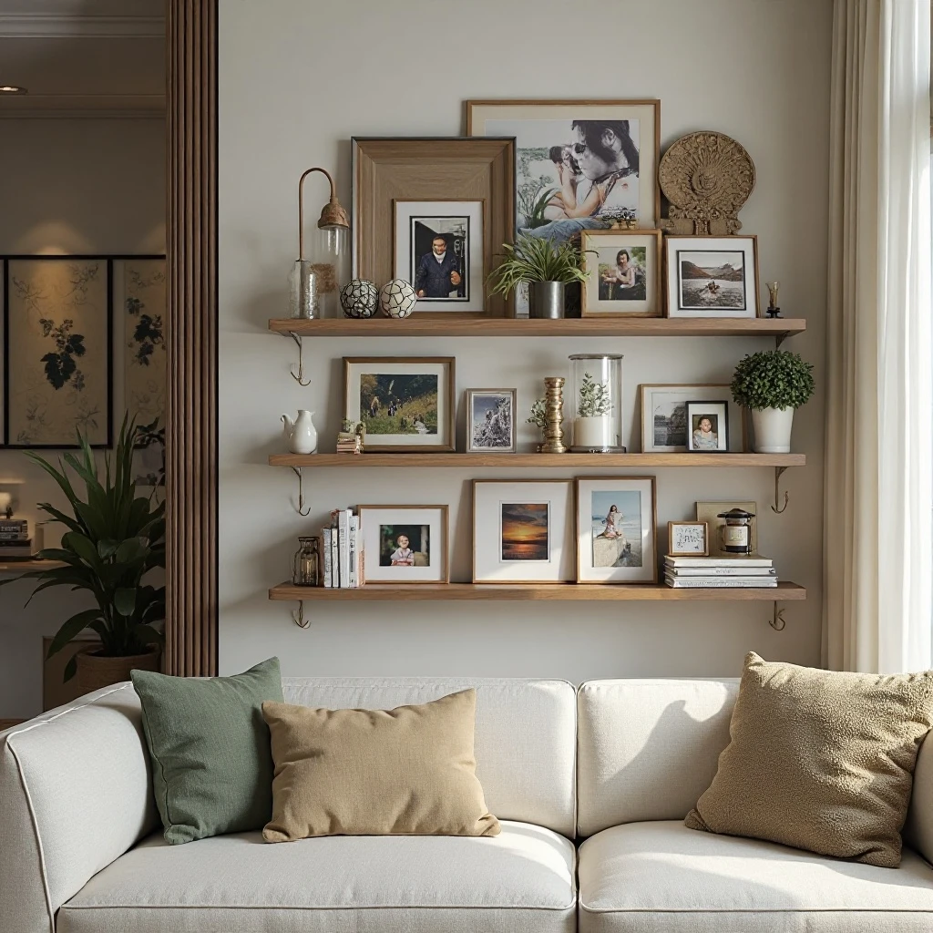
Transform shelves into a three-dimensional photo gallery by displaying framed family photos, travel memories, or art photography in varied frame sizes and orientations, mixing in small mementos from the same experiences. Shop on Amazon
Why It Works: Personal photographs make houses feel like homes and spark joy every time you glance at them. Unlike wall galleries that remain static, shelf displays allow easy rotation for seasons, holidays, or as new memories are created. Mixing frames with related objects (a shell from the beach vacation in the photo, for example) tells richer stories than photos alone.
How to Style It:
- Use 3-5 frame sizes maximum across the entire shelving unit to maintain cohesion, mixing vertical and horizontal orientations
- Choose frames in a unified finish (all black, all natural wood, all white) or metallic for a collected but cohesive look
- Layer smaller frames in front of larger ones, leaning both against the wall at slight angles rather than standing everything rigidly upright
- Leave space between photo groupings for books or objects to prevent the “photo wall” look
Where to Use It: Family living rooms, home offices, reading nooks, or any personal space celebrating relationships and memories
Pro Tip: Print photos slightly larger than your frame opening and trim to fit—this eliminates awkward white borders and makes images look professionally matted.
15. Seasonal Rotation Display
Design shelves for easy seasonal updates by maintaining a consistent base layer of permanent pieces and dedicating specific spots to swappable seasonal elements like holiday décor, seasonal branches, or rotating color accents. Shop on Amazon
Why It Works: Seasonal changes keep your space feeling fresh without requiring complete redesigns, and the rotation brings anticipation and celebration to your home throughout the year. It’s an economical way to embrace trends temporarily without commitment. A well-planned base means seasonal updates take minutes rather than hours.
How to Style It:
- Establish 60-70% permanent pieces (books, classic vases, neutral objects) that remain year-round as your foundation
- Designate specific “seasonal zones”—perhaps the center of each shelf or one full shelf level—for rotating décor
- Invest in storage boxes labeled by season to make swaps quick and organized
- Keep seasonal updates to a consistent color palette per season (oranges and golds for fall, icy blues and whites for winter) to maintain cohesion
Where to Use It: Family living rooms, entryway shelving, mantels with adjacent shelving, or any high-visibility space in your home
Pro Tip: Photograph your favorite seasonal arrangements so you can quickly recreate them next year without the styling stress.
17. Eclectic Travel Souvenir Showcase
Tell your travel story by curating meaningful souvenirs—not every snow globe and keychain, but significant pieces like handmade pottery, textiles, local art, or unique finds—displayed with context that celebrates the experiences behind them. Shop on Amazon
Why It Works: Travel mementos displayed intentionally become meaningful art rather than tchotchke clutter. They’re natural conversation starters that reveal your personality and experiences. This approach transforms generic shelves into a personal museum that evolves with each adventure, making your space truly one-of-a-kind.
How to Style It:
- Edit ruthlessly—display only pieces you truly love that have significant meaning or aesthetic value, typically 8-12 items maximum
- Group items by geography, color, or material type rather than randomly scattering them across all shelves
- Add small labels, vintage maps, or photography books from locations to provide context and enhance the narrative
- Mix souvenirs with travel photography from the same locations, creating paired displays that tell complete stories
Where to Use It: Living rooms of frequent travelers, home offices, reading nooks, or any personal space celebrating global experiences
Pro Tip: Apply the “would I buy this in a store at home?” test to souvenirs—if you wouldn’t purchase it locally for its design merit, it’s probably not strong enough for shelf display.
18. Monochrome Black and White Scheme
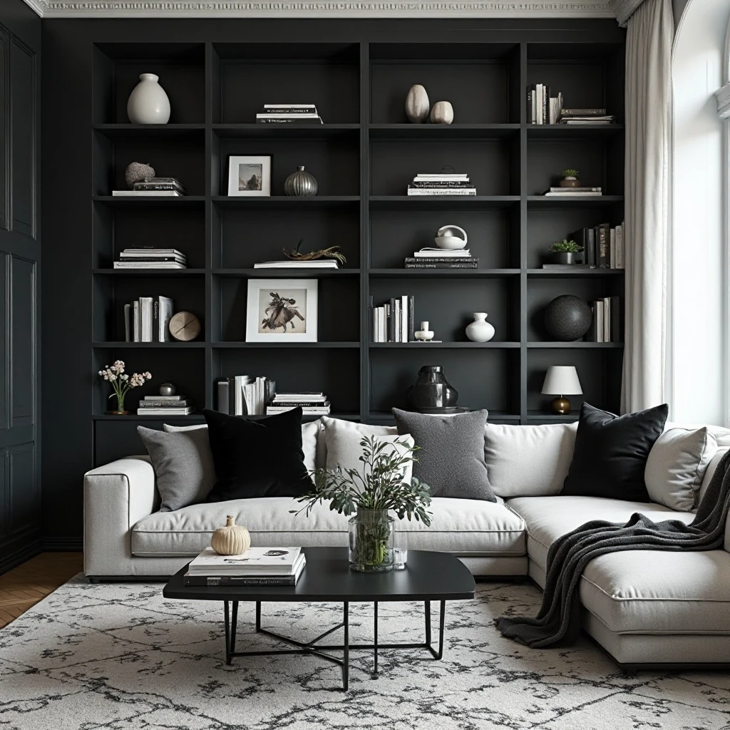
Create striking sophistication by limiting your palette entirely to black, white, and shades of gray through books, objects, photography, and decorative pieces for a gallery-like, high-contrast look. Shop on Amazon
Why It Works: Removing color creates drama through form, texture, and contrast alone. The black and white palette feels timeless, sophisticated, and cohesive regardless of your object sources. It’s particularly effective for making architectural details and the items themselves the stars of the show. This approach also photographs beautifully for anyone who shares their spaces on social media.
How to Style It:
- Select books with black or white spines, turning others backward to show pages if covers don’t match the scheme
- Choose decorative objects in matte black, glossy black, bright white, cream, or gray tones exclusively
- Include black and white photography, graphic prints, or line drawings as focal pieces
- Add textural variety through materials—matte ceramics, glossy lacquer, rough stone, smooth marble—to prevent flatness
Where to Use It: Modern or contemporary living rooms, masculine spaces, gallery walls, minimalist interiors, or rooms with colorful upholstery needing calm shelving
Pro Tip: The 60-30-10 rule applies to monochrome too—use roughly 60% white/light gray, 30% medium gray, and 10% black for balance that doesn’t feel too dark or washed out.
19. Low-Profile Horizontal Arrangement
Keep the eye moving horizontally along shelves rather than up and down by arranging all objects in similar low heights, creating a streamlined, modern look that emphasizes the length of shelving. Shop on Amazon
Why It Works: Low arrangements feel grounded and calm, reducing visual chaos in busy spaces. This approach works beautifully in rooms with dramatic ceiling height where you want to draw attention to the horizontal architecture or in small spaces where vertical emphasis might make ceilings feel lower. It creates a cohesive ribbon of interest at eye level.
How to Style It:
- Keep all objects under 8-10 inches tall, favoring wide bowls, stacked books, low plants, and horizontal sculptures
- Arrange items in linear rows rather than clusters, maintaining consistent spacing (3-4 inches) between pieces
- Use books stacked horizontally as your primary height reference, topping with similarly low decorative objects
- Leave entire upper shelves empty or very minimally decorated to emphasize the intentional low arrangement below
Where to Use It: Long horizontal shelving units, modern interiors, rooms with high ceilings where you want grounded energy, or console table styling
Pro Tip: This style pairs perfectly with one or two tall floor plants placed adjacent to the shelving unit—the contrast makes both elements more impactful.
20. Mixed Media Art Objects
Blur the line between functional shelving and art installation by incorporating sculptural pieces, small art objects, handmade ceramics, or artisan crafts that function as three-dimensional art rather than utilitarian storage. Shop on Amazon
Why It Works: This elevates shelving from storage to gallery space, making your Living Room Shelf Decor feel curated and culturally engaged. Art objects provide visual interest from multiple angles and create shadows and depth that flat items can’t achieve. Supporting artists and artisans adds meaning beyond aesthetics, making each piece a story worth telling.
How to Style It:
- Invest in 3-5 statement art pieces (ceramic sculptures, glass art, metal work, fiber art) rather than many small items
- Give each art object substantial space—at least 6 inches on all sides—to appreciate its form as you would in a gallery
- Mix artistic styles for eclectic interest or choose one medium (all ceramics, all metalwork) for cohesive impact
- Balance art objects with simpler elements like books or plants that provide visual rest between more complex pieces
Where to Use It: Contemporary living rooms, creative home studios, collector spaces, or anywhere celebrating handmade and artistic expression
Pro Tip: Visit local art fairs, pottery studios, and craft markets to find unique pieces at better prices than commercial retailers while supporting local artists directly.
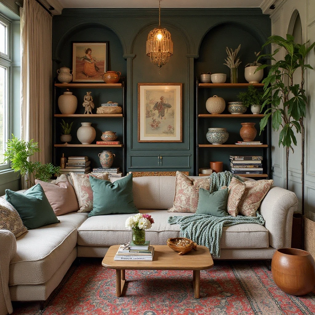
21. Vintage and Antique Curation
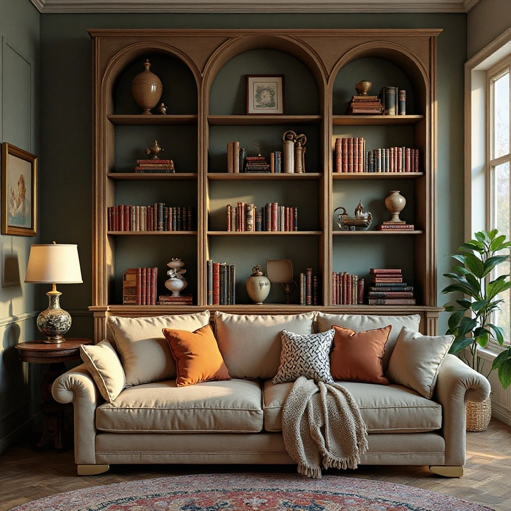
Create character and timelessness by showcasing vintage finds—antique books, heirloom pieces, flea market discoveries, or inherited treasures—that add history and soul impossible to replicate with new items. Shop on Amazon
Why It Works: Vintage pieces provide instant patina and personality that new items take decades to develop. They make spaces feel collected over time rather than bought all at once, adding depth and authenticity. Each piece carries history and craftsmanship often superior to modern mass production. This approach is also sustainable and budget-friendly when you know where to shop.
How to Style It:
- Mix eras rather than creating a museum of one time period—Victorian brass with mid-century ceramics with vintage books
- Embrace imperfections like worn spines, faded colors, or patina as character marks rather than flaws
- Group similar vintage items (old bottles, antique boxes, vintage cameras) to create impact through repetition
- Balance vintage warmth with some modern clean-lined pieces to prevent the “dusty antique shop” effect
Where to Use It: Traditional living rooms, eclectic spaces, cottages and country homes, or any interior valuing history and sustainability
Pro Tip: Learn the difference between valuable antiques and decorative vintage—display valuable pieces securely while using affordable vintage finds for high-traffic or risky spots.
Common Mistakes to Avoid
1. Overcrowding Every Available Space
The impulse to fill every inch of shelf space creates visual chaos and prevents any single item from standing out. When shelves are packed, the eye has nowhere to rest and the overall effect becomes overwhelming rather than curated. Leave at least 30-40% of your shelf space empty, grouping objects with intentional breathing room between arrangements. Empty space is a design element, not wasted space—it allows each displayed item to be appreciated and creates a sense of calm sophistication.
2. Ignoring Scale and Proportion
Placing tiny objects on large expansive shelves makes them disappear, while oversized items on narrow shelves look precarious and uncomfortable. Each object should feel appropriately sized for its shelf—larger, chunkier pieces on lower, deeper shelves, and smaller refined objects on upper, narrower sections. As a rule, objects should occupy roughly one-third to one-half the vertical space between shelves and shouldn’t extend beyond the shelf edge by more than an inch or two.
3. Pushing Everything Against the Back Wall
Lining items flush against the back wall creates a flat, one-dimensional look that lacks depth and sophistication. Instead, layer objects at varying distances from the wall—place some items 2-3 inches forward, lean frames at angles, or overlap smaller objects in front of larger ones. This layering technique creates shadows, dimension, and visual interest that make shelves look professionally styled rather than simply stored.
4. Using Only Small Decorative Objects
Shelves filled exclusively with small knickknacks look cluttered and busy regardless of how carefully arranged. The solution is to incorporate substantial anchor pieces—large vases, sizable sculptures, tall stacks of books, or oversized bowls—that ground your arrangements and provide visual weight. Aim for a mix where 30-40% of your objects are medium to large scale, with smaller pieces acting as supporting details rather than the main show.
5. Neglecting the Bottom Shelf
The lowest shelf often becomes a dumping ground for items that don’t fit elsewhere or is left completely empty because it feels less visible. In reality, bottom shelves anchor your entire arrangement and should receive the same styling attention as eye-level shelves. Use this prime real estate for your largest, heaviest objects like oversized books, substantial baskets, or weighty sculptures that ground the entire shelving unit and provide visual stability.
6. Matching Everything Too Perfectly
When every object coordinates too precisely—matching colors, heights, or styles—the result looks staged and lacks the personality of a lived-in home. The most appealing shelf arrangements include controlled variety: mix matte with glossy, old with new, organic with geometric, and warm tones with cool. Aim for cohesion through one or two unifying elements (a color palette, material type, or style) while allowing individual objects to have distinct personalities within that framework.
Frequently Asked Questions
How many items should I put on each shelf?
The ideal number varies by shelf length, but a good starting point is 3-5 objects or object groupings per 3-foot section, leaving at least 30-40% empty space. For a standard 36-inch shelf, this might be three groupings: a stack of books with a small plant on top, a medium decorative object or vase in the center area, and a framed photo or sculpture on the opposite end.
Deeper shelves allow for layering and can accommodate more items, while shallow shelves (under 8 inches deep) should remain more minimal. Remember that a “grouping” can include multiple items arranged together, so three groupings might actually be 7-10 individual pieces when you include stacked books, clustered objects, or layered frames.
What height should decorative objects be on shelves?
Vary heights intentionally to create visual interest, but generally keep objects between 4-12 inches tall, with occasional taller pieces (up to 18 inches) for drama. The tallest items should occupy no more than 70-80% of the vertical space between shelves to avoid a cramped appearance.
Create rhythm by following a high-low-medium pattern across your shelves—place a tall object on the left, a low grouping in the middle, and a medium-height item on the right, then reverse or vary the pattern on the next shelf. If all objects are similar heights, your shelves will look monotonous; if all are dramatically different, they’ll look chaotic.
Should I arrange books by color or keep them organized by subject?
This depends on whether your shelves serve primarily decorative or functional purposes. For living room display shelves, color-coordinated books create stunning visual impact and make the shelving feel intentional and designed—this works beautifully when books are part of the décor rather than frequently referenced.
For home office or library shelves where you regularly select books to read, organize by subject, author, or genre for practical access, but still consider placing them in attractive arrangements with spines aligned and complementary colored books grouped together. A hybrid approach works well too: organize sections by subject, but within each section arrange by color for both function and beauty.
How do I style shelves without spending a lot of money?
Start by shopping your home—gather items from other rooms, closets, and storage that you love but aren’t currently displaying. Books you already own, dishes or pottery from cabinets, plants from other areas, and personal mementos cost nothing to relocate. Visit thrift stores, estate sales, and flea markets for unique vintage finds at fraction of retail prices.
Bring nature indoors with collected branches, interesting rocks, or foraged botanicals. Focus budget on 1-2 quality statement pieces rather than many mediocre items, and fill in with what you have. DIY options like painting existing objects in fresh colors, creating simple artwork, or repurposing containers as decorative storage stretch budgets significantly while adding personal touches.
What’s the best way to incorporate family photos without making shelves look cluttered?
Limit family photos to 3-5 carefully selected frames per shelving unit, choosing images that are visually strong and personally meaningful rather than including every family snapshot. Use frames in consistent finishes (all black, all wood, or all metallic) but varying sizes to create cohesion while maintaining interest. Integrate photos as part of broader arrangements rather than clustering them together—place one frame with books and a plant, another with decorative objects, spreading them across multiple shelves.
Treat family photos like art by giving them breathing room and intentional placement, and consider black and white prints for a more sophisticated, gallery-like appearance that blends seamlessly with other décor elements.
How often should I dust and rearrange my shelfdécor?
Dust shelves and objects at least every two weeks to prevent buildup, using microfifiber cloths or soft dusters that won’t scratch delicate items—this maintenance task becomes quicker when shelves aren’t overcrowded. Complete rearrangements aren’t necessary more than 2-3 times per year unless you’re doing seasonal updates, as constantly changing arrangements prevents you from truly enjoying your styling work.
However, minor adjustments every few months keep displays fresh: swap one object for another, rotate books forward that haven’t been featured, or move pieces from one shelf to another. When you stop noticing or appreciating your arrangements, that’s the signal it’s time for a refresh rather than adhering to a rigid schedule.
Final Thoughts: Making Your Shelves Uniquely Yours
The most beautifully styled shelves aren’t those that perfectly replicate magazine spreads, but rather those that authentically reflect who you are and what you love. Start with what brings you joy—whether that’s cherished books, collected treasures, or handmade pottery—and build your arrangements around these meaningful anchors. Trust that your personal style, refined over time through experimentation and adjustment, will always outshine any trend.
Remember that shelf styling isn’t about achieving perfection on the first try; it’s about creating a living display that evolves with you. These shelves hold your daily life, marking time through seasons, travels, new interests, and changing aesthetics. The books you’re currently reading, the plant you’re nurturing, the souvenir from last month’s adventure—these authentic touches make your space feel genuinely lived in and loved, which is infinitely more valuable than sterile perfection.
Give yourself permission to play, make mistakes, and continually refine your approach. Move that vase three times until it feels right. Try the plant on the top shelf, then move it down. Mix in something unexpected and see if it works. The beauty of shelves is their flexibility—nothing is permanent, and every adjustment teaches you more about your preferences and style.
Your Next Step: Choose just one shelf today—not your entire shelving unit, just one single shelf—and style it using your three favorite ideas from this guide. Experience the satisfaction of creating one beautiful, intentional space before tackling the rest.
Remember: Your shelves should make you smile every time you walk past them. If they don’t, something needs to change, and that’s perfectly okay. This is your home, your story, and your style—make it count.