30+ Best Wallpaper in Kitchen Ideas
Your kitchen deserves more than plain walls—it deserves a personality as vibrant as the meals you create. Wallpaper in kitchen has evolved from a dated concept to a designer-approved way to inject instant style, hide imperfections, and create a focal point that makes your space feel custom and curated.
Whether you’re working with a tiny galley kitchen or an expansive culinary haven, the right wallpaper can completely transform the heart of your home without the commitment or cost of a full renovation
This post contains affiliate links, which means I may earn a small commission if you decide to buy—at no extra charge to you.
Here 30+ Wallpaper in Kitchen Ideas
1. Classic Subway Tile Wallpaper
A crisp white kitchen featuring realistic subway tile wallpaper Kitchen on the backsplash area, with subtle grout lines and dimensional texture that mimics real ceramic tiles. The clean geometric pattern extends from counter to cabinet, paired with brass fixtures and marble countertops for an elevated look. Shop on Amazon
Why It Works: This gives you the timeless appeal of subway tile without the grout-scrubbing hassle or installation cost. The pattern adds architectural interest while maintaining a clean, bright aesthetic that works with virtually any design style. It’s perfect for renters or anyone wanting the look of tile without permanent commitment.
How to Style It:
- Install only on the backsplash area between counters and upper cabinets for a classic kitchen look with clear boundaries
- Choose vinyl or vinyl-coated options rated for moisture resistance, ideally with a wipeable surface for easy cleaning
- Pair with contrasting grout color in the wallpaper design (gray grout on white tile) for depth and visual interest
- Add floating shelves or a pot rack over the wallpaper to break up the pattern and create dimensional layers
Where to Use It: Backsplash areas, breakfast nook accent walls, butler’s pantry, laundry room with kitchen access
Pro Tip: Apply a clear acrylic sealer designed for wallpaper along the edges near the sink and stove for extra protection against splashes and steam—this extends the life significantly in high-moisture zones.
2. Bold Geometric Patterns
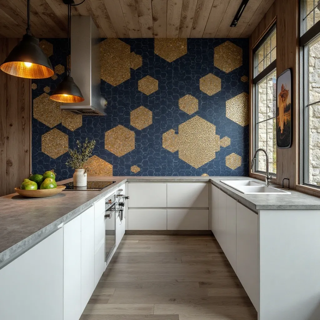
A dramatic kitchen featuring large-scale geometric wallpaper in navy and gold on a single accent wall, with hexagons or bold triangular patterns creating movement. Modern white cabinets and concrete countertops balance the visual weight, while pendant lights echo the angular shapes. Shop on Amazon
Why It Works: Geometric patterns create instant drama and draw the eye upward, making ceilings feel higher and spaces feel more dynamic. The repetition provides visual interest without being overly busy, and the structured nature of geometric designs feels intentional and sophisticated rather than chaotic.
How to Style It:
- Apply to one accent wall only—the wall behind your dining table or the wall opposite your primary work zone
- Choose patterns with at least 60% negative space to prevent the kitchen from feeling claustrophobic
- Echo one color from the wallpaper in 2-3 small accessories (dish towels, canisters, chair cushions) to create cohesion
- Install dimmer switches on nearby lighting to control how boldly the pattern reads throughout the day
Where to Use It: Dining area accent walls, pantry interiors, kitchen islands backing, mudroom transitions
Pro Tip: When selecting geometric wallpaper, hold a sample at arm’s length and squint—if the pattern vibrates or makes your eyes work too hard, it’s too busy for a space where you spend significant time cooking and gathering.
3. Farmhouse Shiplap Wallpaper
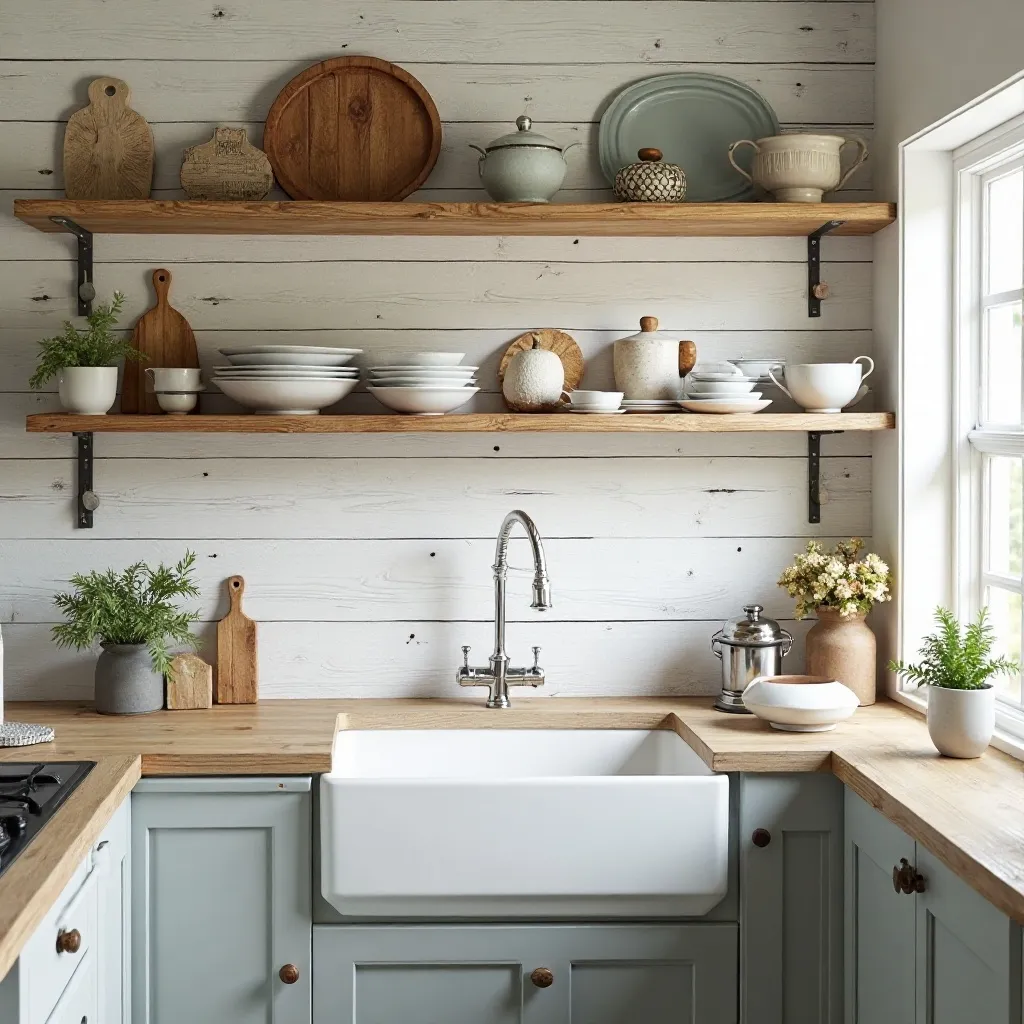
A cozy kitchen showcasing white or weathered gray shiplap-textured wallpaper covering an entire wall, creating authentic farmhouse charm. Open wooden shelving displays vintage dishware, and a farmhouse sink sits below, with the horizontal lines making the space feel wider and more welcoming. Shop on Amazon
Why It Works: Shiplap wallpaper delivers instant farmhouse character with realistic wood grain texture at a fraction of the cost of real planking. The horizontal lines create an illusion of width, making narrow kitchens feel more spacious, while the neutral tones provide a calming backdrop that doesn’t compete with your kitchen activities.
How to Style It:
- Install horizontally to maximize the width-enhancing effect, ensuring the seams align precisely for realistic plank spacing
- Choose textured or embossed versions that catch light naturally and create authentic shadow lines between “planks”
- Layer with rustic elements like wrought iron pot racks, mason jar storage, and butcher block counters for authentic farmhouse cohesion
- Consider a subtle gray or weathered finish rather than pure white to hide minor splashes and avoid a sterile look
Where to Use It: Full wall behind open shelving, breakfast nook surrounding, mudroom entry walls, ceiling applications for cottage charm
Pro Tip: Apply shiplap wallpaper vertically in kitchens with low ceilings to create the illusion of height—it’s unconventional but surprisingly effective in compact spaces where you need every visual trick available.
4. Botanical and Tropical Prints
A bright kitchen alive with lush botanical wallpaper featuring oversized palm leaves, monstera, or tropical foliage in green and white. The pattern covers one statement wall, complemented by natural wood accents, rattan light fixtures, and plenty of natural light streaming through windows. Shop on Amazon
Why It Works: Botanical prints bring the outdoors in, creating a fresh, energizing atmosphere that makes kitchen time feel less like work and more like a retreat. The organic shapes and natural colors reduce stress and add life to the space, while large-scale prints make small kitchens feel more expansive by blurring the boundaries between indoors and out.
How to Style It:
- Select wallpapers with white or cream backgrounds to keep the space bright and prevent botanical prints from overwhelming
- Position on walls with good natural light to enhance the garden-like atmosphere and make colors pop
- Add 2-3 real plants in complementary pots to create depth and make the wallpaper feel intentional rather than decorative
- Keep surrounding colors neutral (whites, natural woods, soft grays) to let the botanical pattern be the star
Where to Use It: Breakfast nook walls, walls opposite windows for reflection, open-concept dining areas, garden room transitions
Pro Tip: Match the scale of your botanical print to your room size—small kitchens need medium-sized leaves (6-10 inches), while spacious kitchens can handle dramatic oversized foliage (18+ inches) without feeling cluttered.
5. Vintage French Country Toile
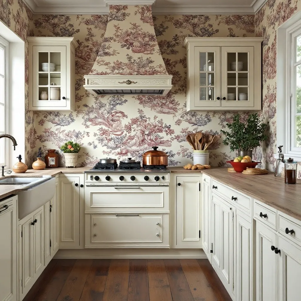
An elegant kitchen featuring classic toile de Jouy wallpaper in traditional navy or red on cream, depicting pastoral scenes of countryside life. The intricate pattern creates sophisticated vintage charm, paired with white cabinetry, copper cookware, and a farmhouse table for authentic French country appeal. Shop on Amazon
Why It Works: Toile instantly elevates a kitchen with Old World sophistication and tells a story through its scenic vignettes. The intricate detailing rewards closer inspection while reading as an elegant texture from a distance, and the traditional color palettes create a timeless look that won’t feel dated in five years.
How to Style It:
- Choose peel-and-stick toile for easier updates, as this is a strong pattern commitment that you may want to change seasonally
- Frame the wallpapered wall with white or cream cabinetry to create clear visual boundaries and prevent pattern overload
- Incorporate copper, brass, or bronze metallic accents that echo the warm tones in classic toile colorways
- Limit the pattern to one wall or a small breakfast nook to maintain the elegant restraint characteristic of French design
Where to Use It: Formal dining areas within kitchen spaces, butler’s pantries, china cabinet backing, ceiling treatments in breakfast rooms
Pro Tip: If traditional toile feels too formal, look for updated versions featuring modern scenes (food markets, chef vignettes, wine country) or contemporary color combinations like charcoal and blush for the same sophisticated structure with fresh appeal.
6. Modern Marble Effect
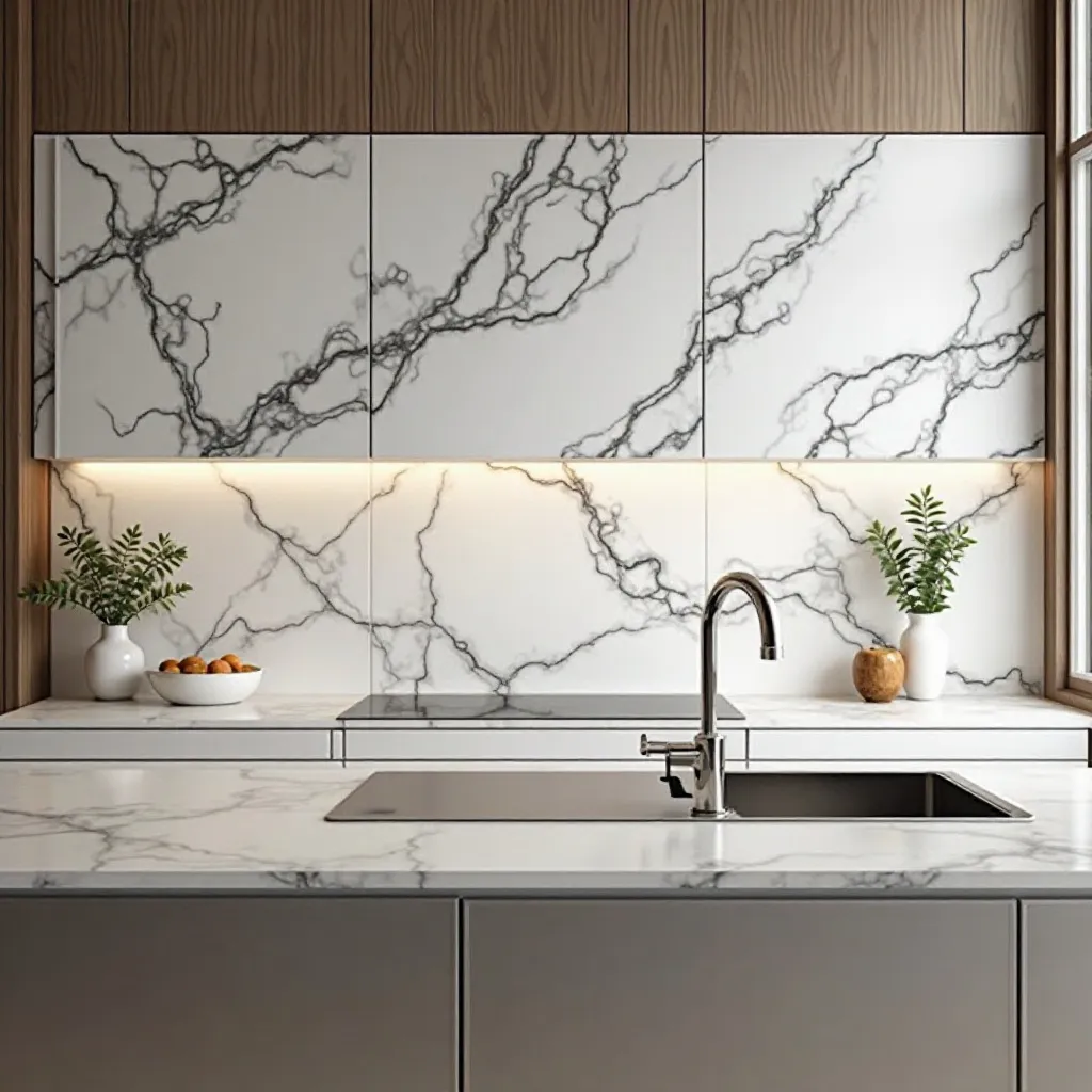
A luxurious kitchen displaying high-end marble wallpaper with realistic veining in white and gray, creating the illusion of expensive stone surfaces. The sophisticated pattern covers a feature wall or backsplash area, paired with minimalist hardware and sleek cabinetry for a contemporary aesthetic. Shop on Amazon
Why It Works: Marble wallpaper delivers million-dollar looks on a reasonable budget, creating instant luxury and sophistication. The natural veining adds organic movement and visual interest without busy patterns, while the neutral palette works seamlessly with both warm and cool color schemes, making it incredibly versatile.
How to Style It:
- Select wallpaper with realistic depth and varied veining—cheap versions with repetitive patterns read as fake immediately
- Apply to vertical surfaces only (walls, not countertops) where the illusion is most convincing and moisture exposure is manageable
- Coordinate the undertone (warm beige-veined or cool gray-veined) with your existing countertops and cabinetry for cohesion
- Add one or two pieces of real marble (a cutting board, mortar and pestle) to legitimize the look through tactile contrast
Where to Use It: Feature walls behind ranges, dining area accent walls, pantry interiors, open shelving backdrops
Pro Tip: Install marble wallpaper on the side of a kitchen island for an unexpected detail that creates a furniture-quality look—it’s protected from direct splashes but adds luxury where guests see it most during gatherings.
7. Black and White Graphic Patterns
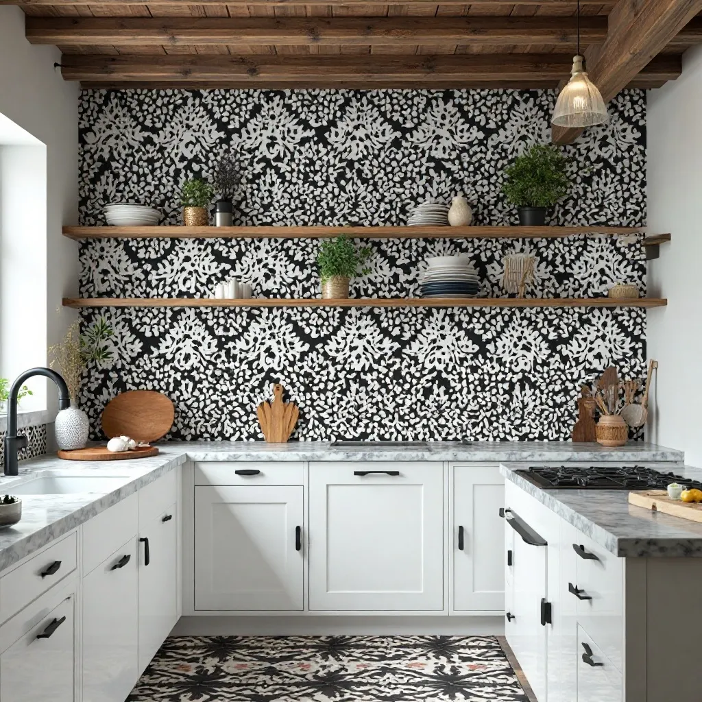
A striking kitchen featuring bold black and white wallpaper with graphic motifs—moroccan tiles, modern damask, or abstract geometrics. The high-contrast pattern creates drama on one accent wall, balanced by white cabinets, black hardware, and marble or quartz countertops that echo the dual-tone scheme. Shop on Amazon
Why It Works: Black and white creates foolproof sophistication that never goes out of style and provides maximum impact with just two colors. The high contrast energizes the space and creates clear focal points, while the neutral palette means you can easily change accent colors seasonally without clashing.
How to Style It:
- Limit to a single accent wall to prevent the high contrast from creating visual fatigue in a space you use daily
- Choose matte finish wallpapers rather than glossy to reduce glare from kitchen lighting and create a more sophisticated look
- Balance the intensity with at least 70% white surfaces elsewhere (cabinets, counters, other walls) to give the eyes rest
- Add one warm metallic (brass, copper, or gold) in small doses to prevent the black and white from feeling cold
Where to Use It: Dining nook focal walls, walls behind open shelving, powder rooms adjacent to kitchens, mudroom entryways
Pro Tip: In smaller kitchens, choose black and white patterns with more white than black (60-70% white background) to maintain brightness while still delivering graphic punch—this prevents the space from feeling cave-like.
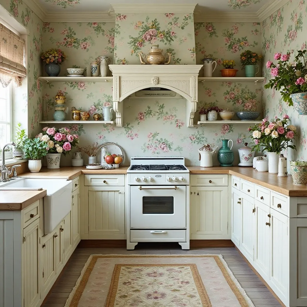
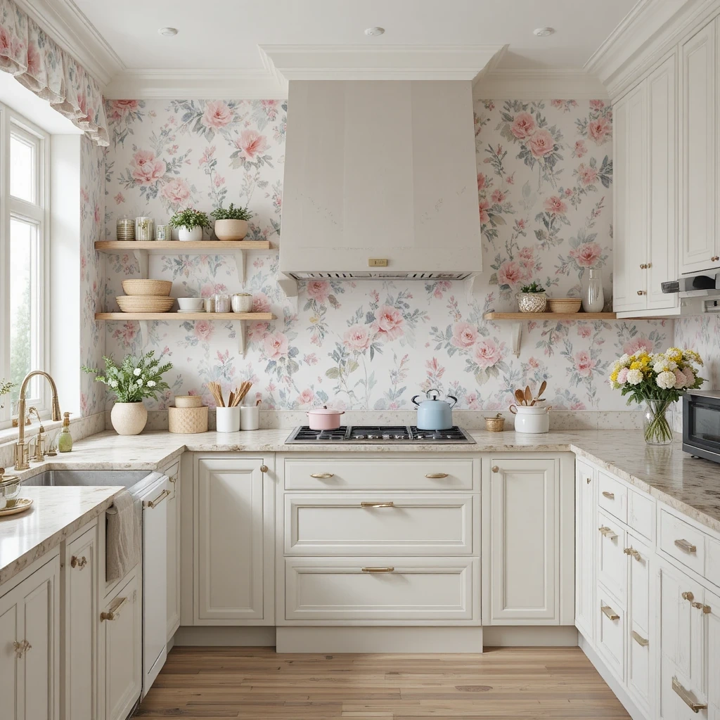
8. Cottage Floral Prints
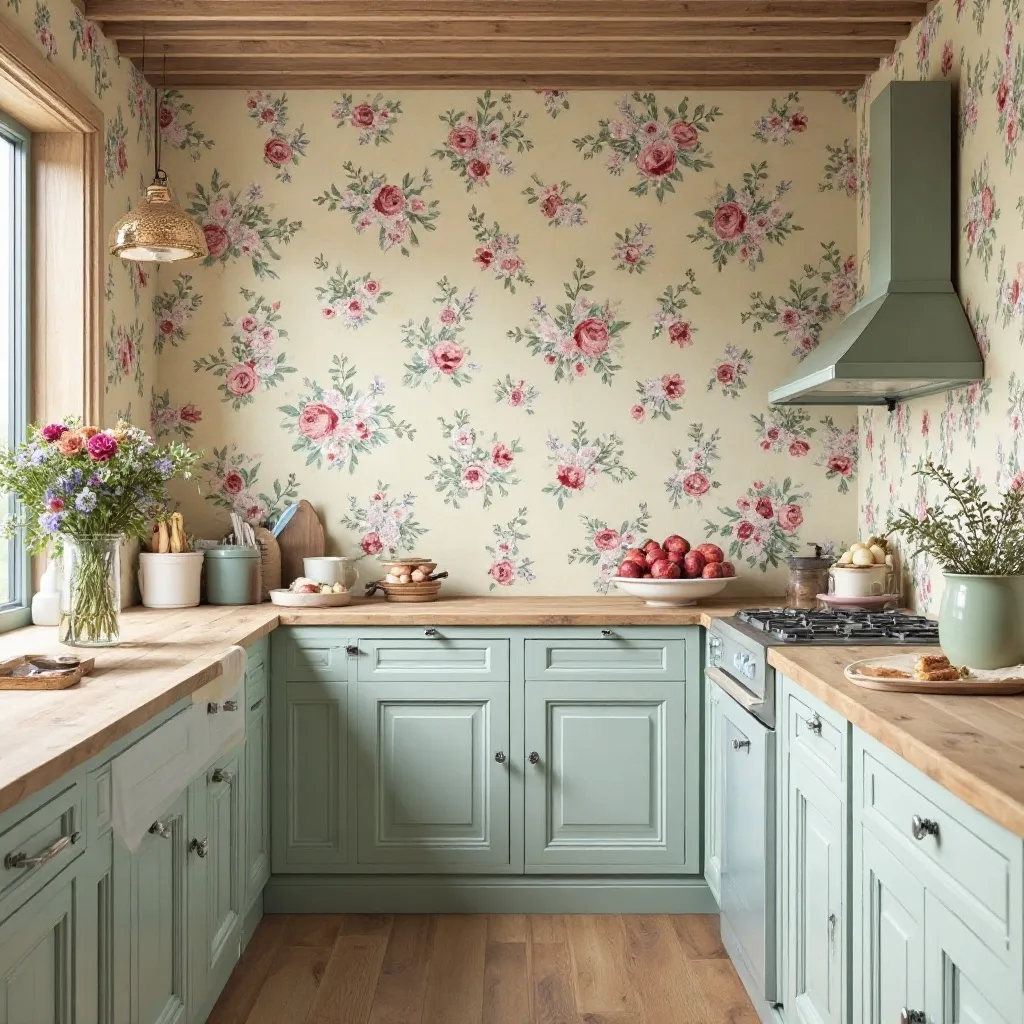
A charming kitchen adorned with romantic floral wallpaper featuring small to medium-sized blooms in soft pastels—roses, peonies, or wildflowers on cream backgrounds. The vintage-inspired pattern creates a cozy, lived-in feeling, complemented by painted wood cabinets, butcher block counters, and vintage accessories. Shop on Amazon
Why It Works: Floral wallpaper softens the hard surfaces inherent to kitchens (cabinets, appliances, countertops) and creates an inviting, homey atmosphere. The repetitive organic shapes are psychologically calming, and the gentle color palettes associated with cottage florals make kitchens feel warm and welcoming rather than sterile and industrial.
How to Style It:
- Select florals with a soft, faded appearance rather than bright, saturated colors for authentic cottage charm and longevity
- Apply behind glass-front cabinets or on walls with minimal obstructions to showcase the pretty pattern without interruption
- Pull 2-3 colors from the floral print for kitchen textiles (curtains, chair pads, dish towels) to create intentional coordination
- Mix in weathered wood tones and vintage finds to support the cottage narrative and prevent the florals from feeling too precious
Where to Use It: Breakfast nook surrounds, walls behind plate racks, laundry areas connected to kitchens, ceiling applications in small eat-in spaces
Pro Tip: If you love florals but worry about them feeling dated, choose botanical illustrations (scientific drawing style) rather than traditional romantic florals—they deliver flower power with a more collected, timeless aesthetic that reads as sophisticated rather than sweet.
9. Textured Grasscloth Effect
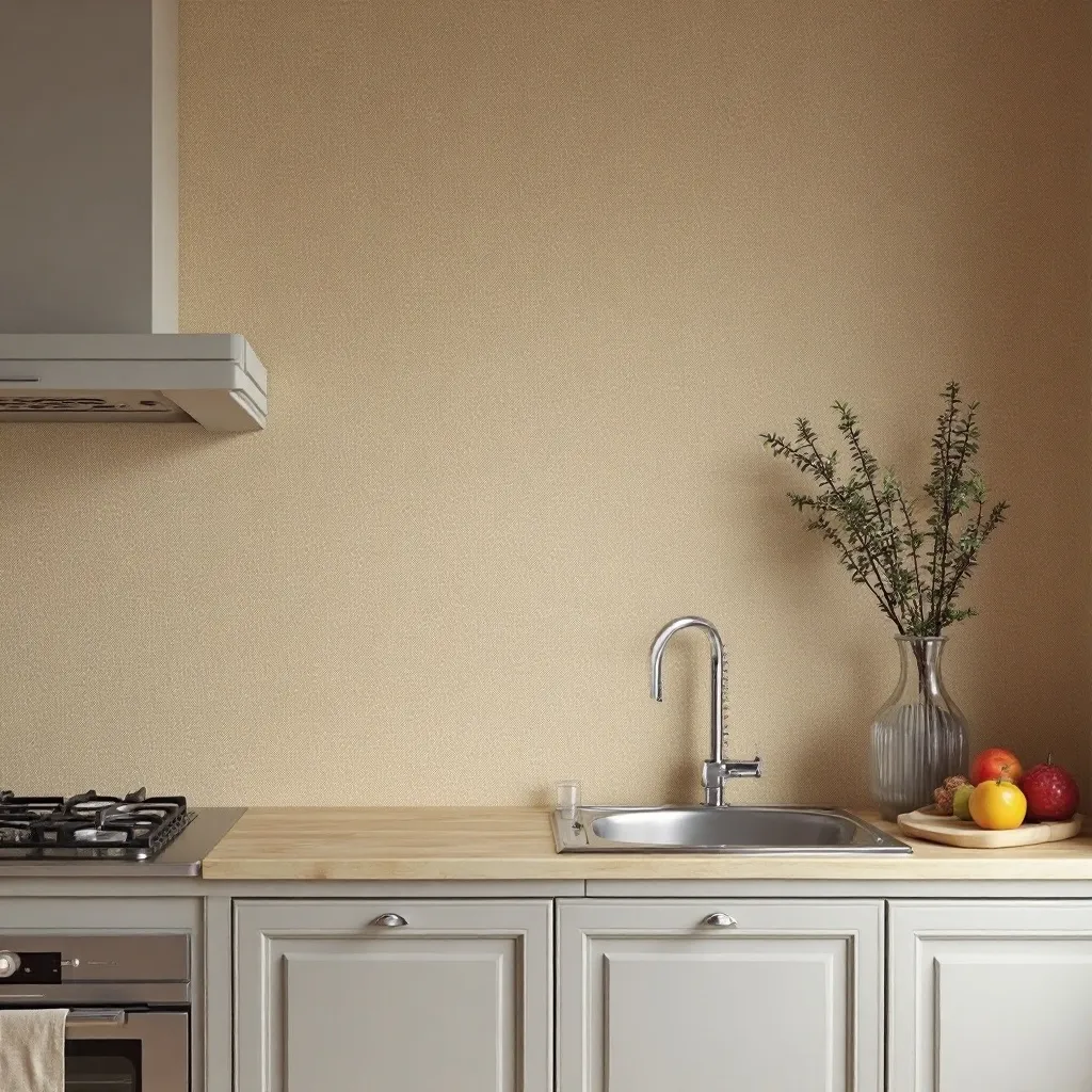
A serene kitchen featuring natural grasscloth-textured wallpaper in warm neutrals—taupe, sand, or soft gray with visible woven texture. The organic material adds depth and sophistication without pattern, creating a calm backdrop that highlights architectural details and brings warmth to modern spaces. Shop on Amazon
Why It Works: Grasscloth texture adds sophisticated depth and absorbs sound, making kitchens feel quieter and more spa-like. The natural variations in the weave ensure no two walls look identical, creating custom character that flat paint can’t achieve. The neutral tones work as a perfect backdrop, letting your kitchen contents and design choices shine.
How to Style It:
- Choose synthetic grasscloth-look wallpapers for kitchens rather than real grasscloth, as they’re wipeable and more moisture-resistant
- Install on walls away from direct water exposure (not immediately behind sinks) to maximize longevity while maintaining the organic look
- Layer with various textures—linen curtains, wooden cutting boards, ceramic dishware—to create a rich, tactile environment
- Use consistent lighting across the grasscloth wall to showcase the texture without creating odd shadows in the woven pattern
Where to Use It: Dining area walls, walls perpendicular to sinks, breakfast room surrounds, transitional spaces between kitchens and living areas
Pro Tip: Grasscloth texture shows every imperfection in your walls, so prep is critical—fill holes, sand smooth, and prime properly, or the texture will amplify rather than hide wall flaws.
10. Mediterranean Tile Patterns
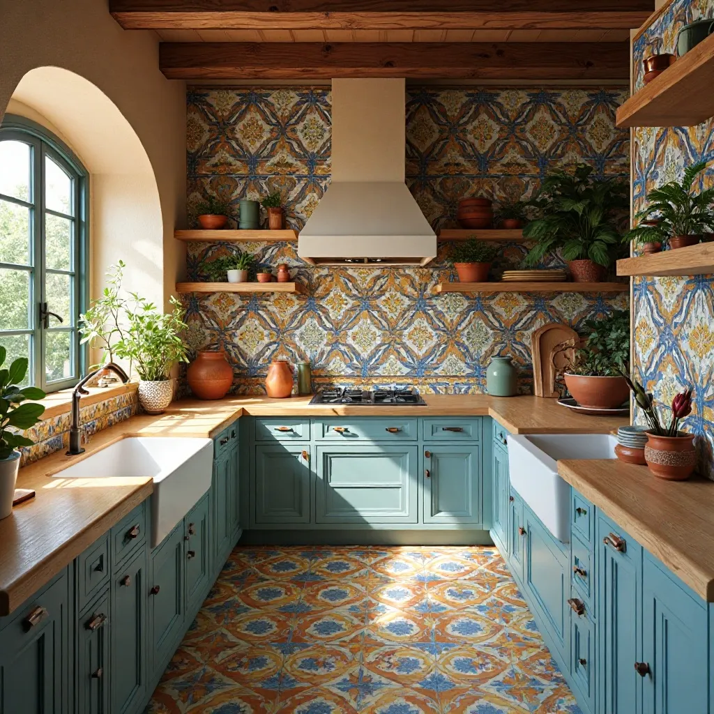
A sun-drenched kitchen showcasing vibrant Mediterranean tile wallpaper with Spanish, Portuguese, or Moroccan-inspired motifs in blues, yellows, and terracotta. The intricate geometric patterns create exotic charm and visual richness, paired with rustic wood beams, terracotta pots, and natural textures. Shop on Amazon
Why It Works: Mediterranean tile patterns instantly transport you to vacation destinations while adding cultural richness and handcrafted appeal. The symmetrical designs create order within complexity, satisfying our desire for both visual interest and psychological calm. The warm, saturated colors energize morning routines and make kitchen time feel more joyful.
How to Style It:
- Limit bold Mediterranean patterns to backsplash areas or single accent walls to prevent sensory overload in busy kitchens
- Choose patterns with 3-4 coordinating colors maximum to maintain cohesion and make decorating easier
- Ground the vibrant patterns with natural materials like wood cutting boards, woven baskets, and terracotta accessories
- Install in kitchens with good natural light, as Mediterranean patterns need brightness to truly shine and avoid feeling muddy
Where to Use It: Backsplash areas, breakfast nook accent walls, outdoor kitchen walls, pantry feature walls
Pro Tip: When using busy Mediterranean patterns, keep your countertops and cabinetry extremely simple (solid colors, minimal hardware) so the pattern remains the star and the space doesn’t compete with itself.
11. Scandinavian Minimalist Prints
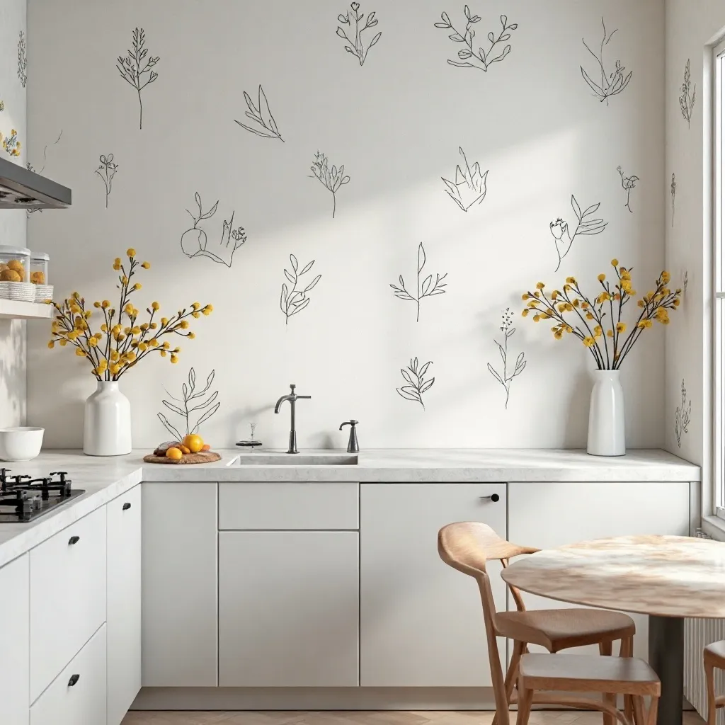
A serene kitchen with subtle Scandinavian-inspired wallpaper featuring simple line drawings, abstract shapes, or minimal botanical elements in soft grays and whites. The understated pattern adds gentle interest without overwhelming, supporting the clean lines and functional beauty of Nordic design. Shop on Amazon
Why It Works: Scandinavian patterns deliver “just enough” visual interest to prevent blandness while maintaining the calm, uncluttered atmosphere essential to Nordic design philosophy. The limited color palettes create cohesion effortlessly, and the functional aesthetic ensures the wallpaper enhances rather than distracts from your kitchen’s purpose.
How to Style It:
- Select patterns with significant negative space (70-80% plain background) to honor the “lagom” principle of just-right balance
- Pair with light wood cabinets (birch, ash, or light oak) and white countertops for authentic Scandinavian harmony
- Add warmth through textiles (linen curtains, wool throws on breakfast nook seating) to prevent the minimalism from feeling cold
- Install throughout the kitchen rather than as an accent wall, since subtle patterns work best when allowed to create an enveloping atmosphere
Where to Use It: Full kitchen walls in open-concept spaces, breakfast nook surrounds, pantry interiors, mudroom walls
Pro Tip: Scandinavian wallpaper works best in kitchens flooded with natural light—if your kitchen is dark, the subtle patterns will disappear entirely, so consider adding under-cabinet lighting or increasing your lighting scheme before installing.
12. Industrial Brick Effect
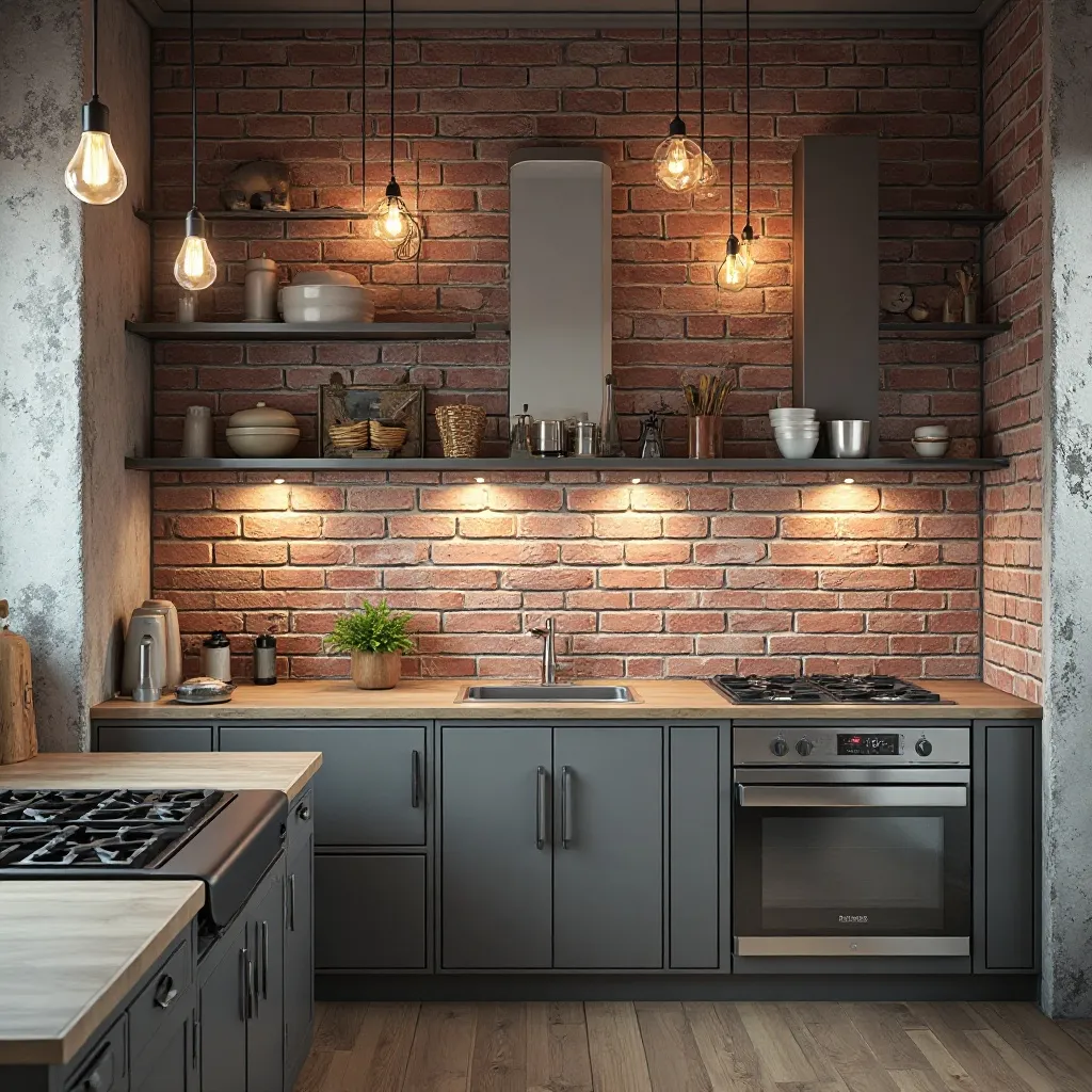
A modern urban kitchen featuring realistic brick wallpaper in exposed red brick, whitewashed brick, or industrial gray concrete brick. The textured pattern adds architectural character and loft-style edge, paired with metal open shelving, Edison bulb lighting, and stainless steel appliances. Shop on Amazon
Why It Works: Brick wallpaper delivers instant age and character to new or bland spaces, creating the authentic patina that makes kitchens feel storied and collected. The industrial aesthetic pairs beautifully with modern appliances, and the texture adds depth without the structural concerns, weight, or cost of real masonry.
How to Style It:
- Choose embossed or textured brick wallpaper rather than flat printed versions for dimensional authenticity that catches light realistically
- Apply to full walls rather than small sections—brick needs scale to look intentional rather than like a failed DIY project
- Balance the rough industrial texture with softer elements (upholstered barstools, wooden cutting boards, fabric window treatments)
- Consider darker brick tones (charcoal or deep red) for larger kitchens and lighter whitewashed versions for compact spaces
Where to Use It: Full accent walls in loft-style homes, backsplash areas in industrial kitchens, basement kitchen walls, urban apartment kitchens
Pro Tip: For the most realistic brick effect, install the wallpaper slightly imperfectly—real brick walls aren’t perfectly plumb, so allowing slight variations actually increases authenticity rather than detracting from it.
13. Art Deco Glamour
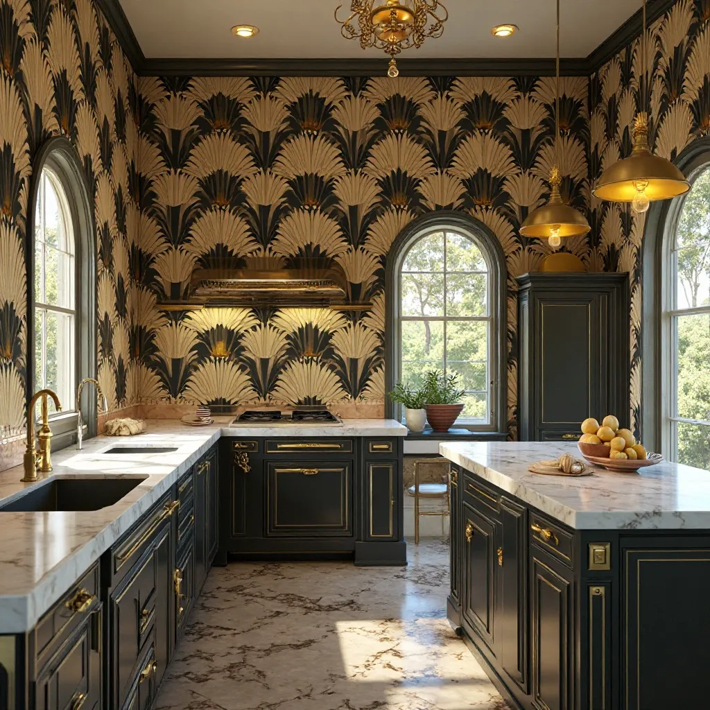
An elegant kitchen featuring Art Deco wallpaper with geometric fans, sunbursts, or chevron patterns in gold, black, and cream. The sophisticated pattern creates 1920s glamour and architectural drama, complemented by mirrored backsplashes, brass fixtures, and luxurious marble surfaces. Shop on Amazon
Why It Works: Art Deco patterns bring Hollywood glamour and timeless sophistication that elevates everyday cooking to an event. The symmetrical, geometric nature of Art Deco creates order and luxury simultaneously, while the metallic accents catch light beautifully, making kitchens feel more expensive and intentionally designed.
How to Style It:
- Incorporate metallic wallpapers (actual metallic ink, not just printed gold) to achieve authentic Art Deco shimmer and depth
- Limit the pattern to one statement wall and echo the geometric motifs in light fixtures or cabinet hardware
- Balance the glamour with functional elements—Art Deco works best when mixed with modern conveniences rather than trying to create a museum
- Layer various metallic finishes (brass faucets, copper pots, gold-framed artwork) to create the rich, layered look characteristic of the era
Where to Use It: Formal dining areas within kitchens, bar areas, butler’s pantries, powder rooms adjacent to entertaining spaces
Pro Tip: Art Deco wallpaper demands confidence—if you’re going to do it, commit fully with coordinated hardware and lighting rather than treating it as an afterthought, or the look will fall flat and feel costumey.
14. Nautical Stripes
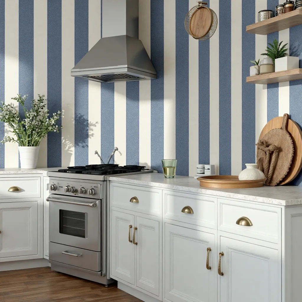
A fresh coastal kitchen with classic striped wallpaper in navy and white, soft blue and cream, or gray and white. The clean vertical or horizontal lines create crisp sophistication and nautical charm, paired with rope details, natural wood, and maritime-inspired accessories. Shop on Amazon
Why It Works: Stripes are foolproof geometry that always looks intentional and polished, while the nautical associations evoke vacation homes and relaxed coastal living. The linear pattern guides the eye and can either heighten ceilings (vertical stripes) or widen walls (horizontal stripes), giving you architectural control through simple pattern choice.
How to Style It:
- Choose stripe widths proportional to your wall size—narrow stripes (1-2 inches) for small kitchens, wide stripes (4-6 inches) for spacious ones
- Run stripes vertically to draw attention to architectural features like tall ceilings or beautiful windows
- Maintain crisp contrast (not washed-out pastels) to achieve the clean, graphic impact that makes nautical stripes work
- Add natural fiber elements (jute rugs, sisal baskets, rope-wrapped vessels) to reinforce the coastal narrative authentically
Where to Use It: Breakfast nook walls, walls behind open shelving, backsplash areas in coastal homes, mudroom entryways
Pro Tip: If traditional navy and white feels too predictable, try unexpected nautical color combinations like charcoal and cream, or sage green and white—you’ll maintain the striped structure while creating something more personal and current.
15. Chinoiserie Elegance
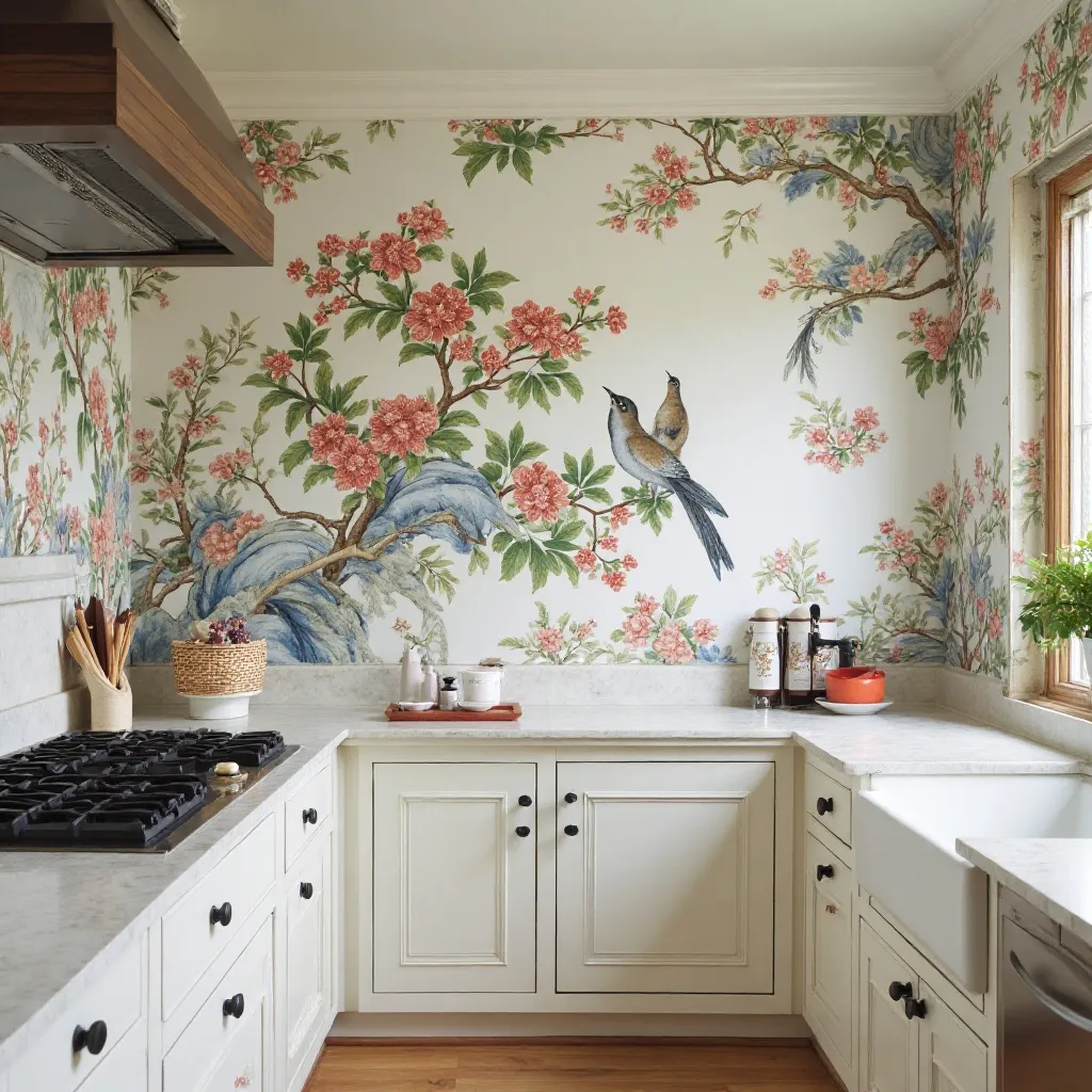
A refined kitchen featuring delicate Chinoiserie wallpaper with hand-painted birds, cherry blossoms, pagodas, or exotic foliage in traditional blue and white or modern interpretations with coral and gold. The artistic pattern creates collected sophistication and worldly elegance, balanced by simple cabinetry and classic fixtures. Shop on Amazon
Why It Works: Chinoiserie brings centuries of artistic tradition and instantly makes spaces feel curated and sophisticated rather than cookie-cutter. The hand-painted aesthetic (even in wallpaper form) adds artisan quality, while the exotic motifs create conversation pieces that reward closer inspection and make your kitchen memorable.
How to Style It:
- Select one focal wall for Chinoiserie to prevent the detailed pattern from overwhelming—this is statement wallpaper, not background
- Pull one color from the pattern for small repeated accents (cabinet interiors, chair cushions, pottery) to create intentional coordination
- Balance the ornate pattern with extremely simple cabinet fronts (flat panel or shaker) in solid colors
- Add authentic Asian-inspired accessories sparingly (a ceramic ginger jar, bamboo utensil holder) rather than theme-ing the entire kitchen
Where to Use It: Dining area focal walls, butler’s pantry feature walls, breakfast room surrounds, powder rooms near entertaining areas
Pro Tip: Modern Chinoiserie with unconventional colors (black backgrounds, jewel tones, metallic accents) feels fresh and current rather than traditionally formal—perfect if you love the artistic style but want something less predictable than classic blue and white.
16. Vintage Americana
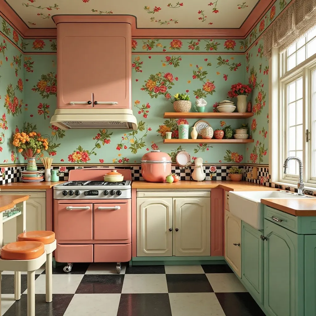
A nostalgic kitchen featuring retro Americana wallpaper with 1950s diner motifs, vintage fruit baskets, cherry patterns, or mid-century atomic designs. The playful patterns create cheerful energy and throwback charm, paired with chrome accents, checkered details, and colorful vintage appliances or accessories. Shop on Amazon
Why It Works: Vintage Americana taps into nostalgia and simpler times, making kitchens feel welcoming and unpretentious. The cheerful colors and whimsical motifs create good mood energy that’s perfect for the social nature of kitchens, while the retro aesthetic has permanent style credibility thanks to mid-century modern’s enduring appeal.
How to Style It:
- Choose authentic vintage reproduction wallpapers rather than cartoon-y versions for patterns that feel genuinely collected
- Limit color palette to 3-4 hues maximum (plus background) to prevent the retro look from becoming chaotic
- Mix authentic vintage pieces (a real Pyrex collection, vintage signs) with modern conveniences for livable nostalgia
- Install in eat-in areas or breakfast nooks rather than working kitchen zones to keep the playful patterns from interfering with serious cooking
Where to Use It: Breakfast nook surrounds, pantry interiors, vintage-themed eat-in areas, retro diner-style kitchen bars
Pro Tip: If full-scale vintage patterns feel too committed, look for wallpapers featuring vintage-style typography or simple retro geometrics—you’ll capture the era’s spirit with more restraint and longevity.
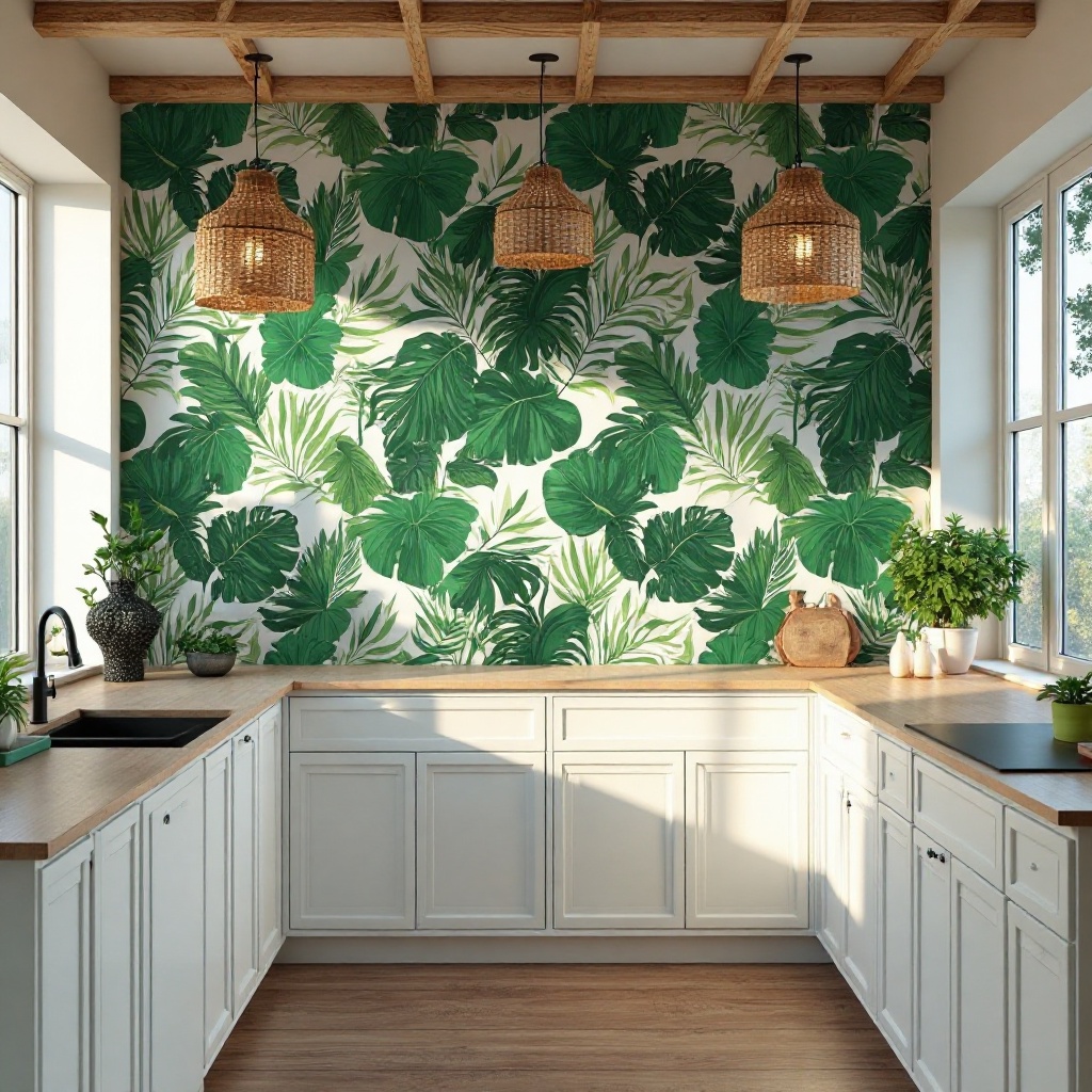
17. Modern Tropical Leaves
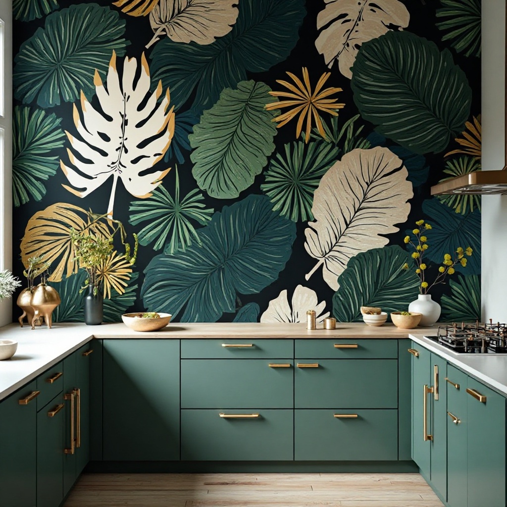
A contemporary kitchen featuring oversized tropical leaf wallpaper in sophisticated colorways—black and white, navy and gold, or emerald green on charcoal. The dramatic foliage creates bold impact with modern restraint, avoiding kitschy tiki vibes through refined color choices and scale. Shop on Amazon
Why It Works: Modern tropical brings nature’s drama indoors with designer sophistication rather than resort clichés. The large-scale organic shapes create instant focal points and architectural interest, while the unexpected color treatments (not the predictable green and white) ensure the look feels curated and current rather than trendy.
How to Style It:
- Select wallpapers with oversized leaves (18-24+ inches) for maximum impact and contemporary scale rather than traditional botanical sizing
- Choose sophisticated, moody colorways rather than bright greens to avoid the pattern reading as juvenile or theme-y
- Apply to one full wall without interruption—modern tropical needs space to breathe and show its full drama
- Keep surrounding elements minimal and modern (sleek cabinets, simple hardware, clean-lined furniture) to let the pattern dominate
Where to Use It: Statement walls in open-concept kitchens, dining area focal walls, walls opposite large windows, contemporary breakfast rooms
Pro Tip: Modern tropical works best in kitchens with abundant natural light and high ceilings—the dramatic scale needs physical and visual space, or it can overwhelm and make rooms feel smaller and darker.
18. English Cottage Garden
A charming kitchen enveloped in lush English garden wallpaper featuring climbing roses, cottage flowers, and romantic foliage in soft watercolor tones. The romantic pattern creates storybook charm and garden-room atmosphere, complemented by painted furniture, vintage linens, and collected accessories.Shop on Amazon
Why It Works: English garden wallpaper creates instant romance and makes kitchens feel like charming garden sheds where magic happens. The layered florals and climbing vines add vertical interest and softness, while the cottage aesthetic encourages a relaxed, welcoming approach to entertaining that puts guests at ease.
How to Style It:
- Choose watercolor or vintage print styles rather than photographically realistic florals for authentic cottage appeal
- Apply to walls with architectural interest (around windows, framing doorways) to enhance the garden-room illusion
- Layer with mismatched vintage china, glass jars filled with fresh flowers, and collections of botanical prints
- Balance the romantic florals with practical elements (butcher block counters, open shelving, farmhouse sinks) to keep the space functional
Where to Use It: Breakfast room surrounds, walls around garden windows, cottage-style eating areas, sunroom extensions to kitchens
Pro Tip: English cottage garden wallpaper looks most authentic on imperfect walls—don’t stress about perfect application, as slight wrinkles and variations actually enhance the collected, lived-in feeling that makes cottage style so appealing.
19. Modern Concrete Texture
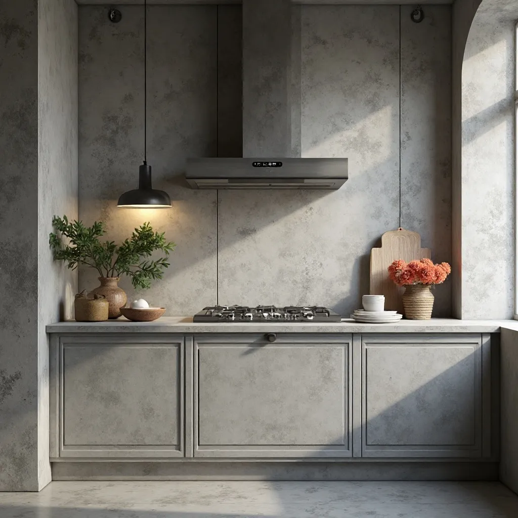
An industrial-chic kitchen showcasing realistic concrete wallpaper with subtle variations in tone and texture, creating authentic urban loft character. The neutral gray backdrop provides sophisticated texture without pattern, allowing modern cabinetry, statement lighting, and art to take center stage. Shop on Amazon
Why It Works: Concrete texture delivers industrial edge with sophisticated neutrality, creating gallery-like backdrops that make everything look more expensive. The subtle variations provide visual interest without competing for attention, and the raw material aesthetic pairs perfectly with both rustic and ultra-modern elements for versatile styling options.
How to Style It:
- Select wallpapers with realistic color variation and subtle texture rather than flat gray for authentic concrete character
- Pair with warm wood tones (walnut, oak, teak) to prevent the gray from feeling cold or prison-like
- Add brass, copper, or black metal fixtures and hardware to create warm contrast against the cool gray backdrop
- Install throughout the kitchen for cohesive loft atmosphere rather than treating it as an accent—concrete works best as an enveloping environment
Where to Use It: Full kitchen walls in loft spaces, urban apartment kitchens, basement kitchens, industrial-modern designs
Pro Tip: Concrete wallpaper shows dirt and smudges more readily than busier patterns, so choose wipeable, vinyl-coated versions and commit to regular maintenance—the trade-off is worth it for the sophisticated gallery aesthetic.
20. Moroccan Zellige Tiles
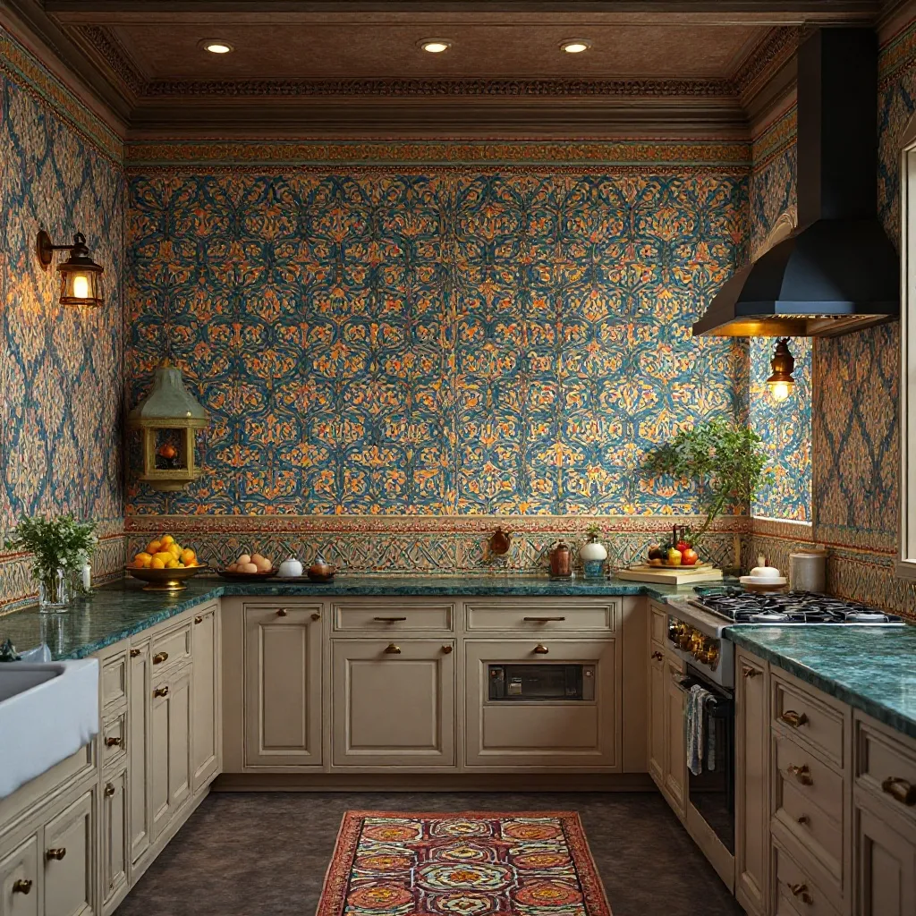
A vibrant kitchen displaying intricate Moroccan zellige tile wallpaper with handcrafted geometric patterns in rich jewel tones—sapphire, emerald, ruby, and gold. The mesmerizing pattern creates exotic luxury and artisan appeal, paired with brass accents, lantern-style lighting, and carved wood details. Shop on Amazon
Why It Works: Zellige patterns bring centuries of artisan tradition and create instant exotic sophistication that transports you to Moroccan riads. The geometric precision within organic, hand-crafted variations satisfies our desire for both order and authenticity, while the rich colors create warmth and luxury that makes kitchens feel special and collected.
How to Style It:
- Limit to backsplash areas or single accent walls to prevent the intricate patterns from creating visual exhaustion
- Choose wallpapers with metallic accents (gold, copper) to catch light and create authentic glazed tile shimmer
- Ground the bold patterns with simple white or cream cabinetry and solid-surface countertops in neutral tones
- Add authentic Moroccan elements (brass tea service, carved wood cutting boards, woven poufs for seating) to legitimize the aesthetic
Where to Use It: Backsplash areas, breakfast nook feature walls, pantry interiors, bar areas in open-concept spaces
Pro Tip: Moroccan patterns work best in kitchens with good natural light and high ceilings—the intricate details need illumination to truly shine, and the busy patterns need physical space to breathe without overwhelming.
21. Japanese Shibori
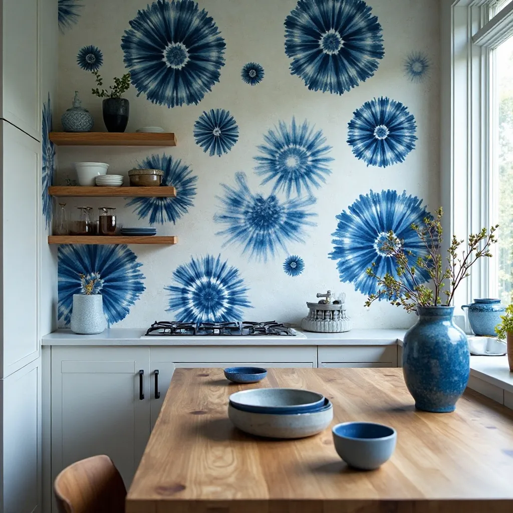
A serene kitchen featuring modern Shibori-inspired wallpaper with indigo tie-dye patterns, creating organic circular motifs and fluid movement. The hand-crafted aesthetic brings artisan sophistication and meditative calm, paired with natural wood, ceramic accessories, and minimal modern design. Shop on Amazon
Why It Works: Shibori combines pattern with organic flow, creating visual interest that feels calming rather than stimulating—perfect for kitchen spaces. The hand-dyed aesthetic adds artisan value and uniqueness, while the indigo and white color palette works seamlessly with virtually any design style from coastal to contemporary.
How to Style It:
- Choose large-scale Shibori patterns (12+ inch repeats) for contemporary impact rather than traditional small-scale versions
- Apply to one feature wall where the organic pattern can be appreciated without interruption from cabinets or appliances
- Layer with natural materials (ceramic, wood, stone) to honor the handcrafted spirit of traditional Shibori dyeing
- Keep color palette restrained—Shibori works best with indigo and white plus one warm wood tone rather than multiple competing colors
Where to Use It: Dining area walls, meditative breakfast nooks, walls behind minimalist open shelving, contemporary Japanese-inspired kitchens
Pro Tip: Shibori patterns have natural irregularity, so don’t stress about perfect pattern matching at seams—slight misalignments actually enhance the handcrafted, organic quality that makes Shibori appealing.
22. Colorful Patchwork Tiles
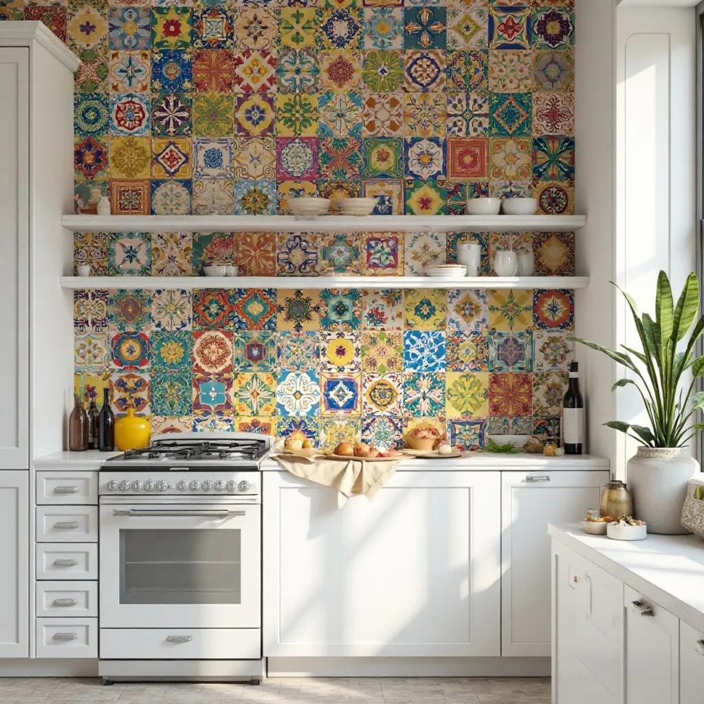
An eclectic kitchen featuring vibrant patchwork tile wallpaper with mismatched Mediterranean, Moroccan, and Spanish patterns creating bohemian energy. Each tile design differs, creating collected charm and visual richness, balanced by simple white cabinets and neutral surfaces that let the pattern shine. Shop on Amazon
Why It Works: Patchwork patterns deliver maximum personality and create the illusion of collected tiles from world travels without the cost or commitment. The mix-and-match aesthetic encourages creative expression and makes kitchens feel personally curated rather than catalog-ordered, while the variety prevents visual boredom that can come with repetitive patterns.
How to Style It:
- Limit patchwork patterns to backsplash areas or small accent walls (4-6 feet maximum) to prevent visual chaos
- Choose patterns with a cohesive color story (all cool tones or all warm tones) to maintain unity within variety
- Pair with extremely simple solid-color cabinets and minimal hardware so the tiles remain the undisputed focal point
- Add 2-3 accessories that pull colors from the tiles (a tea kettle, cutting board, dish towels) to create intentional connections
Where to Use It: Backsplash areas in eclectic kitchens, small breakfast nook walls, pantry feature walls, bohemian-style cooking spaces
Pro Tip: When working with busy patchwork patterns, install them in areas where you’ll see them in passing rather than stare at them continuously—they work beautifully as you move through the kitchen but can be overwhelming if positioned directly in front of your primary work station.
23. Minimalist Line Drawings
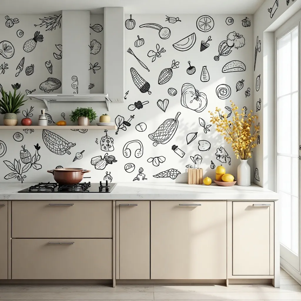
A refined kitchen featuring simple line art wallpaper with continuous single-line drawings of vegetables, kitchen tools, faces, or abstract shapes in black on white. The artistic pattern creates sophisticated gallery appeal and contemporary edge, paired with modern cabinetry and minimal accessories. Shop on Amazon
Why It Works: Line drawing wallpaper brings art gallery sophistication to everyday spaces, creating visual interest through concept rather than color or complexity. The simplicity feels intentional and curated, while the subject matter can add personality without overwhelming—perfect for those who want pattern without visual busyness.
How to Style It:
- Select kitchen-appropriate subjects (vegetables, herbs, coffee cups, utensils) to create thematic cohesion without being literal
- Install throughout the kitchen rather than as accent walls—minimal patterns work best when allowed to create an enveloping atmosphere
- Keep color palette strictly monochromatic (black and white or one color plus white) to maintain the clean, gallery aesthetic
- Add one or two actual art pieces in coordinating style to legitimize the artistic approach and create layers
Where to Use It: Modern minimalist kitchens, Scandinavian-style spaces, breakfast nooks with artistic sensibility, gallery-like open concepts
Pro Tip: Line drawing wallpaper requires clean, smooth walls to look intentional—any wall imperfections will compete with the simple lines and make the space look unfinished rather than minimal, so prep work is critical.
24. Rustic Wood Plank
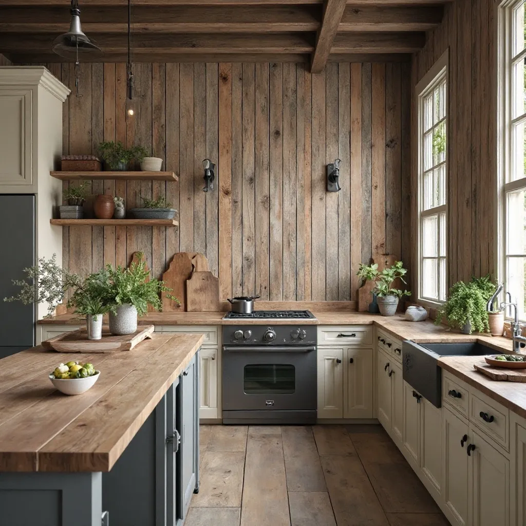
A warm farmhouse kitchen featuring realistic wood plank wallpaper in weathered barn wood, reclaimed timber, or driftwood finishes. The authentic grain patterns and dimensional texture create rustic character and architectural warmth, paired with industrial metal accents and vintage accessories. Shop on Amazon
Why It Works: Wood wallpaper delivers instant warmth and rustic character without the structural concerns, weight, or expense of real
planking. The natural variations in grain and color add organic visual interest, while the horizontal orientation typically used makes spaces feel wider and more expansive—particularly valuable in narrow galley kitchens.
How to Style It:
- Choose heavily textured or embossed versions that cast real shadows and catch light like dimensional wood
- Install horizontally to emphasize width in narrow kitchens, or vertically to draw attention to architectural height
- Balance the rustic texture with refined elements (marble counters, modern appliances) to avoid the space feeling too “cabin”
- Consider various wood tones on different walls for interest, but keep them within the same color family (all cool grays or all warm browns)
Where to Use It: Accent walls in farmhouse kitchens, full walls in rustic spaces, breakfast nook surrounds, ceiling applications for cabin charm
Pro Tip: Wood plank wallpaper looks most authentic when installed with slight intentional imperfections—offset the seams randomly like real planking rather than creating perfectly aligned rows, which immediately reads as wallpaper rather than wood.
25. Metallic Hexagons
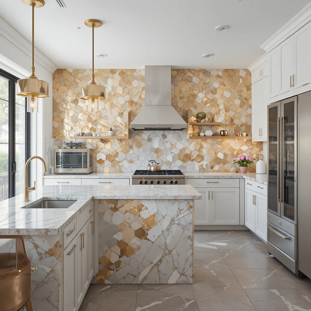
A glamorous contemporary kitchen featuring geometric hexagon wallpaper with metallic finishes in gold, silver, copper, or rose gold. The dimensional pattern catches and reflects light beautifully, creating jewelry-box sophistication and modern edge, balanced by sleek cabinetry and luxurious stone surfaces. Shop on Amazon
Why It Works: Metallic hexagons combine geometric precision with light-catching glamour, creating sophisticated impact that changes throughout the day as light shifts. The honeycomb structure provides mathematical order that’s psychologically satisfying, while the metallic finishes add luxury and help bounce light around, making kitchens feel brighter and more expensive.
How to Style It:
- Choose wallpapers with actual metallic ink or foil rather than printed metallics for authentic shimmer and dimension
- Install on walls that receive both natural and artificial light to maximize the reflective, changing nature of the pattern
- Coordinate the metallic tone with your hardware and fixtures (all warm metals or all cool) for cohesive sophistication
- Balance the glamorous wallpaper with matte surfaces elsewhere (matte cabinets, honed stone) to prevent the space from feeling too shiny
Where to Use It: Accent walls in contemporary kitchens, bar areas, breakfast nook feature walls, transitional spaces between kitchen and dining
Pro Tip: Metallic wallpapers are unforgiving of poor wall prep—every bump and imperfection will be highlighted rather than hidden, so invest time in proper sanding, filling, and priming for a truly luxurious result.
26. Watercolor Florals
A dreamy kitchen adorned with soft watercolor floral wallpaper featuring loose, artistic blooms in gentle pastels—blush, sage, lavender, and cream. The painterly pattern creates romantic atmosphere and artistic sophistication, avoiding the stiffness of traditional florals through its fluid, artistic approach. Shop on Amazon
Why It Works: Watercolor florals bring softness and artistic sensibility without the formality of traditional floral patterns. The translucent, layered quality adds depth and movement, while the gentle color palettes create calming atmospheres perfect for morning routines. The artistic rendering makes them feel gallery-worthy rather than grandmotherly.
How to Style It:
- Choose large-scale watercolor patterns (10+ inch blooms) for contemporary appeal rather than small ditzy prints
- Apply to walls with good natural light where the translucent watercolor quality can be appreciated
- Pull one or two soft colors from the pattern for textiles and small accessories, keeping the rest neutral
- Balance the romantic pattern with modern elements (contemporary lighting, clean-lined furniture) to prevent the look from feeling dated
Where to Use It: Breakfast nook walls, dining areas within kitchens, walls around garden windows, romantic cottage-style spaces
Pro Tip: Watercolor wallpapers work best when the painting style is visible—avoid patterns where the watercolor effect is so subtle it just looks like regular florals, as the artistic quality is what makes this trend feel current and sophisticated.
27. Terrazzo Effect
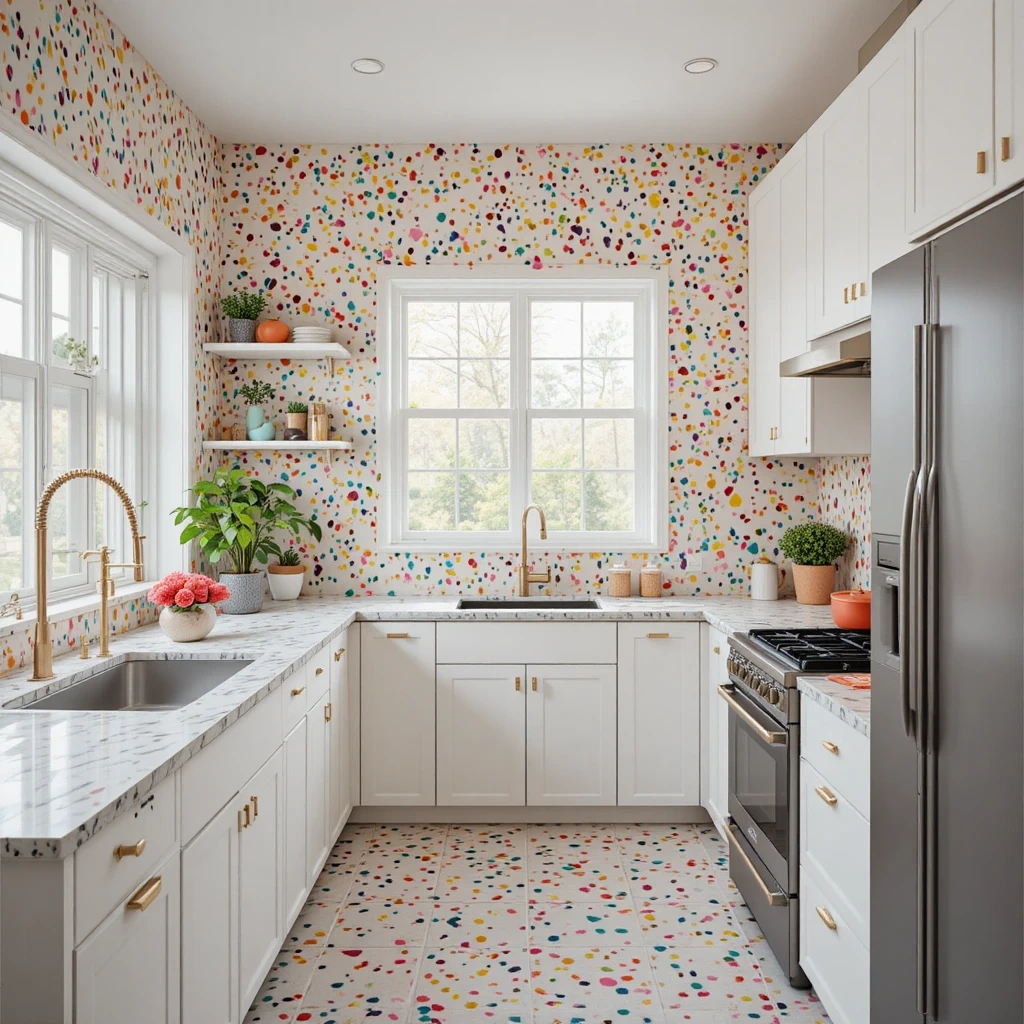
A playful modern kitchen featuring terrazzo-inspired wallpaper with colorful chips and speckles in pink, teal, yellow, and white creating confetti-like energy. The retro-modern pattern brings 1980s glamour updated for contemporary tastes, paired with white or pastel cabinetry and brass or gold hardware. Shop on Amazon
Why It Works: Terrazzo combines playful color with sophisticated randomness, creating visual interest that never gets boring because there’s no formal repeat to identify. The scattered pattern is forgiving of kitchen messes and imperfections, while the multicolor nature allows you to pull accent colors from the pattern for cohesive decorating.
How to Style It:
- Choose terrazzo patterns with white or neutral backgrounds to prevent the multicolor chips from overwhelming the space
- Install throughout the kitchen rather than as accent walls—terrazzo works best as an enveloping, cohesive surface
- Pull 2-3 colors from the terrazzo chips for small accessories and textiles to create intentional coordination
- Balance the playful pattern with simple cabinet fronts (flat panel) and minimal hardware in warm metals
Where to Use It: Full kitchen walls in contemporary spaces, breakfast nook surrounds, playful cooking spaces, retro-modern designs
Pro Tip: Terrazzo wallpaper is one of the few patterns that actually looks better in smaller spaces—in large expanses, the pattern can become monotonous, but in compact kitchens it creates exciting energy without overwhelming.
28. Classic Damask
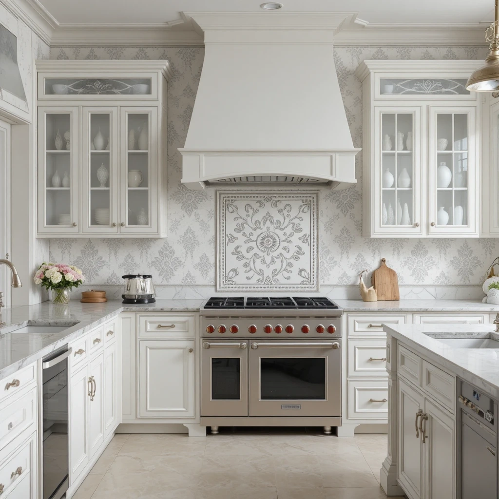
An elegant traditional kitchen featuring sophisticated damask wallpaper with ornate medallion patterns in subtle tone-on-tone colors—cream on white, gray on gray, or metallic on neutral. The formal pattern creates refined luxury and architectural interest, paired with traditional cabinetry and classic fixtures. Shop on Amazon
Why It Works: Damask delivers timeless elegance with historical gravitas, creating instant sophistication that references European palaces and estate homes. The symmetrical repeating pattern provides psychological comfort through its predictability, while the ornate detailing adds richness without requiring color—perfect for those who want pattern in neutral spaces.
How to Style It:
- Choose tone-on-tone damask (subtle contrast) for sophisticated restraint rather than high-contrast versions which can feel costume-y
- Limit to one or two walls maximum—damask is formal and can overwhelm if used throughout an entire kitchen
- Pair with traditional architectural details (crown molding, raised panel cabinets) to support the formal aesthetic
- Add crystal or glass elements (pendant lights, glassware displays) to enhance the elegant, refined atmosphere
Where to Use It: Formal dining areas within kitchens, butler’s pantries, traditional breakfast rooms, walls in classic estate-style homes
Pro Tip: If classic damask feels too formal or dated, look for modern interpretations with oversized scale (24+ inch patterns) or unexpected colorways like charcoal and gold—you’ll maintain the sophisticated structure while creating something more current.
29. Abstract Watercolor Washes
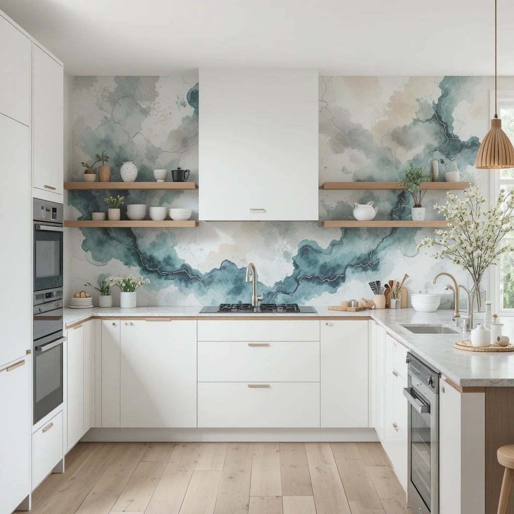
A serene contemporary kitchen featuring abstract watercolor wallpaper with fluid washes of color—soft blues, greens, grays, or warm earth tones blending organically. The artistic pattern creates spa-like calm and sophisticated gallery appeal, paired with minimal modern cabinetry and natural materials. Shop on Amazon
Why It Works: Abstract watercolor creates visual interest through color and movement rather than recognizable pattern, making it psychologically calming while still preventing blank-wall boredom. The lack of formal repeat means the eye never tires of the pattern, and the organic flow brings softness to the hard surfaces and straight lines inherent to kitchen design.
How to Style It:
- Choose vertical orientation for watercolor washes to draw the eye upward and emphasize ceiling height
- Pull your cabinet and countertop colors from tones within the watercolor wash for cohesive flow
- Install on walls with minimal interruption (no cabinets or appliances breaking the flow) to let the artistic effect read properly
- Add actual watercolor artwork in similar tones to create gallery-wall moments that legitimize the artistic approach
Where to Use It: Feature walls in contemporary kitchens, breakfast nook surrounds, walls in open-concept spaces, spa-like cooking environments
Pro Tip: Abstract watercolor wallpaper requires high-quality printing—cheap versions look muddy and pixelated, destroying the sophisticated aesthetic, so invest in premium materials for the gallery-worthy effect you’re after.
30. Vintage Map Designs
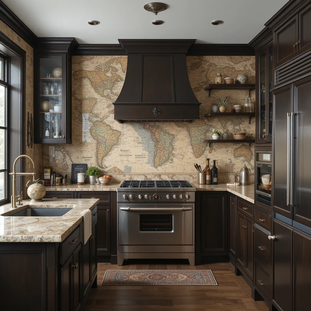
A sophisticated kitchen featuring antique map wallpaper with old-world cartography, vintage travel routes, or botanical expedition drawings in sepia, aged parchment, or hand-colored tones. The intellectual pattern creates worldly charm and collector appeal, paired with dark wood, leather, and brass accents. Shop on Amazon
Why It Works: Map wallpaper brings intellectual sophistication and storytelling to kitchens, creating conversation pieces that reward closer inspection. The vintage aesthetic adds instant age and character to new builds, while the neutral color palettes work seamlessly with various design styles. Maps feel both masculine and accessible, making them perfect for shared spaces.
How to Style It:
- Select maps with personal meaning (regions you’ve traveled, family heritage areas) to create authentic connection to the pattern
- Apply to dining areas or breakfast nooks where people can actually study and appreciate the details during meals
- Balance the vintage pattern with modern conveniences and clean lines to avoid creating a costume-y colonial atmosphere
- Add actual travel souvenirs or vintage globes to support the worldly, collected aesthetic authentically
Where to Use It: Dining area walls, breakfast room surrounds, walls behind built-in banquettes, study-like eating spaces
Pro Tip: Map wallpaper works best in kitchens with good task lighting—the detailed information and fine text need illumination to be legible and appreciated, so plan your lighting scheme to highlight rather than shadow the cartography.
31. Modern Ombre Gradients
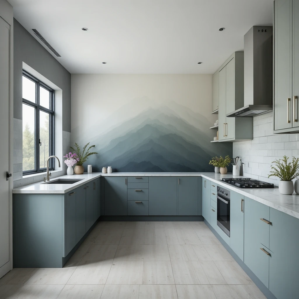
A contemporary kitchen showcasing ombre gradient wallpaper transitioning from deep saturated color at the floor to pale or white at the ceiling—navy to white, charcoal to cream, or sage to barely-there green. The gradual shift creates dramatic architectural interest and draws the eye upward, making ceilings feel dramatically higher. Shop on Amazon
Why It Works: Ombre creates sophisticated color impact while maintaining the calming quality of gradient transitions—there are no harsh lines or patterns to create visual fatigue. The vertical color flow draws attention upward, making kitchens feel more spacious and architecturally significant, while the contemporary aesthetic feels current without being trendy.
How to Style It:
- Choose gradients that transition to white or pale neutral at the top to maximize the ceiling-heightening effect
- Install on full walls without interruption—ombre needs unbroken vertical space to create its full dramatic impact
- Pull your darkest cabinet or countertop color from the deepest tone in the gradient for cohesive color flow
- Keep other walls and surfaces neutral to let the gradient wall be the singular focal point without competition
Where to Use It: Feature walls in contemporary kitchens, walls in open-concept spaces, breakfast nook backdrops, modern loft-style cooking areas
Pro Tip: Ombre wallpaper is sensitive to installation—if the gradient doesn’t run perfectly vertical (if it tilts even slightly), the effect is ruined and makes the room feel crooked, so professional installation is worth the investment for this particular pattern.
32. Maximalist Eclectic Collage
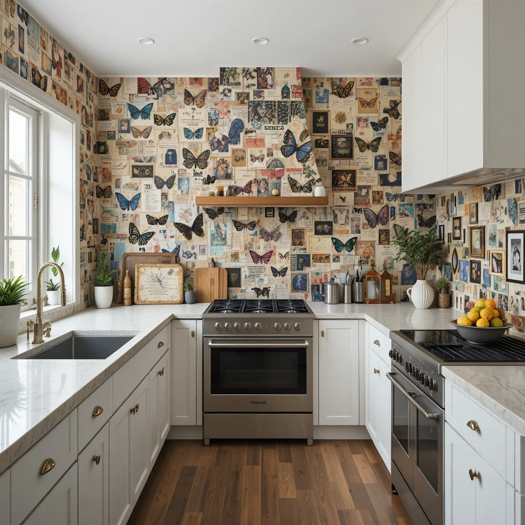
A bold eclectic kitchen featuring maximalist collage wallpaper with layered vintage illustrations, botanical prints, butterflies, birds, and decorative objects creating rich, collected density. The exuberant pattern makes a dramatic statement and creates gallery-worthy personality, balanced by simple modern elements that provide visual rest. Shop on Amazon
Why It Works: Maximalist collage patterns celebrate abundance and creative expression, making kitchens feel like personal galleries rather than sterile workspaces. The layered complexity creates endless visual discovery, ensuring you notice new details each time you look. For those who love color and pattern, maximalism is liberating and joyful rather than overwhelming.
How to Style It:
- Limit maximalist patterns to one statement wall only—more than one wall becomes genuinely chaotic rather than intentionally bold
- Choose patterns on white or cream backgrounds to maintain some breathing room within the density
- Keep all other surfaces extremely simple (white cabinets, solid counters, minimal hardware) to give eyes a place to rest
- Curate actual collections (vintage tins, colorful pottery, cookbook displays) that echo the collected quality of the wallpaper
Where to Use It: Dining area feature walls in eclectic homes, breakfast nook surrounds, pantry interiors, creative cooking spaces
Pro Tip: Maximalist wallpaper requires confidence and commitment—if you’re hesitant, try it in a small breakfast nook or pantry first rather than a full kitchen wall, as it’s the kind of pattern you either love passionately or regret intensely.
Common Mistakes to Avoid
1. Installing Regular Paper in High-Moisture Areas
The biggest killer of kitchen wallpaper is using standard paper in areas directly exposed to steam, splashes, and humidity. Water infiltration causes peeling, bubbling, and mold growth within months. Always choose vinyl, vinyl-coated, or moisture-resistant wallpaper specifically rated for kitchens and bathrooms. Apply these water-resistant options near sinks, stoves, and anywhere moisture is present, and seal edges with clear acrylic sealer for extra protection in the most vulnerable zones.
2. Choosing Busy Patterns in Small Kitchens
Large-scale or high-contrast busy patterns can make compact kitchens feel claustrophobic and visually exhausting. In kitchens under 150 square feet, opt for patterns with at least 60-70% negative space, soft colors, or subtle textures rather than bold graphics or dense florals. Vertical stripes or small-scale geometrics work better than large dramatic prints. Save statement patterns for larger kitchens where they have physical space to breathe without overwhelming.
3. Ignoring Cabinet and Countertop Coordination
Installing wallpaper without considering existing surfaces creates visual chaos and makes everything look cheaper. Before purchasing wallpaper, lay samples against your cabinets and countertops in natural light—patterns should complement, not clash or compete. If you have busy granite or patterned tile, choose solid or subtly textured wallpaper. If your surfaces are simple, you can handle more dramatic wallpaper. Pull at least one color from your countertops into your wallpaper choice for cohesion.
4. Poor Wall Preparation
Wallpaper amplifies every wall imperfection—bumps, holes, and texture irregularities will show through and ruin the finished look. Fill all holes with spackling compound, sand walls smooth (especially if previously textured), and prime with wallpaper-specific primer before installation. This is doubly important for metallic, grasscloth, or thin wallpapers that are particularly unforgiving. Skipping prep work means your expensive wallpaper will look cheap and amateur regardless of the pattern quality.
5. Not Accounting for Pattern Repeat and Waste
Failing to calculate pattern repeat when ordering leads to running short mid-project or creating obvious mismatches at seams. Large-scale patterns (24+ inch repeats) can require 25-30% extra material for matching. Always order 15-20% more than your square footage for small repeats, and 25-30% more for large patterns. Keep extra rolls for future repairs—wallpaper dye lots vary, and you won’t be able to match perfectly later. One extra roll is insurance you’ll appreciate when you need a patch.
6. Installing Wallpaper Behind Stoves Without Protection
Placing any wallpaper, even heat-resistant types, directly behind cooking surfaces without protection is a fire hazard and causes rapid deterioration from heat and grease. Always install a proper backsplash material (tile, metal, glass) between your stove and any wallpaper, extending at least 6 inches beyond the stove on each side and up to your hood or cabinets. Wallpaper can go on adjacent walls, but never in the immediate cooking zone where it’s exposed to open flames, high heat, and grease splatter.
Frequently Asked Questions
Can wallpaper survive in a kitchen environment with cooking moisture and temperature changes?
Yes, but only if you choose the right type. Vinyl, vinyl-coated, or solid sheet vinyl wallpapers are specifically engineered for high-humidity environments and can absolutely thrive in kitchens. Look for wallpapers labeled “scrubbable” or “washable” with moisture-resistance ratings. Avoid fabric-backed, grasscloth (real), or standard paper wallpapers in kitchens, as these absorb moisture and deteriorate quickly. Install moisture-resistant types everywhere, and add clear acrylic sealer along edges near sinks and stoves for additional protection. Proper ventilation (a working range hood) also significantly extends wallpaper life by removing excess steam and grease from the air.
How much wallpaper do I actually need for a kitchen, and how do I calculate pattern repeat?
Measure your wall width and height, multiply for square footage, then add 15-20% for small patterns (under 12-inch repeat) or 25-30% for large patterns (24+ inch repeat). Pattern repeat is listed on wallpaper specifications—it’s the vertical distance before the design repeats itself. Larger repeats create more waste because you must align patterns at seams, requiring you to cut away non-matching portions. To calculate precisely: divide your wall height by the pattern repeat, round up, then multiply by repeat measurement to find how much actual paper you need per strip. Always order one extra roll as insurance, since dye lots vary and future matching is impossible.
Should I hire a professional to install kitchen wallpaper or can I DIY it successfully?
Simple patterns on straight walls are excellent DIY projects, especially with modern peel-and-stick options. However, hire professionals for: large-scale patterns requiring precise matching, expensive wallpapers where mistakes are costly, kitchens with many obstacles (windows, outlets, cabinets creating complex cuts), textured or grasscloth wallpapers that show application errors readily, or if you lack experience and patience. Professional installation costs $2-7 per square foot but includes perfect seam matching, proper moisture sealing, and clean cuts around obstacles. For first-timers, start with a small breakfast nook or pantry using peel-and-stick before tackling full kitchen walls with traditional paste.
What’s the best way to clean kitchen wallpaper without damaging it?
Use a soft damp cloth with mild dish soap for vinyl and scrubbable wallpapers, wiping gently in the direction of the pattern. Never scrub aggressively or use abrasive cleaners, which damage protective coatings. For grease splatter, spray diluted degreaser on the cloth (not directly on wallpaper) and wipe immediately. Test cleaning methods in an inconspicuous spot first to ensure colorfastness. Clean regularly rather than letting grime build up—monthly light cleaning is easier than quarterly deep cleaning. For non-scrubbable wallpapers, use a dry microfiber cloth or duster only, and position these wallpapers away from direct cooking zones where heavy cleaning won’t be necessary.
Can I install wallpaper over existing wallpaper or do I need to remove the old layer first?
You must remove old wallpaper before installing new—layering creates lumpy, unprofessional results and the new wallpaper won’t adhere properly to the glossy old surface. Old wallpaper also traps moisture, causing mold growth between layers. Use a wallpaper steamer or scoring tool plus removal solution to strip old paper completely, then wash walls with TSP to remove all paste residue. If removal is impossible (old wallpaper is painted over or walls are too fragile), apply wallpaper liner/liner paper first—this creates a smooth, neutral surface for your new wallpaper. This extra step adds time and cost but ensures professional results.
How long does kitchen wallpaper typically last before it needs replacing?
Quality moisture-resistant wallpaper properly installed in kitchens lasts 7-15 years depending on location, ventilation, and maintenance. Wallpaper away from direct cooking zones and in well-ventilated kitchens lasts longest. Areas near stoves (but properly protected) or sinks may show wear around years 5-7 and can be spot-repaired. Peel-and-stick wallpapers have shorter lifespans (3-5 years) but are easier to replace. Extend wallpaper life by: using your range hood consistently, cleaning regularly with appropriate methods, repairing small damage immediately before it spreads, and maintaining humidity control. Well-maintained kitchen wallpaper in moderate-use kitchens can look fresh for a decade or more.
Final Thoughts: Your Kitchen, Your Canvas
Your kitchen walls are blank canvases waiting for the personality only you can provide. Whether you’re drawn to the timeless elegance of classic patterns or the bold energy of contemporary designs, wallpaper offers an accessible way to transform your space without the commitment or expense of major renovations. Start with what excites you—not what’s trending on social media or what worked in someone else’s home.
These walls witness your daily rituals, your family gatherings, your quiet morning coffee moments, and your celebratory dinner preparations. They deserve to reflect who you are and how you want to feel in your kitchen. The right wallpaper doesn’t just decorate—it elevates your mood, sparks conversation, and turns ordinary cooking into an experience worth savoring in a space you’ve thoughtfully created.
Trust your instincts and don’t let fear of commitment stop you from trying something bold. Wallpaper is remarkably forgiving—if you don’t love it after living with it, you can change it. The beauty of wallpaper is its impermanence compared to tile or paint that feels locked in forever.
Your Next Step: Choose your favorite three ideas from this guide and order samples to hold against your actual kitchen walls in morning, afternoon, and evening light. See how they interact with your cabinets and countertops before committing to full rolls.
Remember: The most successful kitchens aren’t those that follow rules perfectly—they’re the ones that make you smile every time you walk in, where the walls feel like an extension of your personality rather than a design magazine formula.